The wonderful thing about art over time is that it continues to evolve. While the thought process behind the work may shock the more conventional folks as it is introduced, the movement can go down in history. While the works of Impressionism (this term will include Post-impressionism and Neo-impressionism) may result in a very different image than Cubism, rethinking the pictorial plane is what these movements have in common. The preceding way that an artist would assess their subject would be in a one point perspective, established by Renaissance art. But what makes these two movements remarkable is how multiple viewpoints are captured within the subject. What’s baffling about it is the “how?” behind it, which will be further explained in detail.
The first Impressionist movement took place between 1867 and 1886. Artists that made up this movement were Claude Monet, Pierre Auguste Renoir, Camille Pissarro, Alfred Sisley, Berthe Morisot, Armand Guillaumin, and Frédéric Bazille in France, working off of each other. Impressionism typically captures landscapes and other open spaces that use natural light. Because of natural light this means that over a period of several hours the subject will look different. Therefore painting in this style requires the artist to be very skilled by use of quick thinking and gestural brushstrokes. A great example that plays into that aspect is Bal du moulin de la Galette, 1876, 4′ 4′′ x 5′ 9′′ oil on canvas by Pierre-Auguste Renoir. All in all what every work had in common resulted in an image that was flattened but patterns of bright color and textures were emphasized. Post-impressionism and Neo-impressionism use the main elements already mentioned but vary slightly depending on the artist. These artists include Paul Cezanne, Paul Gauguin, Georges Seurat and Vincent van Gogh.
Cubism is similar to Impressionism in the sense that viewing this subject is not going to be in one fixed state with the result showing multiple perspectives. The movement gained traction through Pablo Picasso and Georges Braque in Paris between 1907 and 1914. Except in Cubism, rather than light affecting the changes in perspective while the artist is working the artist themselves changes their viewing position. Thus the work of Cubism results in multiple combined perspectives from viewing the subject at different angles, demolishing the one point perspective practice established during Renaissance art. Impressionism and Cubism are also similar in that gestural marks must be made that only capture the subject’s essence rather than all its details. Cézanne’s The Basket of Apples, 1893, 5.6 in × 31.5 oil on canvas is an example of Cubism because the viewer can see objects such as the lady finger cookies are stacked but different sides of it are painted with the perspective being changed. The top cookies are more downturned than they would be if they were painted from the same perspective as the bottom cookies. It’s also hard to make out whether or not the basket can keep its balance and not fall. This illusion is created because the basket was painted using more than one perspective.
Pierre-Auguste Renoir. Bal du moulin de la Galette, 1876. Oil on canvas; 4′ 4′′ x 5′ 9′′. Orsay Museum collection, Paris, France. Image by Google Arts & Culture.Paul Cézanne. The Basket of Apples, 1893. Oil on canvas, 5.6 in × 31.5. Art Institute of Chicago collection, Chicago, IL. Image by CC0 Public Domain Designation.
Because of these movements with Impressionism leading into Cubism the viewer can see that there is more than one way to consider the pictorial plane. Gestural brushstrokes/marks and working quickly is what it takes to achieve these styles, and it takes a very skilled artist to assess their subject in this manner. In the case of Impressionism it’s the moving lights and shadows. In the case of Cubism it’s the basic forms being combined at different angles. Achieving something other than one point perspective was very groundbreaking.
When the average viewer thinks of a portrait they usually think of paintings of the rich and powerful, or of well-dressed and made-up figures, usually for school photos or ones online profiles. Catherine Opie however, transformed the art of portraits, using them as a form of expression that not only investigates someone’s essence, but makes a point of addressing society itself.
Catherine Opie. Mike and Sky, 1993. Silver dye bleach print; 19 1/8 x 14 7/8 in. MoMA.
The most well known of her portraits are her photographs from the 90’s, documenting queer culture during the height of the AIDS pandemic.[1][2]Mike and Sky, 1993features two men, one behind the other. They’re both strong looking men, with tattoos, and piercings and yet its clear the two have a relationship. Seeing just one of these men wouldn’t elicit the same reaction but together they create a powerful energy that would fiercely cause a reaction with the viewer at the time.
Catherine Opie. Dyke, 1993. Chromogenic Print; 40 x 30 in. MoMA
Dyke, is very similar, what could be a young man or woman facing away is immediately charged by the word Dyke tattooed on the back of her neck, which forces the viewer to have a reaction whether positive or negative.
Catherine Opie. Gina and April, 1998. Domestic.
Gina & April, 1998shows two black women in an embrace in bed, caressing one another’s arms and heads, one with her eyes closed, the other looking on softly. Not only does this soft interaction counter racial stereotypes, showing the women as soft, it also counters common lesbian stereotypes, the women are fully dressed and unprovocative, not being manipulated by the fetishistic male gaze.
Unlike many artists, Opie did not cater to the rich or the male viewer, while some of her portraits are nude, they are not nude in a sexual way, but in a way that is vulnerable, just as most of her subjects are. There is no profound message, no glaring text or pointed titles, just queer people of all shapes and sizes existing and co-existing together. While the subject matter may not seem as important today, it was not nearly as commonplace back in the 90’s, nor was it out there for everyone to see. Opie changed that.[3]
[1] Dazed “How Catherine Opie Transformed the Image of Contemporary America.” 2021
[2] Wallentine “Catherine Opie on Her First Monograph, ‘A Map of My Mind.’” 2021
[3] Shapiro “Catherine Opie – Photographs by Catherine Opie: Book Review by Emily Shapiro.”
At first glance, Dada and Surrealism can easily be mistaken for each other. This is because their styles and motivation behind the art is similar. Both of these movements are meant to make viewers of the art question logic. In her article on Dada and Surrealism, Alice Samusevich writes, “They sought to break down conventions in the arts in order to bring forth a new, improved culture…Surrealism was similar to the Dada movement because it was meant to defy the reason and logic in response to the seemingly unreasonable World War I.” However, if you look past the sometimes questionable, outlandish pieces both movements have to offer, you’ll find that their emergence, styles, and messages are different in a lot of ways.
Dada first emerged in Zurich, Switzerland 1914 as a result of the end of the first World War. As what happens with the end of most wars, countries have to rebuild and there is generally a more serious atmosphere. Many artists started to grow unhappy with the monotony of everyday life. Art historians at the MoMA explain, “For the disillusioned artists of the Dada movement, the war merely confirmed the degradation of social structures that led to such violence: corrupt and nationalist politics, repressive social values, and unquestioning conformity of culture and thought… Dada artists sought to expose accepted and often repressive conventions of order and logic, favoring strategies of chance, spontaneity, and irreverence.” Dada artists were often anti-establishment, left leaning individuals. They proudly rejected the meaning of traditional art and what they felt it stood for. Often, the art world and artists can be seen as pretentious, elitist, and so on. Dadaists, being against the bourgeoisie, rejected these ideas.
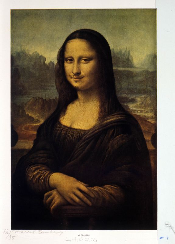
Marcel Duchamp. L.H.O.O.Q., 1919/1964 Rectified readymade. Pencil on reproduction; 30 x 23 cm. Collection of the Israel Museum, Jerusalem The Vera and Arturo Schwarz Collection of Dada and Surrealist Art. Image by Israel Museum. Photo by Avshalom Avital.
L.H.O.O.Q (1919) by leader of the Dada movement, Marcel Duchamp, depicts the Mona Lisa painting by Leonardo DaVinci with a handlebar mustache and goatee. This is known as a “readymade,” which gives new life and purpose to everyday objects. According to Dr. Charles Cramer and Dr. Kim Grant, “The readymade is divorced from its ordinary context and use value and re-presented in an art world context. This encourages us to encounter the object in a different way.” The piece is meant to be a comical critique of art in general. The Mona Lisa is one of the most iconic paintings in history, today it is worth about $850 million. By making a satirical piece of this piece, perhaps Duchamp was finding the humor in a painting that many people take so seriously.
As Dada art began to dwindle in popularity, Surrealism emerged in Paris in the early 1920s. Similar to Dada, Surrealism was also a response to the first World War. In his article on surrealism, art historian James Voorhies says, “The cerebral and irrational tenets of Surrealism find their ancestry in the clever and whimsical disregard for tradition fostered by Dadaism a decade earlier.” Surrealists wanted to introduce different ideas, and to inspire people to think beyond what they think they know about the world.
Unlike Dadaists, Surrealists consider themselves to be real artists. On the other hand, Dadaists’ art is meant to mock the art world; it is anti-art. Surrealism emerged not to mock, but to make people question rational thought. Surrealists’ goal was to make thought provoking work that makes you see the world in a new perspective. Also, although Dada and Surrealism came about because of World War I, dada was a negative and critical expression of feelings, while surrealism was a more positive expression. In other words, Dadaists used their art as an outlet to critique, and surrealists used their art to simply question. One example of this style of art is Lobster on Telephone (1938), a sculpture by Edward James and Salvador Dalí. The title describes the appearance of the work perfectly; there is a plastic, red lobster on top of an black rotary phone. These are two vastly different things that the average person would not think would go together. When asked why he created the piece, Dalí said, “I do not understand why, when I ask for a grilled lobster in a restaurant, I am never served a cooked telephone. I do not understand why champagne is always chilled and why on the other hand telephones, which are habitually so frightfully warm and disagreeably sticky to the touch, are not also put in silver buckets with crushed ice around them.” James and Dalí wanted viewers of the piece to question its purpose; was there even meant to be a purpose? Does all art have to have meaning or can it just exist for art’s sake?
Salvador Dalí. Lobster on a Telephone, 1938. Steel, plaster, rubber, resin and paper; 7″ x 13″ x 7″. Tate Modern, London, England. Image by Tate Britain. Photo by Salvador Dali, Gala-Salvador Dali Foundation/DACS, London 2020.
Known for their humor and not taking themselves too seriously, Dadaism and Surrealism have many things in common and it is easy to see why they are often mistaken for each other. They also have many differences as well; Dada was more negative, meant to critique, and was anti-establishment. On the other hand, Surrealists were more positive, meant to inspire questions, and they were less involved in politics when it came to their art. Despite their similarities and differences, they are two powerful art movements that are still respected and discussed today.
While the Fauvism and Pop Art movements happened nearly fifty years apart from one another, the two movements occasionally link together with striking similarities, in use of color, iconography, and brush work. While Fauvism itself was about the strong use of color and shape over realism in color and form, Pop Art used those lessons in a way that makes it such a well known movement even today, without Fauvism, it is likely that Pop Art would have looked much different.
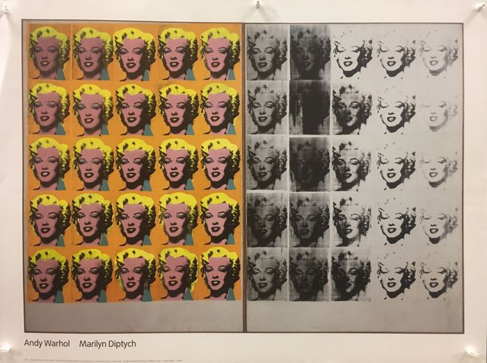
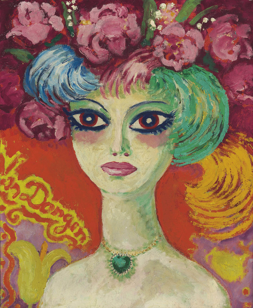
Andy Warhol. Marilyn Diptych, 1962. Silkscreen ink and acrylic paint on two canvases; Each 2054 x 1448 x 20mm. Aspen Art Museum, Aspen USA.Kees Van Dongen. Portrait de femme. Oil on Canvas; 61 x 49.5 cm. Christie’s, New York.
When discussing Pop Art, to most people Andy Warhol comes to mind. Considered to be one of the founders of the movement[1], his use of bright color and repetition added to the signature style. Comparing his piece Marilyn Diptych to Kees Van Dongen’s, Portrait de femme can help show the styles similarities, the bright colors, heavy eyeliner and mascara and plump lips, the barely there toning in the faces and the bright orange backgrounds, contrasting with other shades of yellow and cyan to make all the colors pop. Despite the two pieces being two completely separate mediums, they call to one another.
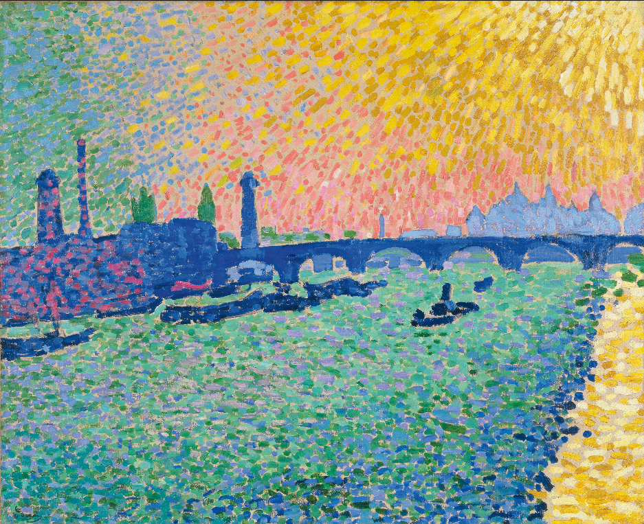
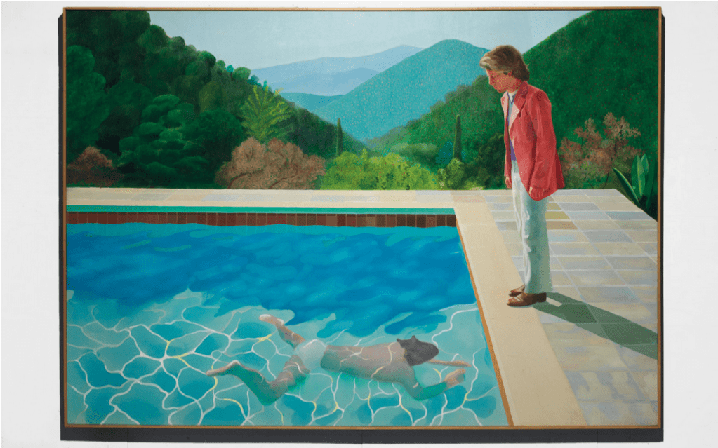
Andre Derain. Waterloo Bridge, 1906. Oil on Canvas; 80.5 x 101 cm. Museuo Nacional Thyssen-Bornemisza, Madrid. David Hockney. Portrait of an Artist (Pool with Two Figures), 1972. Acrylic on canvas; 84 x 120 in. Private Collector.
Another two paintings to compare are Waterloo Bridge, 1906, by Andre Derain and Portrait of an Artist (Pool with Two Figures), 1972, by David Hockney, you can see the almost mosaic style of laying down color, the strong dashes of green and blue throughout the pieces, that while applied differently, combine to a similar effect. David Hockney, also considered to be a major player in Pop Art, has later art that is even compared to Fauvism[2], especially for pieces like Nichols Canyon, and The Garden, with bright heavy strokes and use of pattern and line.
While other aspects of the two movements can look or represent much different things, it’s easy to see the influence that color had on both movements.
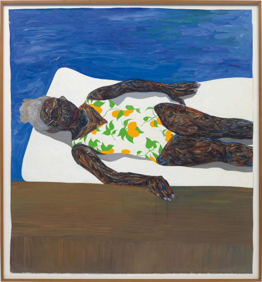
Amoako Boafo. The Lemon Bathing Suit, 2019. Oil on Unstretched Canvas; 81×76 inches. Photo by Phillips London.
Thomas “Amoako” Boafo born on May 10th, 1984 in Ghana is an up and coming painter in the art world, thought to be one of the Most Influential Artists of 2020.[1] He grew up in Osu in the Greater Acra Region of Ghanna, losing his father at a young age, living with his financially struggling single mother. While he had dreams of being an artist, he thought it simply wasn’t possible, “It’s something that I wanted to do from the beginning, but in Ghana, we don’t have the arts infrastructure. You have to find those things yourself.”[2] Luckily for Boafo, his mothers employer must have seen talent in the young mans work, footing his tuition and allowing him to go to the Accra’s Ghanatta College of Art, graduating in 2008 with the Best Portrait Painter of the Year award. In 2014 he moved to Vienna with his soon to be wife Sunada Mesquita, and enrolled in the Academy of Fine Arts for his MFA.
He struggled when he first moved to Vienna to make it as an artist, painting portraits of those in the city’s cultural area until he learned to ditch his brushes and work with his fingers, creating extremely interesting and textured art that won him his next award in 2017, the Walter Koschatzky Art Award for an Artist Under 25. His artwork is known for its bold colors and patterns, challenging the perceptions of black subjectivity, diversity, and complexity.[3] Other than the figures in the paintings, the colors in the paintings are almost completely monochromatic, mixing solid paint and complex patterns in a way that makes the skin and poses pop.
His art finally began to gain further notoriety in 2018 when Kehinde Wiley, an artist known for his presidential portrait of Barack Obama, reached out to purchase one of his works, and subsequently notified his own galleries to his find. While his gallery in Los Angeles had never seen one of Boafo’s pieces before, they offered him a spot when a larger show fell through not even weeks later. The Artists pieces were listed at $10,000 dollars each, and the show was sold out by the end of the second day.
His work quickly grew and grew in popularity, His booth at the Mariane Ibrahim Gallery at Art Basel in Miami Beach back in 2019 similarly sold out. In 2020 his performance only grew, At Phillips in London his painting The Lemon Bathing Suit (2019) a painting featuring an older black woman, resting on a white water float next to the side of a pool in a bathing suit adorned with lemons, sold for the equivalent of $875,000, which was more than thirteen times its original estimate. His work has been acquired by multiple institutions as well, and is not featured in the Guggenheim, the Los Angeles County Museum of Art, and Vienna’s Albertina Museum.[4]
In this year he collaborated with Dior designer Kim Jones for his 2021 collection, and opened a show called “I Stand By Me” at Mariane Ibrahim’s Chicago gallery. The show, being his first solo exhibition, focuses on reflection during a time of crisis, using techniques that maximize both expression and minimalism, celebrating subjects bound to the world around them, sourcing European wallpapers to explore the possibilities of photo transfers.[5]
While the artist is just getting started its clear that his art is going to only keep going, exploring even more possibilities with his exploration of color and texture.
[2] Nate Freedman, “The Swift, Cruel, Incredible Rise of Amoako Boafo: How Feverish Selling and Infighting Built the Buzziest Artist of 2020”, Artnet, Artnet Worldwide Corporation, September 28th, 2020, https://news.artnet.com/art-world/amoako-boafo-1910883
Freeman, N. (2020, September 28). The Swift, Cruel, Incredible Rise of Amoako Boafo: How Feverish Selling and Infighting Built the Buzziest Artist of 2020. Retrieved from Artnet: https://news.artnet.com/art-world/amoako-boafo-1910883
While many people engage with art in meaningful ways, one of the primary ways that the everyday person engages with art is through movies and television, and more often than not, that content is an adaption of something else. It is estimated that over fifty percent of all Hollywood films are adaptions, and they consistently tend to gross higher at the box office than original screenplays. [1] While the films tend to be more popular than their original counterparts, they can often be more controversial. While live action adaptions often strive to adapt various forms of media for financial success, when it comes to adapting comic, manga, or animated original material, they often fail to adapt the spirit and soul of the original media, leaving their adaptions to be pale imitations, leaving the everyday viewer to miss out on the original content.
The earliest failed adaption on this list is the 2009 film Dragon Ball Evolution, directed by James Wong and written by Ben Ramsey, an adaption of the Manga Dragon Ball by Akira Toriyama, that ran from 1984-1995, that was received so poorly that the writer offered a public apology in 2016, stating “I went into the project chasing after a big payday, not as a fan of the franchise but as a businessman taking on an assignment. I have learned that when you go into a creative endeavor without passion you come out with sub-optimal results, and sometimes flat-out garbage.” [2] According to the original creator as well, the makers of the film ignored his input as well, “At the time of the Hollywood movie, the live-action Dragon Ball, the script had too little of a grasp on the world and its characteristics, and on top of that, it had a conventional content that I couldn’t find interesting, so I cautioned them, and suggested changes; but in spite of that, they seemed to have a strange confidence, and didn’t really listen to me. What came out in the end was a movie I couldn’t really call a Dragon Ball that lived up to my expectations.” [3] The characters are flat and changed in order to replicate typical high-school film drama woes, despite the fact that the protagonist Goku never went to school at all during the original series. Goku, who is so pure hearted that when hit with an attack that would use his own negative thoughts to destroy him, did absolutely nothing, is instead turned into a self-centered and vain character, not to mention that the character was cast as a white actor, despite the character, while being an alien, was always meant to be interpreted as Japanese. The film, predictably, had terrible reviews, with a current Rotten Tomatoes score of fifteen percent. Critic Steve Biodrowski of Cinefantastique offering, “This film offers further proof, as if any were needed, that Western filmmakers cannot do justice to their Eastern counterparts when it comes to retooling anime and/or Fant-Asia for Occidental consumption.” While Dragon Ball Evolution failed on almost every metric, the manga has several successful anime adaptions, that do the original source much more credit, described by Carl Kimlinger of Anime News Network as “an action-packed tale told with rare humor and something even rarer—a genuine sense of adventure.”[4] Ironically it was the failure of the live action movie that led to the return of the creator to the anime series after years of being uninvolved with his original creation, “Dragon Ball once became a thing of the past to me, but after that, I got angry about the live action movie, re-wrote an entire movie script, and now I’m complaining about the quality of the new TV anime, so it seems that DB has grown on me much that I can’t leave it alone.” [5] While the film was originally planned to be part of a series lasting from three to seven movies, the series was unsurprisingly, canceled.
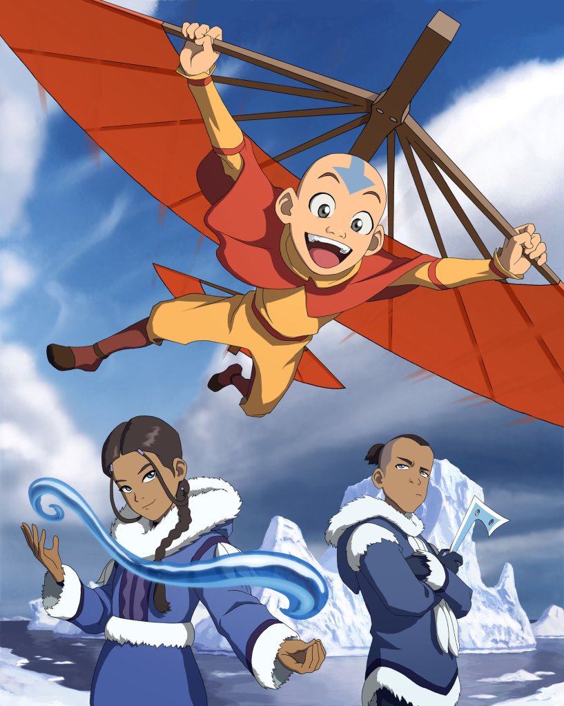
M. Night Shyamalan. The Last Airbender, 2010. Film; 103 Minutes. Nickelodeon Movies, Paramount Pictures.Michael Dante DiMartino & Bryan Konietzko. Avatar: The Last Airbender, 2005-2008. Animation; 61 Episodes. Nickelodeon Animation Studios, ViacomCBS Domestic Media Networks.
In the very next year, we had the adaption of Avatar: The Last Airbender, an anime-cartoon fusion that was created by Michael Dante DiMartino and Bryan Konietzko, and produced by Nickelodeon Animation Studios. The show, while having complex themes and stories is easily summed up by it’s intro, “Water. Earth. Fire. Air. Long ago, the four nations lived together in harmony. Then, everything changed when the Fire Nation attacked. Only the Avatar, master of all four elements, could stop them, but when the world needed him most, he vanished. A hundred years passed, and my brother and I discovered the new Avatar, an Airbender named Aang. And although his Airbending skills are great, he has a lot to learn before he’s ready to save anyone. But I believe Aang can save the world.”[6] The show is often cited as pushing American Cartoons in a whole new direction in terms of storytelling and visuals. [7]As a ratings success it’s no surprise that Nickelodeon wanted to create a live action adaption of the work. It’s also no surprise that the adaption, The Last Airbender, directed and written by M. Night Shyamalan for 2010, was a massive failure, trying and failing to adapt the seven or so hours of the first season, also known as Book One, into a convoluted, hundred-minute mess of never-ending narration and bad 3-D effects. The impressive effects and visuals of the original show demonstrated impressive knowledge of various fighting styles and incorporating them into their different elemental bending styles, Tai Chi being used for Waterbending, Hung Gar for Earth Bending, Northern Shaolin for Firebending, and Ba Gua for Airbending. The film however failed in the endeavor, a review by Lindy West of The Stranger describes the film, saying that, “Airbender’s editing is clunky, its pace glacial. It feels like watching someone’s homemade tai chi highlight reel, if tai chi could be somehow racist.”[8] The fighting styles which were previously smooth and meaningful, every single move creating or redirecting the elements in creative and visually interesting ways are now slow and weak, a notably riffed on moment in the film being when a group of seven Earthbenders take a comedically long, and ridiculously over-choreographed set of movements to move one small boulder, something that, in the original show, would’ve taken one person in the span of perhaps a second. The movement no longer contributes to the actual power of the move, instead simply being martial arts for the sake of martial arts.
Despite the claims of being “the most culturally diverse tentpole movies ever released, period.” By Shyamalan, the film was called to be boycotted by multiple groups, including Saving the World with Postage, Racebending.com[9], and by the Media Action Network for Asian Americans after the casting was announced in December of 2008, revealing that the main characters that were meant to be Tibetan/Hindu and Inuit respectively were instead casted by white actors, and that the fire nation, the main villains of the world, who were depicted with cultural mixes of Chinese and Japanese culture, were instead casted as Indian and Iranian actors. Any depth and culture of the original races of the story were virtually erased, and despite the fact that the original source material had voice acting, several of the names of the characters, even including the titular character, The Last Airbender, Aang, were butchered, M. Night Shyamalan ironically stating the characters Asian origins as the reason, “For me, the whole point of making the adaptation was to ground it deeper in reality. So, I pronounced the names as Asians would. It’s just impossible to pronounce Aang the way it is used in the series. It’s incorrect! I can’t do it. So, I just pronounced it correctly.”[10] The film, scoring an impressive five percent on Rotten Tomatoes, was originally planned to be part of a trilogy of films, matching with the three seasons of the show. Unlike in Dragon Ball Evolution, Shyamalan refused to take any real responsibility for the failures of the film, stating that he treated the film with only the utmost respect and dedication. [11]The Last Airbender remains the director and writer’s lowest rated movie. Despite the failure of the film, Netflix is attempting another live action adaption of the series, this time in the form of a television series. While the series has released it’s casting which is much more faithful to the original characters, the creators of the original series, who were originally involved with the project, left in 2020, stating creative differences, and that “What I can be certain about is that whatever version ends up on-screen, it will not be what Bryan and I had envisioned or intended to make,” [12] It seems like many of Netflix’s cartoon-anime adaptions, the series is likely to follow many of the missteps of its movie predecessor.
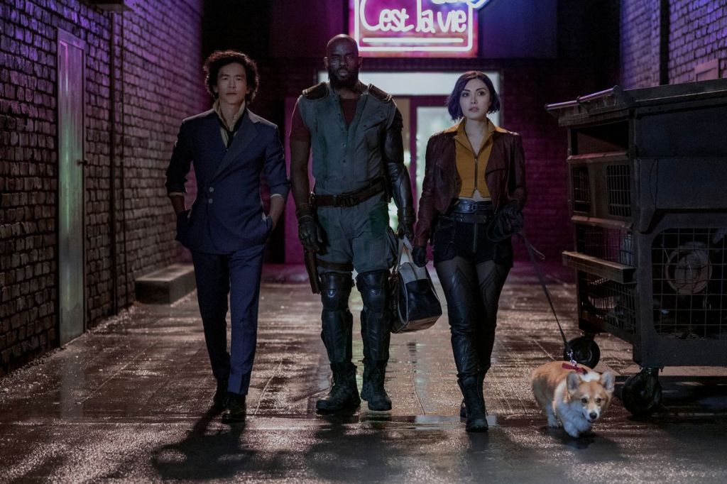
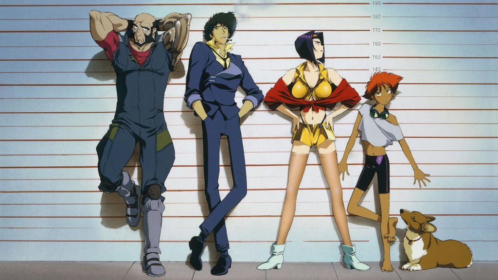
Christopher Yost. Cowboy Bebop, 2021. Television Series, 10 Episodes. Netflix Streaming Services. Hajime Yayate. Cowboy Bebop, 1998. Anime; 26 Episodes. Studio Sunrise, TXN.
Another unfortunate sign of the likely issues of the upcoming Netflix adaption of Avatar: The Last Airbender, is the recent release and cancellation of their adaption of the original anime Cowboy Bebop, created by Hajime Yatate and animated by Studio Sunrise in 1998. While the show, developed by Christopher Yost in 2021 for Netflix attempted to follow the anime, much more closely than many adaptions, the series still failed, and the second season was cancelled less than three weeks after the first season’s release, the general consensus of the show being, “what was the point?” [13] Reviewer Angie Han of The Hollywood Reporter stating that “The series’ biggest sin, however, is that even as it dutifully retraces the steps of its predecessor, it captures none of the magic. The zippy pacing has turned leaden, the sharp visuals reduced to muddy CG, the playful humor translated as phony laughter, the lived-in grittiness replaced with shoddy-looking sets. It’s a Cowboy Bebop too fixated on checking off boxes to consider writing its own list.”
None of this is more obvious than with the intro itself, which while it dutifully tried to use both the same music and the same visuals, what previously came off as cool and visually interesting now looks goofy and fan made. While the intro slowly shifts to the show’s own visuals, the change is nearly jarring, rapidly shifting from monochrome to full color visuals, leaving the intro to look like it was created by two completely different studios. [14] Moments in the show that worked in the anime instead seem extremely gimmicky and strange, the actors often being able to replicate the animated personalities of their characters. Sherin Nicole of Geek Girl Riot stating that “The original Bebop is improvisational and a little bit abstract. It has movement and flow and it feels alive. This Netflix adaptation is like a robot playing jazz. All the notes are there, more or less, but they’re not played with feeling.” [15] There is no real fundamental misunderstanding with this show like the others, the cast was, with one exception, all correctly cast, the visuals and plots were almost beat for beat pulled from the anime. So, if the show was, in all technicalities, correctly adapted, then why did it fail. The real problem is that Cowboy Bebop simply shouldn’t be live action. Even if the previously mentioned movies hadn’t had their slew of other issues, they would have likely sat in the same position as Cowboy Bebop, which is currently sitting with a forty-six percent rating on rotten tomatoes, not laughably bad or drastically unwatchable, just not worth the time or effort. Another mediocre adaption in a sea of watchable content.
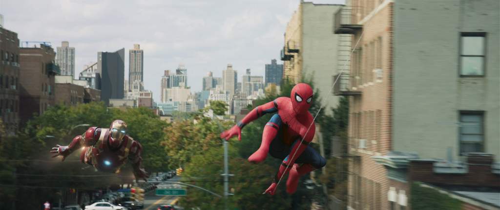
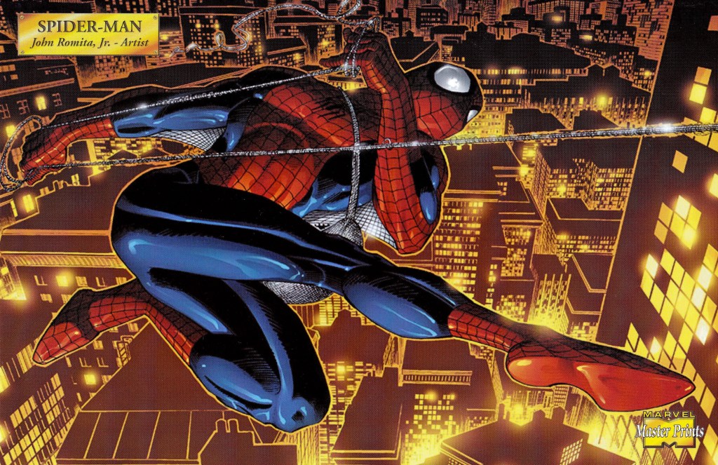
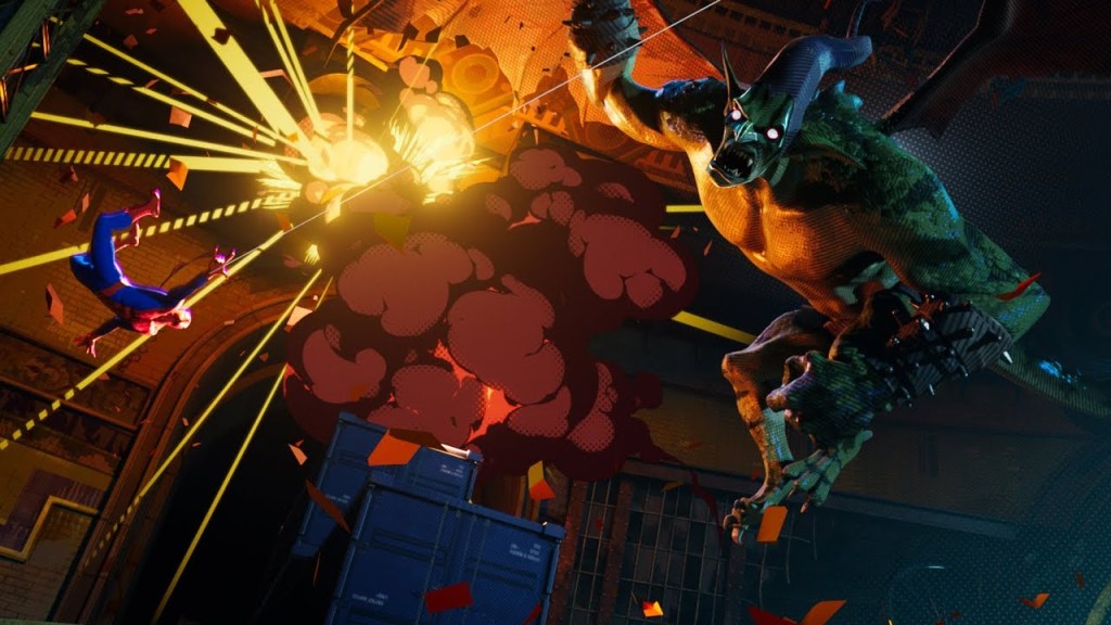
Jon Watts. Spider-Man: Homecoming, 2017. Film; 133 Minutes. Marvel Studios, Sony Pictures Releasing. John Romita Jr. Spider-Man, 2001. Comics. Marvel Comics, Marvel Entertainment.Phil Lord. Spider-Man: Into the Spider-Verse, 2018. Animation, 117 Minutes. Sony Pictures Animation, Sony Pictures Releasing.
It’s hard to call the next set of film and television adaptions a failure, when all things considered, these adaptions have done incredibly well, with critics, audiences, and the box office. Three of the films in this series are in the top ten of top lifetime grosses. Out of the forty-three pieces of media in this series, only three have ‘splatted’ on Rotten Tomatoes, two of which are still rated well enough by audiences to be considered popular by everyday audiences. [16] So, why is the Marvel Cinematic Universe going to be considered a bad adaption for the sake of this collection?
If you haven’t read comic books, your idea of comic books is probably slightly defined, thick black line art, and neon coloring dots. When Marvel Comics was created in the 1930’s, this comparison would be correct. While comic book visuals have greatly improved over the years, one thing is still true, comic books have a gorgeous use of true black to make their pages pop. While using true black is usually frowned upon in art, seeing as true black never really happens in nature, in comic books, with extremely small exceptions, the comics are lined and shaded with black. However, with the exceptions of Iron Man, Iron Man II, and Thor, Marvel movies don’t even contain true black. After the company switched from film to digital cameras, the films have looked, in one word, dull, thanks to the introduction of digital color grading. Scenes that would have popped in the comics look monotonous and grey.[17] While that isn’t to say that the MCU doesn’t have any good visuals, but they are nowhere on the scale of the comics, because the MCU is meant to be grounded in the real world. Not our world necessarily, but the MCU demands looking like The real world, and apparently in the real world it means dull colors and streamlined costumes that seem like more what “real people” would wear rather than a gaudy scaled suit or giant flowing capes and tights. For all that the MCU tries to be otherworldly, magical, and alien, they refuse to be anything other than ordinary in terms of visuals, other than the occasional interesting use of CGI, often used in series for Thor, Doctor Strange, and Guardians of the Galaxy.
The MCU also struggles with adapting the sheer amount of source material it contains, especially as it also tries to implement content from both the main comic universe, and the Ultimate comic universe, which spanned from 2000-2015, providing the much more modern layout that the MCU tends to use, along with several of its characterization changes. However, a big problem with the MCU, is its rush to get from the original characters of the sixties, to characters who were only created in the last decade, when they barely have any of the original characters introduced in the first place, and have them set up in a way that makes it hard to use the characters in their original respects at all. The upcoming Ms. Marvel show has completely changed the main characters origin and powers, due to the fact that the MCU failed in introducing the Inhumans. Rather than not using a character they can’t properly introduce, they changed the character completely. The MCU already did something similar with their interpretation of Spider-Man, although many people don’t realize it.
Spider-Man, in popular culture, is a nerdy teenaged superhero bitten by a radioactive spider, lives with his Aunt May, who dates a girl named MJ and fights villains in silly costumes while cracking bad jokes. It’s approximately the only thing the MCU actually uses from the character Peter Parker, the rest is instead stolen from another character, the Spider-Man known as Miles Morales. Peter Parker spends most of his canonical, public high school career in Queens getting into petty fights with Flash Thompson over Liz Allen, harassing his villains with his snarky attitude, trying desperately to earn money for his now extremely poor household by working for the Daily Bugle newspaper while his Aunt suffers from constant medical issues, spending every other issue having petty fights with the also teenaged Johnny Storm of the Fantastic Four, dating Betty Brant of the Daily Bugle until he graduates high school approximately three years after being introduced in Amazing Spider-Man #28, until Betty is suddenly proposed to by Peter’s coworker Ned Leeds, who later turns out to be a wifebeater, and the supervillain The Hobgoblin. This doesn’t sound much like the plot of MCU Spider-Man does it? Miles Morales however, who goes to a private school in Brooklyn, who is best friends with an overweight Asian kid named Ganke Lee, who has a love for Legos and does his best to assist Miles with Super-heroing, acting like his backup support both in his personal life, and assisting Miles technologically. Miles later joins the ultimate universe version of the Avengers, known as the Ultimates after that universes equivalent of a civil war, and later ends up dating a young girl who’s the granddaughter of the supervillain The Vulture – well you get the point. [18]
There’s the talk about not wanting to kill Uncle Ben again, not wanting to have the same tale of Peter Parker’s origin story over and over again, and that’s fine. But the MCU had well over sixty years of comic book material to use, from multiple universes and dozens of series. Instead, they chose to steal the story of the one black Spider-Man to make their Peter Parker seem more diverse, while changing the name of his love interest because they were too afraid to actually make Mary Jane Watson a woman of color. They even included Miles’s Uncle Aaron in the movie committing crime, but not even a single named mention of his deceased Uncle Ben, who has always been the basis of Peter’s sense of morals and obligation.
Not only does this affect everything about Peter’s journey, leaving his moral figure to instead become Tony Stark, it also influenced Miles’s debut animated movie, Spider-Man: Into the Spider-Verse 2018, according to Director Peter Ramsey, Spider-Man Homecoming directly led to both the change in Ned’s character design, but also his very short appearance in the film, despite being a major part of Miles’s journey in the comics. [19][20] But even while ITSV had to work around the MCU, it still managed to create a story that both utilized the original comic characters, but also changed and added to them to make them even more fully developed characters than they were originally, giving Miles an interest in art, Gwen an interest in dance that became a major part of her fighting style in the movie, and letting Peter Parker develop and grow up in a way that his other adaptions simply never let him do, taking advantage of his comic book stories from Amazing Spider-Man Volume 2 where he served as a, not necessarily professional, but well meaning teacher, who while he didn’t have kids of his own and was struggling with his relationship with his wife Mary Jane, cared deeply about the kids in his care and would do anything to help them. ITSV manages to not only tell a story in a way that is good to the characters, it also stylistically uses elements from the comics such as its infamous Kirby Dots, while also developing its own visual style, not just to better emulate the comics that the stories originated from, but to also push 3-D animation in a direction its never gone before, inventive in both the genre, and the industry itself. [21]
An adaption shouldn’t just be about taking a story and recreating it in another medium, or trying to take a piece of something and gentrify it to create something popular, and that’s where live action adaptions always fail. While live action adaptions always must adapt themselves to fit the everyday audience that the box office is bound to, animated features allow for not only experimentation, but a greater allowance into what is or isn’t possible in a way that live action, even with the assistance of CGI, just can’t help to match.
[17] Patrick (H) Willems, “Why Do Marvel’s Movies Look Kind of Ugly? (video essay), Patrick (H) Willems, Youtube.com, November 16th, 2016, https://youtu.be/hpWYtXtmEFQ
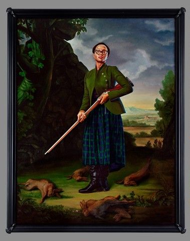
Kehinde Wiley, Portrait of Lynette Yiadom-Boakye, Jacob Morland of Capplethwaite 2017 Oil on canvas 120 5/16 × 93 5/16 in. (305.6 × 237 cm) Yale University Art Gallery and Yale Center for British Art, Purchased with a gift from Mary and Sean Kelly in honor of Courtney J. Martin and with the Janet and Simeon Braguin Fund and Friends of British Art Fund
Britain in the World: A Display of the Collections is an exhibition featured at the Yale Center for British art in New Haven, Connecticut. “This installation reveals how frequently the story of art in Britain focuses on a narrative of international exchange. This arrangement addresses the impact of immigration and travel on British art and culture across the centuries, and the role that the arts have played in propagating Britain’s imperial vision—exploring the ways in which the perception of the British Empire influenced how Britain’s saw themselves and others.” The overall them is very well reflected among each piece of art displayed in this collection. We see many different depictions as well as many different time periods displayed throughout this exhibition giving us a wider look into the theme of British culture and the travels they faced. When walking into the museum, this is the first exhibition you walk through, as you walk in you see billboard size artwork displayed up the wall with a larger than life feeling. It is a truly beautiful first sight and really a stupendous way to start an exhibit. However, the exhibition is split between two floors, and we have the large circular shaped grand room, but the rest of the floor is of a completely different exhibition giving a very unsettling and disconnected feeling. The rest of the Britain in the World Exhibition is up two floors higher, leaving us very disconnected overall. The fourth floor is very well lit with white walls the really contrast the artwork well; most of them have gold frames which helps the balance. One eye-catching feature is noticeable while on the top floor, you have an opening where you can look out to the center of the building and if you look down you see the rest of the exhibition two floors down. It is a very interesting lookout point that the viewer can use, but even with the two-floor layout I still find the space that is set in chronological order, to be arranged in very pleasing way. A few pieces of art that stuck out to me and made an impression on the overall theme of British culture included, a portrait of the artist Lynette Yiadom-Boakye by Kehinde Wiley and Theodor von Holst’s The Wish, 1840. These two painting are a part of the British in the World Exhibition and are both feature portraits of women but in a very different way. I think these two represent strong women, one dated back to the mid-nineteenth century and one in today’s time of the twenty-first century. Wiley’s painting is bold and vibrant, representing another artist in a strong way as a Scottish bunny hunter. However, Holst paints a darker vibe portrait of a women that appears to be a psychic, hence the title the wish. I found myself drawn to both pieces, overall, there is many unique and different styled pieces in the exhibition that might speak to you. In conclusion, I would have to rate British in the World Exhibition a four out of five. While the artwork was incredible filling with many different forms and style that touch on all art created by the British and their culture throughout their journeys The setup of the exhibition really leaves the chronological set up disjointed and confusing. It seems like two different exhibitions because of the layout instead of one big cohesive exhibition. I feel as if it would’ve been better to keep the exhibition on just one floor so we could fully divulge in the art instead of starting the exhibition, going into another that is completely different and then going back.
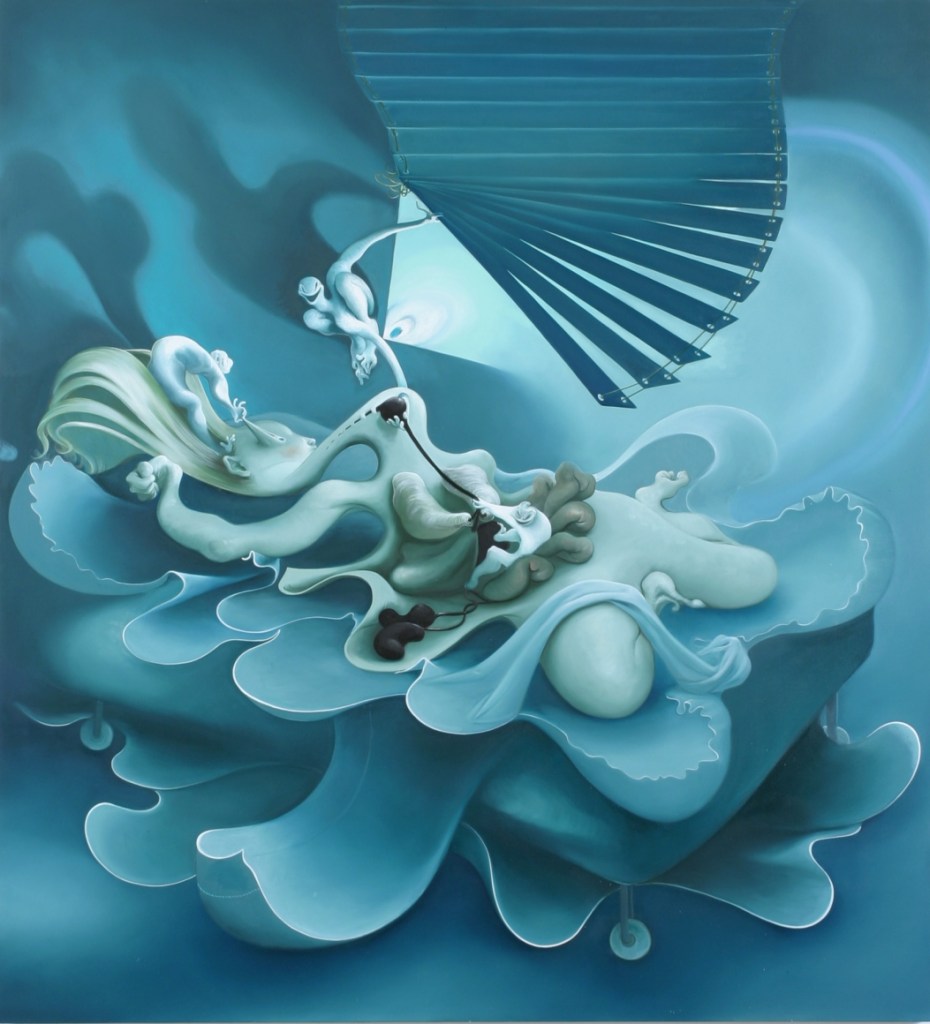
Inka Essenhigh, In Bed. 2005. Oil on Canvas; 68 X 62 inches. 303 Gallery, New York
In the beginning of the twentieth century art was moving more towards mind tantalizing ways then we had previously seen before. Surrealism is the art movement that started in the 1920s and the main concept is for you to look beyond what your eyes are seeing and use your subconscious mind to understand what you’re looking at. Expressionism dates to 1910 with the idea of the artists understanding and not necessarily reality itself but more so the meaning, the expression behind the object or experience. Both requiring the viewer to look further then what meets the eye, surrealism and expressionism are two very different art movements allow us to explore our subconscious mind to reveal deeper meanings.
These two art movements came about in very different ways. But I feel as though they have such a strong connection in the art world as final pieces. “Although both Surrealism and Expressionism are troubled with the perception of the unconscious behavior, surrealism is conventional in introduction while the later one is over-romantic.”[1] Robert Hobbs was known for exploring the idea of expressionism and surrealism in the hope to understand their methods and help us become aware of their different techniques. But just because two things are done in different ways doesn’t mean they cannot be similar. I think it in fact makes them have even more in common as a complete art piece.
For example, I took a further look at Inka Essenhigh, In Bed. This piece depicted the Surrealism art style, we see a blue tinted representation of a women lying in bed. The woman appears to be stretched out in a way of resembling an octopus with extremities extended out cascading through the canvas. This woman lays over a large bed with the sheets draping alongside her tentacles creates a sea-like feeling. As we begin to look even further, we notice what appears to be window with blinds, that lurk down over the women creating a lurking demon like effect. This depiction instantly reminds the onlooker of a nightmare scene, from the muted blue tones to the unrealistic and eerie aspects to the whole. The entire image requires us to look closely and really use our minds to feel and see everything the artist is trying to tell us in the canvas. This instantly compares to Käthe Kollwitz Death Grabbing at a Group of Children (Tod greift in eine Kinderschar) from the series Death (Tod). In a completely different medium and style, we see here a child in pain; he looks to be screaming and a dark figure coming above that is taking him. From the title we can infer that this figure is death, here to take the child. This again, is a dark piece that with a little subconscious thought we can understand the entire meaning of the piece. The lithograph medium helps us understand the depth and darkness surrounding the underlying meaning of this piece.
When comparing these two styles we can see a line connecting the subconscious mind among surrealism and expressionism to one another. While they have their differences, the overall depicted art from these movements both display a deeper psychological response that the viewer uncovers.
Inka Essenhigh. In Bed, 2005. Oil on canvas. (A&T 29)
Käthe Kollwitz. Death Grabbing at a Group of Children (Tod greift in eine Kinderschar) from the series Death (Tod), 1934. Lithograph. Museum of Modern Art Collection.
[1] Hobbs, Robert C. “Early Abstract Expressionism and Surrealism.” Art Journal 45, no. 4 (1985): 299–302.
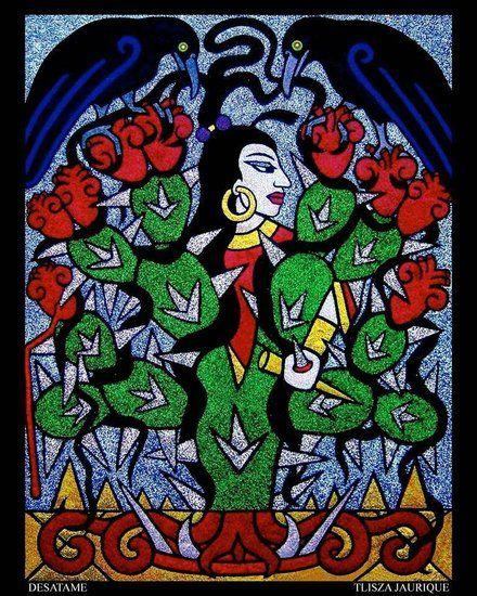
Over the time we have spent looking at art and artists in the course I have found myself drawn to artists I find connections with. While researching, I came across Tlisza Jaurique, her work is mesmerizing, while combining traditional Latin culture with new media. Jaurique pulls from her Mexican roots to show her cultural identity throughout all her work. She tends to prominently create her work inspired by traditional Mexican celebrations such as day of the dead and the feast day of the Virgin of Guadalupe. Jaurique work incorporates a mix of topography, painting and sculpture while showing clearing iconography with a pinch of glitter. The expression behind her work is to give us insight on the meaning of Mexican traditions using symbolism and beauty.[1]
Tlisza Jaurique brings a whole new light to Western art through all of her work with the use of her main ingredient, glitter. When we think of glitter we tend to think of something involving a child’s arts and crafts project. But Jaurique uses glitter in a way that enhances the strong figures and symbols her art is centered around in a way that accentuates her art and does not diminish it. The glitter is along the circular mirrors in her pieces to show emphasize the idea of reflection.[2] Using this technique makes us the viewer feel directly involved into the work, whether we can fully understand what is being portrayed. Taqueria makes us challenge our first thoughts and dig deeper to understand of the Mexican traditions and history she is so proud of. By using glitter in the empowering yet contemporary way, the layering of materials and cultural symbolism create a unique and honorary body of work.
Chicana art is about expressing the cultural ideas of Mexican culture. Tlisza clearly embodies this and using her cultures to shock meaning into all her work. Her art is all about the spirit of Mexican traditions while pushing the politics she places among her art which are often very subtle. These ideas can often be overlooked by the pure beauty of her art, however once we as the viewers recognize these things, we cannot unsee the importance of them. She connects her work to issues like many other Chicana artists.[3] Specifically, she uses the issues around the border through an activist approach to create meaning in all her art she communicates these issues through tiny details throughout her pieces. Tiny details that include things like the Virgin, sacred hearts, cacti, and even speech scrolls all have important meaning in her Mexican heritage.
One of her most striking and intellectually challenging pieces is her 2005-piece Desatame, (unravel me). This piece hangs on the wall and immediately we were drawn in by the bright colors portrayed throughout around the piece. The entire piece is glitter, besides the black border, but in every component and layer we see symbolism speaking to the issues that Latin American artist face. We also see the same features and center focal point of a strong women featured in her 2000’s piece Mayahuel.[4]Both works by Jaurique clearly intertwine the Chicana culture with the underlying meaning of women empowerment and cultural appreciation flowing through the entire body of art.
Jauquire does such an astounding job tying in her cultural traditions in a new contemporary fashion. Her art is so bright and fun, but by using a limited palate the glitter does not become overwhelming, instead it adds another layer for us to digest. Tlisza Jauquire is a great representation of a Chicana artist trying to help others fully understand the culture of Latin American artists, and how express issues they face in their culture in their work using symbolism while keeping the art intriguing. The way she can use so much traditional heritage and turn it into a contemporary piece, while using a material many never thought of as inspiring.
Neeta Madahar was born in 1966 in England, she went through many years of schooling originally getting a degree in mathematics. She chooses to follow her own path rather than her families and furthered her education with a degree from the Winchester School of Art in 1999 where she focused on videography. She then went on to the University of Southampton in England and received a BA Honors degree in Fine Art. In 2003, she graduated from the School of the Museum of Fine Arts, Boston and Tufts University, Boston with a Master of Fine Art degree in Studio Art. During the end of her studies, she completed her thesis work called Sustenance, this was her first work that got the attention and recognition her work deserved. Madahar is a British citizen with her cultural upbringing coming from her Indian roots, who lived and worked in the United States. This unique upbringing helped her find ways to references themes of transition and migration in her work. She is most known in the art world for her interesting photography in which she explores natural aspects in different perspectives about what is real versus perception and the power of observation. Her first major show was in 2004, creating a new look in the world of photography. Neeta Madahar has exhibited her work both in the United States and Europe. She has even had a solo show in Oakville Galleries, in Ontario Canada back in 2007. Other than the many shows she has been apart off Madahar has been rewarded several prestigious commissions from places like Hardwood House, Film and Video Umbrella, and Photoworks. These are companies that work to serve the general public in easily accessible ways. On top of that, her work is kept in many public collections including the Victoria and Albert Museum in London and Harvard University’s Fogg Art Museum in Massachusetts. Madahar has been featured in well-known publications like The New York Times, The Boston Globe and even Aesthetic Magazine. She was even a top feature in Portfolio magazine’s special issue about the UK’s fifty most significant contemporary photographers. Since then, was awarded by the National Media Museum in the UK a very prestigious award of the Bradford Fellowship in Photography. The museum even decided to culminate her major solo exhibition from October 2009 to February 2010.