The Fine Art of Illustrating for Children 

What is the first piece of art you can remember seeing? As children, we aren’t expected to appreciate “high art”, but rather simple appeals to what are considered childish delights: flashy colors, simplified forms, and characters with big, sickeningly-cute eyes. Children’s book illustrations are a form of imagery we so often find ourselves consuming during the most impressionable stages of our lives, yet illustration is altogether viewed as unworthy and largely excluded from the “gallery art” world. Despite their apparent inferiority, few pieces of art resonate so strongly or remain in our memories so long as the images of our childhood. Art with the potential to have such long-term influence should at least be afforded our consideration and respect. Although children’s book illustrations serve a different audience and set of preferences, they are no less valuable as a genre of art history. Additionally, children’s book illustrators have demonstrated a wider range of technique and style than many would give them credit for. Art created for children can be just as if not more influential than the “fine art” deemed by the mainstream art establishment to be approved for adult consumption.

Sir John Tenniel, born February 28, 1820 in England, was an illustrator and satirical artist (political cartoonist). His early style was associated with the German Nazarene movement of the 19th century. This movement was characterized by “shaded outlines” on the sides of figures or objects which were drawn twice as thick to suggest shading or volume[1]With this style as the foundation for his style, it soon evolved and modernized to incorporate more detail into backgrounds and figures. Tenniel was also known to draw from life rather than from nature, a divergence from the pre-Raphaelite theory which had dominated art for decades and dictated that “drawing from nature was the only way to produce truthful art[2].” Tenniel felt that he worked best when referring to his own visual memory rather than observation. He was the principle cartoonist at Punch magazine , contributing around 2300 cartoons over his tenure there[3]. The politically charged illustrations were known for expressing the viewpoints of the British public, sometimes including offensive Anti-Irish sentiment. Irishmen were depicted as grotesque monsters while Ireland itself was personified through the character of a helpless young girl. It is perhaps this series of images which inspired author Lewis Carroll, who was drawn to Tenniel’s “grotesqueness”, to take an interest in his illustrations.  

Carroll, a regular reader of Punch, had written Alice’s Adventures in Wonderland and was seeking a professional illustrator. Tenniel agreed but was resolute when it came to his artistic vision, attempting to steer Carroll in a different direction at every turn. It was Tenniel who insisted that the creatures in Alice should not look like real animals, but rather fanciful creations. Carrol would go on to state that, “Mr. Tenniel is the only artist who has drawn for me who resolutely refused to use a model and declared he no more needed one than I should need a multiplication table to work a mathematical problem.[4]” Despite this, Tenniel’s risk would pay off through the now iconic imagery of the Alice’s first edition illustrations. The engraved wood-block prints were a bit grotesque, a bit comical, and would represent the dark and somewhat disorienting nature of Alice’s adventures well. The odd character designs of his illustrations would spurn innumerous adaptations over the years, including the famed Walt Disney animated film adaptation, Alice in Wonderland. It didn’t stop there, further inspiring the surrealist works of artist Salvador Dali and being adapted into a live-action Disney movie directed by Tim Burton. Tenniel’s illustration of Alice meeting the bizarrely proportioned Red Queen and her court represents the cornerstones of Tenniel’s work. His line work, grotesquely rendered character designs, and highly detailed shading style have solidified this and his other works for Alice in the minds of millions. 

EH Shepard’s work for 1926’s Winnie-the-Pooh is a harsh diversion from the works of Tenniel for a number of reasons. His subject matter is quite a bit more innocent, less surreal and disconcerting. However, the two artists bear more similarities than one might think. EH Shepard started as a painter, the way many artists do, but eventually began submitting illustrations to Punch magazine. Once accepted, his professional career as an illustrator took off. After being drafted into the Royal Artillery during World War 1 he continued to submit ideas tirelessly, and was offered a full time position at Punch when he returned[5]Shepard was ecstatic for the very reason that he would get to sit where his idol Sir John Tenniel once had[6]. The work that would popularize Shepard’s name was a story about a little boy and his stuffed bear come to life, Winnie-the-Pooh. It’s author, A. A. Milne was recommended to Shepard through one of his colleagues at Punch, and the rest was history. The two would form a mutually beneficial and tender working relationship, quite unlike Tenniel and Carroll’s. Shepard’s style, though influenced by his background as a political cartoonist to consist of un-colored ink drawings, was delicate. He utilized a great deal of white space to draw the viewer’s attention to certain aspects of his illustrations and create an almost snapshot-like composition.  

His character design for Pooh would play a vital role in the book’s success, and he worked closely with Milne to ensure this. Milne’s story was inspired by his own son’s love for his nursery toys, and Shepard would reference his own childhood attachment to a wooden horse in creating a character that conveyed this feeling[7]. Shepard’s illustration of the One Hundred Acre Wood, the familiar setting for Pooh’s story, was an impressive exercise in world-building. Shepard actually opted to visited Milne’s country home in Essex to observe the area that inspired the setting[8]. On top of his iconic depiction of Pooh bear, it would cement the tale and its imagery in the hearts and minds of children for years to come. It would inspire Disney’s animated TV series and movies, and even a Disney live-action remake. 

In 1939, author and illustrator Ludwig Bemelmans released his most beloved children’s book, Madeline. Featuring a plucky young girl with red hair and a knack for getting into trouble, Madeline was based upon the women in his life along with himself. Growing up in France, his mother had told him stories of her own childhood in a convent school, which he reimagined as the “old house in Paris that was covered in vines.[9]” As for Madeline’s aptitude for getting into trouble, that was self-referential. When he reached adolescence, he was sent to work for his uncle in a series of hotels, forcing him to deal with a colorful cast of hotel patrons and workers. In 1941, Bemelmans told the New York Times about the time a headwaiter at one hotel pushed him too far. “He wanted to beat me with a heavy leather whip, and I told him that if he hit me I would shoot him. He hit me, and I shot him in the abdomen. For some time it seemed he would die. He didn’t. But the police advised my family that I must be sent either to a reform school or America.[10]” After moving to America, he eventually found Illustration work in the Saturday Evening Post, The New Yorker, and Vogue. Many years later, a family trip to France would push him to write his own story, 1939’s Madeline 

The illustrations he created to accompany the work were memorable primarily for Bemelmans’ unique style. It featured vibrant, impressionistic paintings with slightly abstracted figures and objects mostly outlined in black ink to make them stand out from the background. The overall mood of the illustrations is playful yet sensitive, both fabulous qualities to intrigue children and keep them reading. This illustration, from Bemelmans second book in the series, Madeline’s Rescue, features Madeline looking out her window at the stunningly depicted town below. She stands out against the black background of the room she is standing in, but it is evident in the scene’s composition that the background is the focus in this particular illustration. Bits of the buildings, street, and window around her are accented by black ink. It captures the emotion of being stuck inside rather than being allowed to explore the lush landscape of one’s surroundings. This piece, a much more abstracted and perhaps fine-art resembling example of children’s book illustration, highlights all the cornerstones of Bemelmans’ work. Madeline has gone on to inspire an animated tv series and live-action movie. 

Eric Carle is an illustrator whose name resonates with a good many. Even still, those whose memories his name escapes would most likely know him by his illustrations for Brown Bear, Brown Bear, What Do You See? along with The Very Hungry Caterpillar. Carle grew up in New York, but moved to Germany when he was just 6 year old. There he studied and graduated from art school before moving back to America to pursue a career in graphic design. He was still known primarily for his work in advertising and graphic design when he was contacted by author Bill Martin Jr. about illustrating his children’s book Brown Bear. It is this collaboration which cemented both Martin Jr.’s stories and Carle’s illustration style in the minds of those who were read it growing up.  

He creates his illustrations using a collage technique, wherein hand-painted papers are cut and layered to form bright and textural images[11]. This added element to what would otherwise be flat illustrations makes the book more fun and engaging for young children. As Brown Bear and Caterpillar heavily feature animals and nature, they resonate well with small children who are beginning to discover the natural beauty and unfamiliarity of the world around them. Carl has said, “With many of my books I attempt to bridge the gap between the home and school. To me home represents, or should represent, warmth, security, toys, holding hands, being held.  School is a strange and new place for a child.  Will it be a happy place? There are new people, a teacher, classmates – will they be friendly?  I believe the passage from home to school is the second biggest trauma of childhood; the first is, of course, being born.  Indeed, in both cases we leave a place of warmth and protection for one that is unknown.  The unknown often brings fear with it.  In my books I try to counteract this fear, to replace it with a positive message.  I believe that children are naturally creative and eager to learn.  I want to show them that learning is really both fascinating and fun.[12]” Both this sentiment and his style are echoed in this iconic image from Brown Bear, Brown Bear, What Do You See. The brown bear is represented as colorful and smiling to draw children in rather than steer them away from a large animal with claws. The textures in the layered paper resemble the bark on a tree, another brown object that they may already be familiar with and that can help teach them their colors. Carle’s work shows a keen understanding of early child psychology and the elements that he can employ to provide lasting learning connections. 

The iSpy books are a bit of an anomaly in the children’s book universe. Written by Jean Marzollo and first released by Scholastic in 1992, the books prompt the reader to search within a large and convoluted image to find visual representations of the words in a word bank. While they undeniably feature photographs rather than traditional illustrations, Connecticut-born artist Walter Wick considers himself a “photographic illustrator”[13]. He got his start as a commercial photographer before he started his own studio in New York City and served clients such as Psychology Today, Discover, and Newsweek[14]. It was his series of search-and-find picture books, iSpy, that garnered him massive success as a photographer.  

To create his images, Wick must first construct complex dioramas that are often quite large in scale. As a young boy he had loved to “tinker” and eventually started attempting to make his drawings pop out in 3D. This primed him well for the sets he would eventually create for his iSpy illustrations, which involve collecting and making props, arranging objects, and adjusting lights. This piece, from the iSpy Fantasy book entitled City Blocks is a good example of the elaborate set design involved in Wick’s craft. He has assembled many objects that young children will be familiar with: wooden blocks, toy cars, and other beloved children’s toys. However, they are arranged so extravagantly as to depict a very elaborate scene more reminiscent of an actual big city highway than a children’s creation. His attention to backdrop and lighting, where a realistic sky at twilight contrasts against the city diorama, further demonstrate this marriage of real-life and fantasy. Wick has stated that, “When I do talks in schools I challenge students to solve puzzles. The teacher is often surprised to see how certain kids whiz through the puzzle in front of the whole assembly. When that kid swaggers back to his or her seat with high fives all the way, I think of the recognition I got for my talent when I was young. Not for high marks on a report card, but for learning how to solve problems and think creatively on my own. It’s my mission to stimulate that kind of learning with my books.[15]” His photographic illustrations both inspire creativity and learning in children of all ages, and the iSpy series has even been adapted into a series of computer video games. On top of education, his work shows a key capability of children’s book illustration: entertainment.  

Anoosha Syed is a freelance illustrator and character designer for animation who represents a more current and culturally relevant perspective on children’s book illustration. The Pakistani-Canadian artist got her BFA at CeruleumEcole d’arts Visuels in Switzerland. She has since been asked to illustrate a number of popular children’s books, including Daring Dreamers ClubKid Scientists, and Bilal Cooks DaalHer latest book is in collaboration with Karamo Brown, the Culture Expert from the popular Netflix series Queer Eye. I Am Perfectly Designed features a young African-American boy and his father enjoying a walk through the city. On her website, Anoosha describes the book as “an exuberant celebration of loving who you are, exactly as you are.[16]” On their walk, they observe the many different shapes that modern families take on. This and much of Anoosha’s work represent modern day society and the somewhat recent move toward inclusive children’s content, celebrating all different races, gender identities, sexual orientations, cultural backgrounds, and disabilities. Anoosha illustrates her work digitally, a practice which has come to dominate the current children’s book market. Her style features bright, playful colors that highlight important characters and objects. In this illustration, characters in the background have a more limited color palette so that they don’t draw attention away from the foreground. It is sweet and playful yet detailed enough to keep young readers turning pages to see what’s next 

Art forms stuck with the “commercial” label have long been seen as lesser by fine artists, their consumers, and critics. “Fine art” is validated for its often somewhat elusive meaning, context, and role as a reflection of the artist’s unique point of view. In contrast, illustrators are often paid up-front to convey a client’s ideas. Are illustrators, then, lesser artists as a direct effect of choosing to convey the message and perspective of another?  I argue that illustrators work, especially children’s book illustrators, must adhere to an even wider set of requirements that make them worthy of recognition from the fine art world. Their work can have a long-lasting impact on the developing brains of children, including through learning, memory, and cultivating a lifelong interest in art. Their bodies of work are versatile in medium, purpose, and style. They also possess a unique skillset that is less common with fine artists. They must always meet strict deadlines, have to collaborate with clients throughout development on top of satisfying their prompt, and can even be asked to modify their personal style whereas most fine artists are hired specifically to demonstrate it.  Unlike the vast majority of fine art, the imagery within children’s book and the stories they accompany are often adapted into massively popular and successful animated and live-action movies and tv series, and even video games. For this I believe illustrations, even children’s illustrations, deserve a place at the fine art table and a larger platform within galleries and museums. 


Proposed Exhibition Image List

John Tenniel – Alice’s Adventures in Wonderland (1865)

E.H. Shepard – Winnie-the-Pooh (1926)

Ludwig Bemelmans – Madeline’s Rescue (1953)

Eric Carle – Brown Bear, Brown Bear, What Do You See? (1967)

Walter Wick – “City Blocks” (1994)

Anoosha Syed – I Am Perfectly Designed (2019)


Bibliography

“About.” Walter Wick Studio. Accessed May 14, 2019. http://www.walterwick.com/about.

Bland, David. A History of Book Illustration. Cleveland: The World Publishing Company, 1958. 

Bromwich, Jonah Engel. “How the Author of ‘Madeline’ Created His Most Famous Character.” The New York Times. April 27, 2018. Accessed May 14, 2019. https://www.nytimes.com/2018/04/27/style/madeleine-author-illustrator.html.

“E.H. Shepard.” Illustration History. Accessed May 14, 2019. https://www.illustrationhistory.org/artists/ernest-howard-shepard.

“Eric Carle.” The NCCIL. Accessed May 14, 2019. https://www.nccil.org/artists/eric-carle.

Morris, Frankie (2005). Artist of Wonderland: The Life, Political Cartoons, and Illustrations of Tenniel. Charlottesville: University of Virginia Press. p. 37.

“Sir John Tenniel.” Illustration History. March 2018. Accessed May 14, 2019. https://www.illustrationhistory.org/artists/sir-john-tenniel.

Syed, Anoosha. “Published Works.” Anoosha Syed. Accessed May 14, 2019. http://www.anooshasyed.com/books-1#/i-am-perfectly-designed/.

“Walter Wick.” The NCCIL. January 19, 2017. Accessed May 14, 2019. https://www.nccil.org/artists/walter-wick. 

Wendy Red Star – “Red Star’s Resistance”

Wendy Red Star is part of an emerging network of contemporary artists who seek to push back against stereotypical depictions of Native Americans in both art and society. Growing up as a part of the Crow Nation, Red Star remembered seeing Native Americans, especially Native women, showcased in a variety of degrading roles by white Westerners[1]. The motivation for much of her work comes from her desire to satirize this flawed perception. Known best for her self-referential photographs, she’s able to decontextualize Western misconceptions of Native life through her work.

The first piece, entitled Twin Peaks or Bust #9 from the series White Squaw is one of her most outrageous. It references a series of adult Western romance novels she’d seen and immediately knew she wanted to parody[2]. She casts herself as its brash, over-sexualized heroine, suggestively licking the crude reproduction of a tomahawk. Tomahawks are often coded as a symbol of Native American warfare and resistance to colonization[3]. The catchphrase “hard pressed for revenge, she knows all the right moves!” sits alongside the image, a further trivialization of Native stereotypes. It seems to comment upon the “savage” label imposed upon them by early colonizers. Even in the 80’s and 90’s, when cheesy romance novels such as this abounded, that label of “savage” persisted and was even capitalized upon to create a sense of sexual danger. A clearance sticker marks the book down to only $1.00, perhaps to comment on how cheapened Native culture has become through the white Western gaze.

The piece is undeniably over the top as if to double down on the absurdity of Western fetishization of Native women. Its composition harkens back to the cringe-worthy covers of 80’s & 90’s-era romance novel covers, and is in effect quite unappealing as an image. The foreground of the image is an illustration of several unrelated scenes involving early Native Americans. These scenes include a Native American couple in the throes of passion, a screaming, gun-toting Native man, white soldiers on horseback, and what appears to be a white saloon girl hiking up her dress. It’s clearly hand-drawn, evident of a time before digital cover art. In contrast, Red Star’s Native woman is a sloppily cut silhouette from a photograph. She wears bright red lipstick, with heavy, modern eye makeup. The fake yellow feather poking straight out of her headband alludes to the inauthenticity of her Native-inspired clothing, causing her to appear more like an offensive Halloween costume or adult film star than an actual Native American woman. I find that in her efforts to create this intentionally disconcerting image, she takes a more clear stand against the stereotypes she’s embellishing. Its unpleasantness almost holds a mirror up to non-Native viewers, as this must be how appalled actual Native Americans feel when viewing images of their own culture from the un-educated Western perspective.

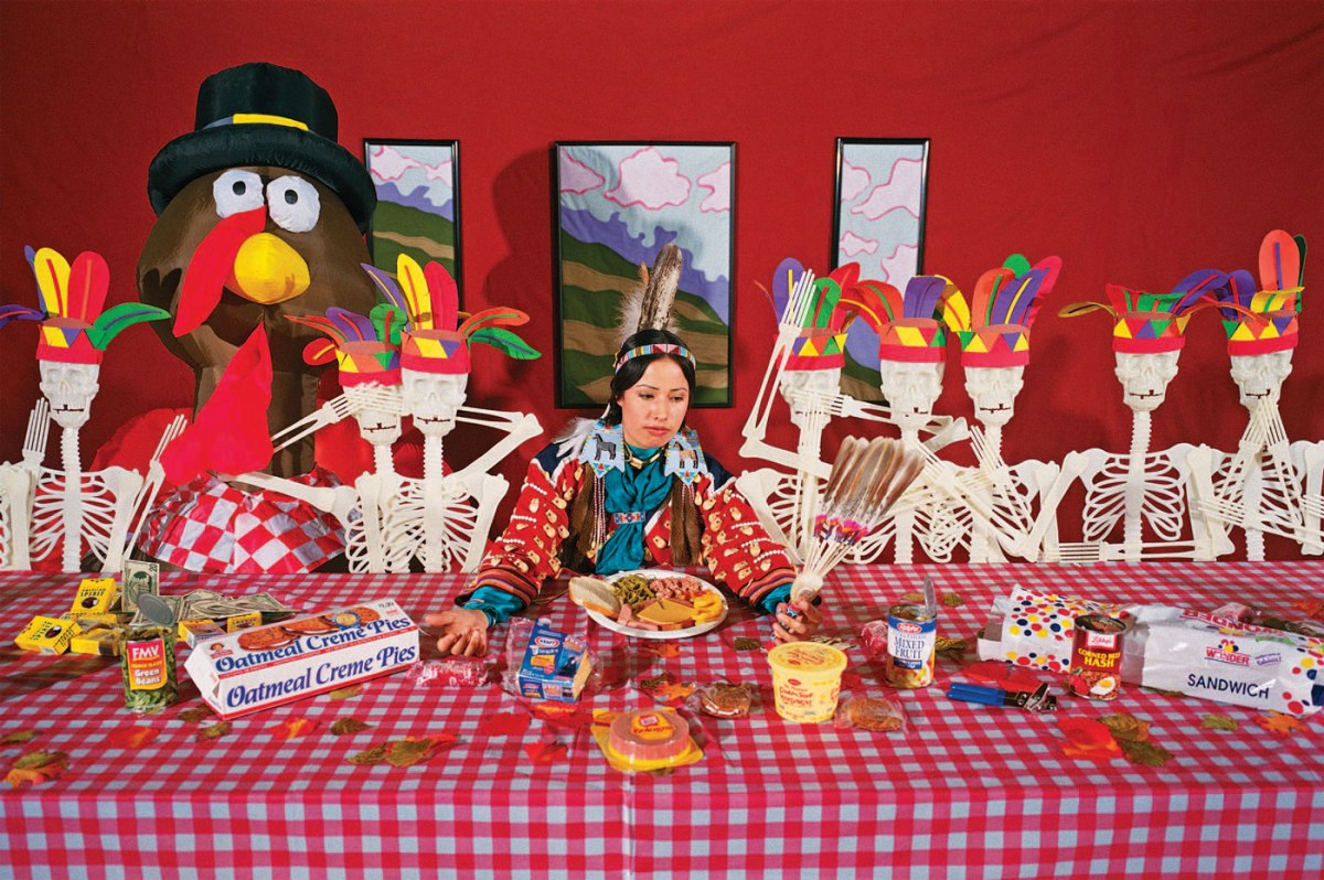
The next image, The Last Thanks, offers a more traditionally acceptable style of photography, while staying unflinchingly true to Red Star’s message. It confronts Western presumptions of the first Thanksgiving dinner. Red Star sits dead-center at a picnic table, wearing what appears to be authentic Native-American dress and staring questioningly at the feathered fan in her hand. She is surrounded by objects which commodify Native American culture as related to the concept of Thanksgiving. On either side of her is a line of anatomical skeleton models adorned with fake feathered headdresses, the sort of construction paper DIY almost every child in the United States has been made to craft at some point in their early education. One seat at the table is reserved for a giant inflatable turkey wearing a novelty pilgrim hat. The table itself is adorned with the plastic, red-checkered cloth which is cheapest and most widely accessible to Americans.

The table is littered with highly processed food such as pre-packaged Oscar Meyer bologna, Little Debbie Oatmeal Cream Pies, canned green beans, Wonder Bread, and Kraft singles. Like dumbed-down stereotyping of Native American culture, we have commodified our food to make it cheaper, more convenient, and easier to swallow. This may also allude to early indigenous hunting practices, where hunting was a way of live and a means of survival that necessitated using all parts of the animal. This mentality promoted respect of the animal which had died to provide them sustenance. In contrast, much of the meat we eat today hardly seems to have come from an animal at all.

Another very intentional pile of items sits at one corner of the table. Several cigarette boxes are strewn about. They are American Spirits, a brand whose logo helped to popularize the image of a tobacco-smoking Native American man. This brand is known for utilizing the stereotypes and iconography of Native Americans to promote the perception that their cigarettes are more ethically-sourced and natural. In reality, the brand is still peddling a carcinogenic product with zero affiliation to any American Indian groups[4]. Beside the cigarette boxes is a pile of paper money, perhaps a reference to Native Americans as gamblers and their culture as an avenue of gambling for Westerners. The prominence of casinos was made possible through Indian reservation laws which existed independently of state laws[5]. As a result, many Native Americans are perceived as greedy facilitators of gambling, an undeniably dangerous habit. However, this practice is no more dangerous nor complicit than the culture surrounding alcohol consumption across the United States. It is one of the few ways Native Americans were able to gain a leg up in the wake of colonization and the resulting loss of their land and people.

To non-Native Americans across the United States, Thanksgiving is just an excuse to eat turkey and visit extended family. The concept of the First Thanksgiving, where Natives and colonists supposedly shared a pleasant meal together to celebrate their budding relationship, is just watered down history for the sake of easier consumption by children and non-Natives. In truth, there was no such event. The First Thanksgiving was no more than a story told by President Lincoln to ease the minds of Americans during the time of political unrest which surrounded the Civil War[6]. The title of this piece, The Last Thanks, applies a darker implication to our celebration of the holiday, implicating it as a tool for the erasure of American history as it relates to the Native American experience.

The Last Thanks is a more fully realized product of Wendy Red Star’s artistic vision. It pokes fun at numerous aspects of white Americans’ misrepresentation of Native American culture, tying it all together with a strong cultural reference (the First Thanksgiving) which is recognizable to Natives and Westerners alike. It also provides a more comprehensive deconstruction of Native American stereotypes, including use of the Native American image to promote sales for non-Native businesses. WhileTwin Peaks or Bust #9 offers a comical yet scathing critique on the over-sexualization of Native Americans, it is less hard-hitting as a result. It’s also less visually appealing as a result of its subject matter. Red Star creates her strongest work when she employs her signature satire while still creating highly-referential and visually coherent art.


Images Referenced

Twin Peaks or Bust #9
The Last Thanks


Sources

  1. Thompson, Chuck. “Wendy Red Star and the Indigenous Voice – C&I Magazine.” Cowboys and Indians Magazine. January 30, 2018. Accessed March 26, 2019. https://www.cowboysindians.com/2018/01/wendy-red-star-and-the-indigenous-voice/.
  2. Beck, Abaki. “Decolonizing Photography: A Conversation With Wendy Red Star.” Aperture Foundation NY. December 14, 2016. Accessed March 26, 2019. https://aperture.org/blog/wendy-red-star/.
  3. Alchin, Linda. “The Tomahawk.” Native Indian Tribes. January 16, 2018. Accessed March 26, 2019. https://www.warpaths2peacepipes.com/native-indian-weapons-tools/tomahawk.htm.
  4. “American Spirit Cigarettes: Not Healthy and Not Native.” Ethical Shopping. Accessed March 26, 2019. http://www.ethicalshopping.com/food/packaged-products/american-spirit-cigarettes.html.
  5. Israel, David K. “10 Things You Need to Know about Indian Reservation Gambling.” Mental Floss. July 08, 2010. Accessed March 26, 2019. http://mentalfloss.com/article/25137/10-things-you-need-know-about-indian-reservation-gambling.
  6. Toensing, Gale Courey. “What Really Happened at the First Thanksgiving? The Wampanoag Side of the Tale.” Indian Country Today. November 24, 2017. Accessed March 26, 2019. https://newsmaven.io/indiancountrytoday/archive/what-really-happened-at-the-first-thanksgiving-the-wampanoag-side-of-the-tale-iTFzfinx_Eiclx573os-yg/.


Chiho Aoshima – “Chiho in the City Glow”

Debates centering around the necessity of attending art school in the digital age have recently surged across all online spheres, but art school purists may’ve met their match in the provocative and inspired works of Economics major turned pop artist Chiho Aoshima. Aoshima taught herself how to illustrate digitally, and after having work featured in Takashi Murakami’s Tokyo Girls Bravo,was invited to work in his factory as part of the Kaikai Kiki Collective. Murakami, founder of the Japanese post-modern Superflat art movement, would act as a surrogate professor in her artistic endeavors.[1] Aoshima’s career is proof that ambition and a compelling artistic vision are all one needs to achieve success in the arts.

After finding her place among the well-known KaiKai Kiki Collective, Aoshima would go on to have works included in the Ackland Art Museum in Chapel Hill, the Museum of Contemporary Art in Chicago, the Carnegie Museum of Art in Pittsburgh, and the Seattle Art Museum.[2] This acclaimed work would inspire a collaboration with famed Japanese designer Issey Miyake on his 2003 Spring/Summer collection.[3] Other high-profile projects include a series of works which was featured in numerous ad-spaces throughout the Union Square subway station in New York, and a 2005 solo show in which she presented a 5-screen 7-minute animation piece along with her first sculptural piece.[4] While the transition from confused university student to successful artist may appear seamless on Aoshima’s resume, her unconventional path was, in reality, difficult to navigate.

Aoshima struggled considerably in her time as an Economics student, having been quoted as saying “When I was going to university, (Department of Economics) I was bored to death, even when I was hanging out with my friends. I was eager to create something but didn’t know what to create, every day time passed so slowly and I felt like I was going to die.Since I have had that experience, even in situations where I’m extremely busy and don’t have the time to sleep, I can still think to myself ‘it is better this way than to have nothing to do.”[5] Although she majored in economics, she wasn’t sure what she wanted to do and didn’t feel overly attached to her studies. Instead, she took on a number of part-time jobs to keep her mind busy. One, a job in the graphic design department of a company, required a basic knowledge of Adobe Illustrator which she would learn through her colleagues. From there, she taught herself how to create art with the program and fell in love with the medium.

Much of her thought process can be discerned through her charming use of words. When asked to describe her inspiration, she states, “My work feels like strands of my thoughts that have flown around the universe before coming back to materialize.”[6] It’s evident that she gives ample thought to every piece she creates, easily breathing life into them through her fanciful imagination and conviction of character. In an interview for TimeOut Tokyo, Aoshima further displays her thoughtful nature when asked what initially intrigued her about the relationship between mankind and nature, a common thread throughout her work. Aoshima responded that, “In a big city like Tokyo, it is difficult to get in touch with nature. But in cemeteries, you can see insects, cats and other animals running around amid wild trees and bushes. I like to think of them as oases in the middle of the concrete jungle.”[7] Clearly, Aoshima is far too introspective a person for these thoughts to be contained, and they have been beautifully realized through her art.

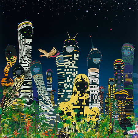
Aoshima’s work is sophisticated and intentional, never shying away from obscure or disturbing imagery, yet maintaining pleasantly balanced composition and use of color. Her work is true to the Superflat genre, which is often associated with criticism of post-war Japanese culture, including consumerism and the sexual fetishization of young girls.[8] In pieces like City Glow, Aoshima shows off an astute ability to marry the synthetic and natural world. Flora and fauna are set against a night skyline, the buildings warped to resemble young girls with eerily glowing eyes. She questions the ability of mankind, nature, and the spiritual world to coexist and imagines what our reality might resemble in a utopian future where these elements have collided.[9] In a number of other pieces, she takes to creating surreal and intriguing worlds inhabited by young girls. These young girls, while illustrated in a traditionally cute anime style, are in many cases unclothed and in compromising positions. All the while appearing unbothered and docile, the grotesque way these girls are sometimes presented calls into question their over-sexualization within popular culture and media and its disturbing implications. Aoshima’s work resembles traditional Japanese ukiyo-e art in its use of flat colors and bold, thick lines. Together with her use of bright colors and cartoonishly cute depictions of people and objects, Aoshima’s style itself contrasts with her often nightmarish subject matter.


Images Referenced

City Glow


Sources

  1. https://web.archive.org/web/20141114070909/https://www.blumandpoe.com/sites/default/files/press/Juxtapoz0106.pdf
  2. http://www.artnet.com/artists/chiho-aoshima/
  3. http://english.kaikaikiki.co.jp/artists/list/C6/
  4. http://english.kaikaikiki.co.jp/artists/list/C6/
  5. https://web.archive.org/web/20150504060230/http://magazine.saatchiart.com/culture/reports-from/los-angeles-reports-from/interview_chiho_aoshima
  6. http://english.kaikaikiki.co.jp/artists/list/C6/
  7. https://www.timeout.com/tokyo/art/interview-chiho-aoshima
  8. http://www.artnet.com/Magazine/features/drohojowska-philp/drohojowska-philp1-18-01.asp
  9. http://www.seattleartmuseum.org/chiho

Dada vs. Neo-Dada – Contextualizing Contemporary Art

The Dada art movement or “Dadaism” began around 1914 in Europe. The movement was itself created in reaction to World War 1, as artists began to question the society that had allowed the atrocities of the war to occur (Dada 2019, par. 1). They placed most of the blame upon conformity and traditional values in both art and society, and therefore sought to completely reject traditional approaches to art. In this way Dada could be considered an art movement which embraced “anti-art” (Dada 2019, par. 3), and was framed as a critique on society. It accomplished this through emphasis upon the message conveyed by the art rather than just it’s appearance or façade. A major art concept popularized by Dada artists in the early 20th-century was the readymade: an “ordinary article of life” stripped of its traditional uses and significance and presented so as to create a “new thought for that object” (Ray and Duchamp 1917). The most famed example of the readymade is Marcel Duchamp’s Fountain. Duchamp submitted a signed urinal to an art exhibit in New York City and was promptly denied inclusion in the exhibition. Fountain became a huge symbol for the Dada art movement as a whole. By effectively removing the urinal’s usefulness, the purpose of the object became entirely aesthetic and Marcel believed it should therefore be considered art. This brought up a common thread throughout the Dada art movement: that the artist themselves defined what should be considered art. The act of choosing and labeling a “readymade” object for presentation as art was just as much an act of creation as a painting or handmade object would be. Fountain epitomized Dada’s rejection of conventional art practice, and many found it to be debase and meaningless as a result. Nonetheless, it has had an immense impact on art throughout the 1900’s and into the modern day.

Decades later, the 1950’s saw a resurgence of the Dadaism style in what was coined “Neo-Dada”. It began and ended in America alongside the Pop Art movement, meaning Neo-Dada drew from both Dada and Pop Art. Pop Art, in many ways exemplifying commercialism and conformity, was a stark contrast to the core principles of Dada, which offered criticism of these same principles. Some former Dada artists didn’t see Neo-Dada as an homage to Dada, but rather a derivative – a less impactful copy. While Dadaism was a rejection of traditional artistic form and practice, Neo-Dadaism was a rejection of art altogether. It leaned on absurdity and often seemed to have no meaning or message at all. Although some pieces might’ve appeared absurd or random upon first glance, at the heart of Dada artwork was a message which rejected societal norms and the boundaries set for what could be considered art. To some, Neo-Dadaism was absurd art for the purpose of absurdity, stripped of the underlying message behind its predecessor.

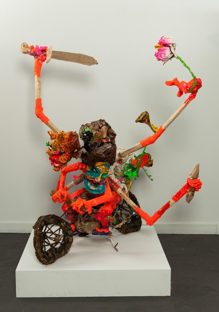
Neo-Dadaists, on the other hand, believed their art to have meaning through the viewer’s interpretation (Neo Dada 2019, par. 5). They accepted that art could have multiple meanings or no meaning at all, and placed more emphasis upon anti-art and anti-aesthetic than Dada had. Their work juxtaposed absurd imagery with modern materials and Pop Art to effectively question their relationship or lack thereof (Chilvers and Glaves-Smith 2009). Neo-Dadaism expanded upon the somewhat paradoxical nature of Dada. One such example is Ushio Shinohara’s “Ashura” (“Ushio Shinohara” 2019), a sculpture made from found objects. The found objects are assembled so as to depict a cartoonish man with several extra appendages: one holding a sword, another a flower, two more gripping the handlebars of the rusted-looking motorbike he sits atop. Segments of the piece are garishly painted in the same bright colors one might see in an Andy Warhol piece, while others retain their naturally dingy appearance. These found objects (often literally discarded trash) earned much of Shinohara’s work the label “junk art” (Lansroth 2015, par. 6), much like Duchamp’s repurposed urinal may’ve been regarded by some in its day. It is the inherent contrast between these aesthetically derelict found objects and the neon colors that accompany them which add another layer to fundamental Dadaism and create something entirely new.


Images Referenced

Fountain
Ashura


Sources

Chilvers, Ian and John Glaves-Smith. A Dictionary of Modern and Contemporary Art. Oxford University Press (2009), p. 503.

“Dada Movement Overview.” The Art Story. Accessed February 12, 2019. https://www.theartstory.org/movement/dada/.

Lansroth, Bob. “10 Neo Dada Art Pieces That Influenced and Shaped This Groundbreaking Art Movement.” Widewalls, October 3, 2015. https://www.widewalls.ch/neo-dada-artworks/.

“Neo-Dada Movement Overview.” The Art Story. Accessed February 12, 2019. https://www.theartstory.org/movement-neo-dada.htm.

Ray, Man and Marcel Duchamp. “The Richard Mutt Case.” Edited by Marcel Duchamp. The Blind Man, May 1917.

“Ushio Shinohara | Ashura (2014) | Available for Sale | Artsy.” 11 Artworks, Bio & Shows on Artsy. Artsy. Accessed February 12, 2019. https://www.artsy.net/artwork/ushio-shinohara-ashura.

Peter Pellettiere – “An Exploration into Vegetation”

When an organism looks “alien” to us, what qualities does it have? You might imagine the lush, extra-terrestrial rainforest of James Cameron’s Avatar, or even the monstrous human-eating plant from Little Shop of Horrors.It may come as a surprise, then, to learn that often those tasked with imagining convincing alien plant specimens look first to earth-dwelling species. At the Slater Memorial Museum in Norwich, Connecticut, sculptor Peter Pellettiere is memorialized through a collection of his works which explore this same relationship between the Earthly and the otherworldly.

The Slater Memorial Museum is best known for its vast collection of antique plaster casts of ancient statues. When one exits the area where they are exhibited and enters the mezzanine where Pellettiere’s creations dwell, they might feel they’ve entered another world. As the room contrasts with the rest of the museum, exemplified by the emptiness of this particular exhibit and the echoing of ones feet, there is a substantial change in subject matter. The series of “floraform plaster sculptures”[1], all-white and situated on the cold stone floor of a small, glass-walled room, at first appear unfamiliar. The oversized plant specimens, each displayed upon an unadorned, off-white pedestal, give the room and its contents a sort of celestial sterility. The pieces are detailed with such care and specificity that they feel almost like objects of worship, and despite their apparent artificiality, that they might begin to breath at any moment.

Was it Pellettiere’s intention to create this atmosphere of uncanniness? The museum’s placard states that the series is “based upon his percept that all sculpture should bring together form and human concern; that it should thoughtfully convey the human condition.”[2] Indeed, while they first evoke images of the botanical, several of the pieces easily relate to the inner workings of the human body. One, clearly labeled as ‘Impatiens Bud’, appeared first to me as a simplification of the human brain and spinal cord. Another, labeled ‘Narcissus Bud (Double)’ is a bulb with offshoots that call to mind the valves of the human heart. Perhaps it is this mix of similarity and dissimilarity that evokes the label “alien” in many cases. I’m reminded of “the uncanny valley”, a term used to describe the strange revulsion many get when things appear human, but aren’t quite right.[3] Though most often used in relation to Artificial Intelligence, I feel it can most certainly relate to Pellettiere’s study into plant and human anatomy.

Pellettiere’s sculptures are in fact scientifically accurate. He took concise measurements of each natural form before scaling them up in size. They were then directly modeled in water-based clay over wire armatures.[4] I find that while these forms are in many ways familiar, buds and bulbs of common plants such as poppies and dogwood, they are presented so as to give an unfamiliar perspective. At a much larger size, we are able to see small details of each organism which are imperceptible in their natural state of being. Pellettiere also appears methodical in the way he chooses to crop the individual pieces. Only in the few examples of bulbs are we able to see an organism in its entirety. The buds, cropped just where they begin on the stem or slightly before it, resemble anatomical illustrations or models of human bodily structures. These techniques help to blur the line between humanoid and plant structure, allowing us to ponder what makes the two so different in our perception.

I’m unsure if Peter Pellettiere’s exhibit answers every question it conjures, but that may very well be by design. The botanical specimens so faithfully suggest human form that they feel neither plant nor human, at least to me. I feel that anybody remotely intrigued and not wholly disturbed by questions of the existential nature would find this collection a valuable and thought-provoking look at the often over-looked nature of life on and potentially beyond Earth.


Sources

  1. Zoe, Vivian, and Leigh Thomas. “New Micro-Exhibition in the “Bubble”.” The Muse, Summer 2013, 2.
  2. Ibid.
  3. “Uncanny Valley.” Wikipedia. February 20, 2019. Accessed March 04, 2019.
  4. Ibid.