Exhibition Honoring Black Artists

One of the best, most powerful ways to amplify black voices is through the visual arts. Whether invoking an emotional response to its audience through portraying their struggles, celebrating culture, or simply celebrating fine art, this exhibition aims to empower black voices in all ways, through all types of art. By displaying both of these types of art it is a means to balance struggle with celebration, seriousness with playfulness, or just admiration of talent. Also by displaying both sides of the coin out of respect it shows black people’s strength for what pulls them through difficult times, rather than only pitying those of color. Yet the weight for which the struggles they carry should not be ignored, and should make the privileged viewers uncomfortable. Another strong reason to have this exhibition is because of the lack of black artists displayed in galleries and museums being underrepresented. The same goes for black art critics, black art dealers, and black museum trustees. A good reason for why one would want to come to this exhibition would not only be to enjoy the extraordinary artwork but also the recorded number of attendees at the exhibition is considered for the value of an art piece and when the number is higher it supports the black artists. Also viewers can follow the artist on social media giving more value to their work, something curators also look for. 

The first artist to introduce would be a versatile pioneer of black art, Faith Ringgold. She has won countless awards including a National Endowment for the Arts Award, a Guggenheim Fellowship for painting and an NAACP Image Award. Faith Ringgold, born Faith Will Jones, was born on October 8, 1930, in Harlem, a time where she’d be greatly exposed to the Harlem Renaissance. She graduated with a B.S. in fine art and education in 1955 from The City of New York and soon after also received a M.A in art. Protesting in the 60s and 70s against art institutions that had not included people of color, her artwork’s narrative during that time period changes from angry and disheartened when it comes to living in America as a person of color to portraying black females in all their glory in later decades. Later in her career she’d published award winning children’s books during the 80s and 90s written and illustrated by her. They educate youth upon the pivotal as well as inspiring times during black history, Aunt Harriet’s Underground Railroad, and My Dream of Martin Luther King just to name a couple. Woman on a Bridge #1 of 5: Tar Beach, (1988, Acrylic paint, canvas, printed fabric, ink, and thread, 74 5/8 x 68 1/2 inches) would be included since the book to go along with the piece, titled Tar Beach, won the Caldecott medal which goes out to the most distinguished American picture book for children for its preceding year. Pictured within the artwork are all people of color –  a family sitting with visitors on a city building’s rooftop at night with a food table, potted plants, and a clothesline with laundry hooked. In the background there are the skyscrapers of Harlem lit at night along with the George Washington Bridge also lit. The is a little girl and a boy laying down on a blanket looking into the sky. Interestingly, the little girl in the nightgown is pictured twice because she also appears flying in the background too. 

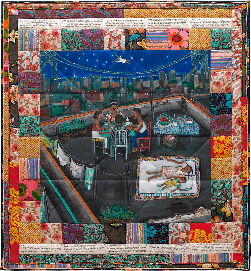
Faith Ringgold. Woman on a Bridge #1 of 5: Tar Beach, 1988. Acrylic paint, canvas, printed fabric, ink, and thread; 74 5/8 x 68 1/2 inches. Solomon R. Guggenheim Museum collection, New York, New York. Image by Guggenheim Museum.

The story behind Tar Beach spoke upon feeling free. A little girl named Cassie Louise Lightfoot living in Harlem imagines herself flying over the George Washington Bridge. She dreams of ways her beloved family members can also feel free, addressing the financial hardships her parents have dealt with while also speaking highly of them. The little girl is determined to take over the city and make a better life for her family, dreaming of what could be. This emphasizes the power of dreaming and that in Ringgold’s case – dreams do come true. 

Her style is characterized by the bright and bold two dimensional artwork style from the Harlem Renaissance and also references Cubism as well as Fauvism, specifically Picasso and Matisse. Like the staple in most of her works, she used an illustrative quilt border in Tar Beach. Ringgold is best known for her quilted artwork for which the patterns take inspiration from multiple elements. Tibetian thangka paintings are one of them. Another is how quilts resonate and honor her mother who took an interest in fashion design, sold dresses in Harlem as well as taught Faith how to sew. Quilt Making also speaks upon the craft behind women’s work within the community in both American and African culture. Quilts are also a reference for what was used to help slaves escape through the underground railroad. The combination of painting and quiltmaking combined is quite innovative. First she paints on fine woven cotton duck canvas fabric. Then she attaches colorful squares of upholstery fabric along the boards, some of which she’d also paint on. 

Who’s Bad? (1988, Acrylic on canvas with pieced fabric border, 79 1/2 x 92 1/2 in.)  would be included because of its fun lightheartedness with Michael Jackson centered, yet speaks upon race also. The Michael Jackson figure appeals to a large audience because of his popularity. For that, this work could even be considered as pop art since he is a widely recognized figure. This adds to Ringgold’s versatility, attributing her work to many aspects of black culture, back then and during more recent times. Within the piece painted there are repeated writings of the names Martin Luther King Jr. and Malcom X in a vandalized style. In the background there are a bunch black men of all ages and differing personas, based on their fashion apparel, shown together dancing. With this as well as including the following piece mentioned, the viewer can see that because of her history with textiles and fashion she uses apparel to create each individual figure’s persona that reflects the times. In this case it’s the 80s. It speaks upon how no matter how one may identify themself or how society sees them as a black man Michael Jackson’s exceptional talent brings the black community together for a good time. United, this promotes black power. Her work again captures the style of art depicted during the Harlem renaissance as well as Cubist and Fauvist elements. Again the artist references her staple quilted border.

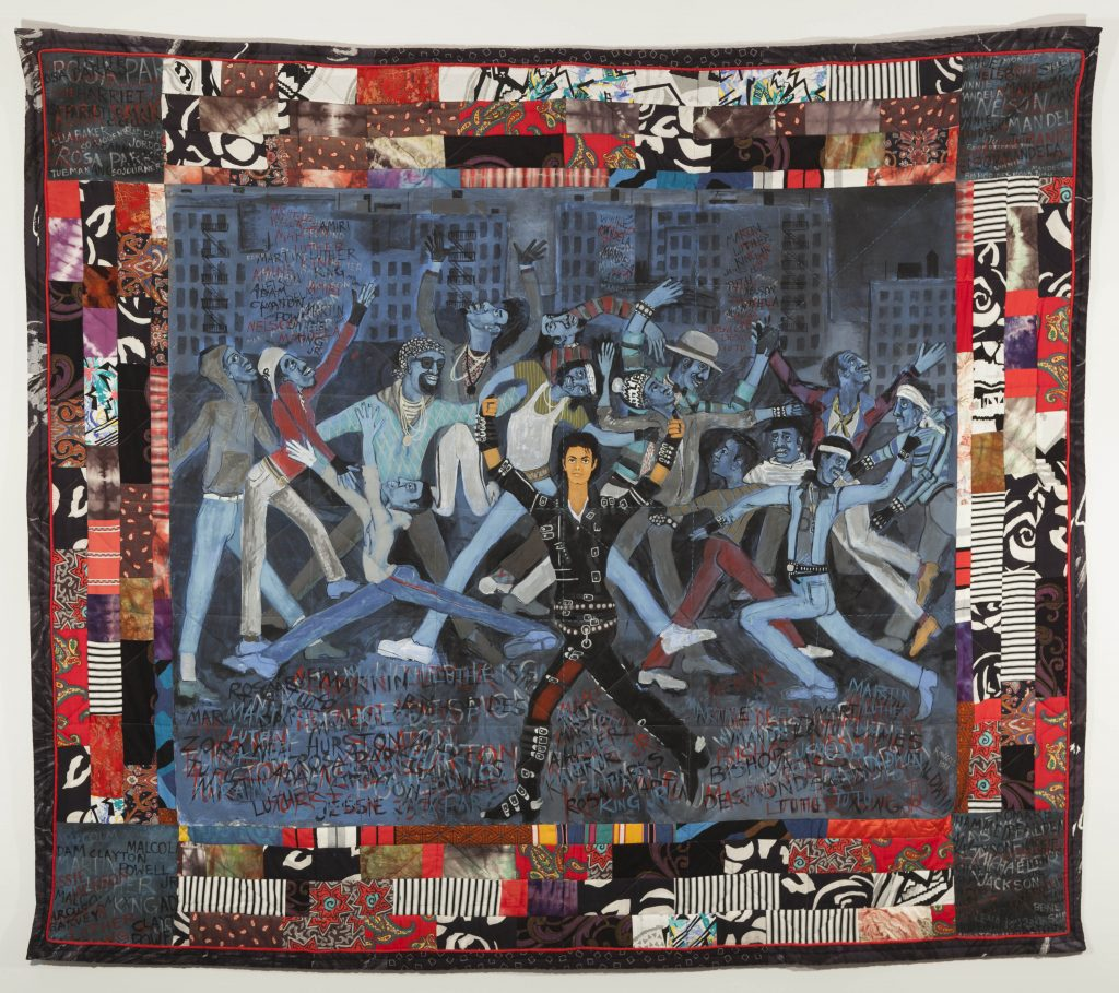
Faith Ringgold. Who’s Bad?, 1988. Acrylic on canvas with pieced fabric border; 79 1/2 x 92 1/2 in. Image by https://www.faithringgold.com/portfolio/whos-bad/.

Another great piece of Faith Ringgold’s to include would be Groovin’ High, 1996 because it celebrates another vibrant time in black culture. “Groovin’ High was inspired by Ringgold’s memories of Sunday afternoon dances at the Savoy and her connection to her native Harlem neighborhood. The title references jazz composer and trumpeter Dizzy Gillespie’s 1945 bebop classic.” The founding of bebop is unique to black culture being founded by Charlie Parker and Dizzy Gillespie. It typically comprises the necessary trumpet and saxophone with a rhythm section (this includes a piano, bass, and drums). The piece similar to Who’s Bad depicts roughly a dozen and a half people, again of all ages, of which are a gathering of black people dancing. Groovin’ High is culturally educational as well as fun and engaging. Again the style resonates the same as mentioned in the earlier pieces, using bold colors with two dimensional figures. Also appearing again she shows her eye for fashion trends, something that she must’ve adopted from her mother, because it shows what people wore taking place in the 40s/50s. The fact that she shows this within both Who’s Bad? As well as Groovin’ High is another captivating trademark since they’re two different eras. To add, again they both also show the power of music and its ability to bring people together. 

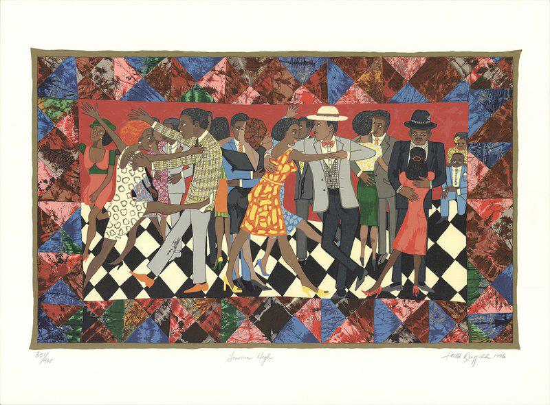
Faith Ringgold. Groovin’ High, 1996. Silkscreen; 32 ½ x 44 in. Image by https://www.artsy.net/artwork/faith-ringgold-groovin-high-10.

To go with the theme of bringing people together would be the cozy southern shack house artworks of Beverly Buchanan. When anyone looks at them she hopes that they “strike a chord” with whoever that may be. Many people react saying the works remind them of home. She’s been widely recognized and has received rewards including National Endowment for the Arts Fellowship (1980), a Pollock-Krasner Foundation Award (1994), and a Lifetime Achievement Award from the Women’s Caucus for Art (2011). Her work is also displayed at the Metropolitan Museum of Art.

Beverly was born October 8, 1940 in Fuquay-Varina, NC. What influenced her work was how her father was the dean of the department of agriculture at South Carolina State College as well as an agricultural agent for the state to travel so he could teach the trade, with Beverly tagging along with him. Her father’s friend was a landscape architect and she would mimic her own handmade small three dimensional versions of buildings based on the knowledge he’d share. She was pressured by her parents and being black in the 60s to be successful by pursuing medical school, since she was already a health educator in New Jersey. She instead chose to be an artist. During the late 60s she was turned away from a gallery being directly told from them that they don’t show black art. In the same interview where she expresses that she also states how she’s been told even years preceding, “what great work for a woman”. And even for a third example of discrimination that same interview shares how in 1977 once her works were in a gallery in New York gaining success up north curators and dealers down south (Atlanta, GA) finally contacted her showing interest her work after the fact of seeing it beforehand and dismissing it.

 Beverly claims her work’s style is strongly influenced by the abstract expressionist movement. She creates two dimensional and three dimensional works of a common theme, inspired by one to two, perhaps even three hundred year old shacks that are still standing from the old south in South Carolina. Her works are semi representational but her aims towards embodying the spirit of those who lived there and who built them, as she puts it. 

A good piece of Beverly Buchanan’s to include would be Dublin, Georgia, Dublin, Georgia, 1992, Oil pastel on paper, 22 x 30 inches. The piece depicts two small log shacks, taller than they are wide, each with orange roofs, the right one pictured with a staircase, with a dark blue sky, low lit grass at the bottom, thus it being nighttime this achieves the look of a candle lit window. Similar to all her other works she presents a beautiful, bold, rich jewel toned use of color theory. The windows capture a glowing candle lit light, reflective of the times when the house was lived in. This adds, as mentioned earlier, the “cozy” “at home” feel. It’s almost as if these places were never left abandoned, perhaps Beverly gives them life again, which successfully ties along with her artist statement/intent of capturing the shack’s spirit. While scribbles in art are commonly discouraged, instead she owns that type of mark making throughout her work. A similar example for reference would be Macon Georgia, Oil pastel on paper, 22 5/8 x 30 inches 2003. The mark making gives an innocent, childlike, welcoming feel, which is how one wants to feel when walking into another’s home. The mark making also relates to the weathered chaos that the still standing building has been through a couple hundred years or so. Perfect lines wouldn’t make any sense for this type of subject and theme.

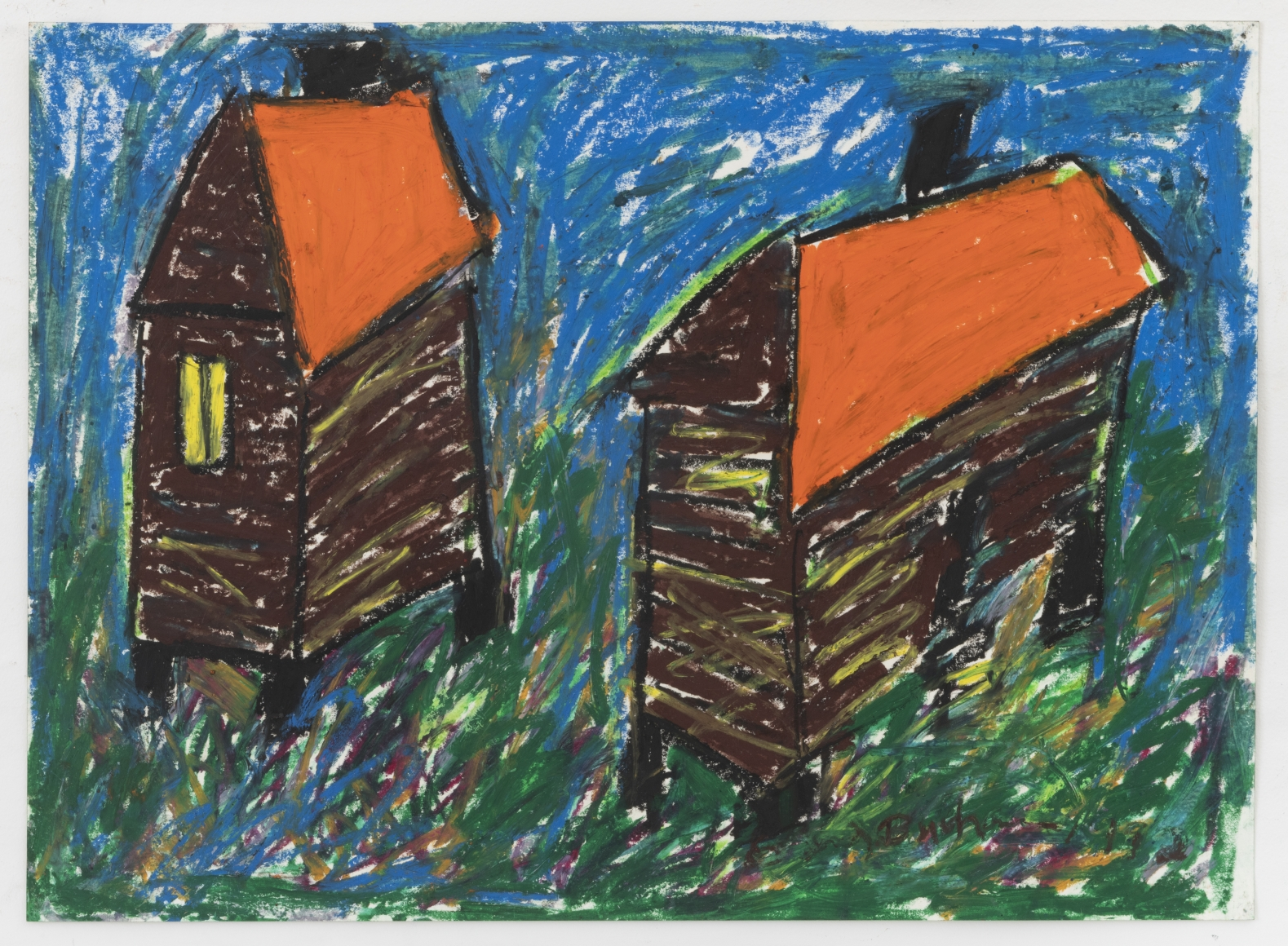
Beverly Buchanan. Dublin, Georgia, 1992. Oil pastel on paper; 22 x 30 inches. Andrew Edlin Gallery Collection, New York, New York. Image by Andrew Edlin Gallery.

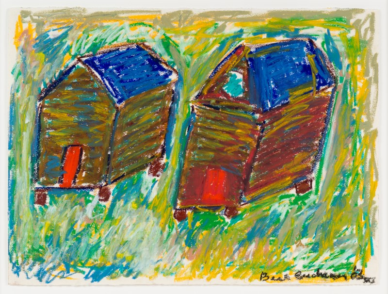
Beverly Buchanan. Macon, Georgia, 2003. Oil pastel on paper; 22 5/8 x 30 inches. The Johnson Gallery Collection, Spartanburg, SC. Image by The Johnson Gallery Collection.

While it is important to recognize the work of black artists who’ve paved the way, it’s equally just as important to recognize up and coming ones. Ariel Dannielle, 29, is a portrait painter with the theme of drawing the viewer into the intimate everyday life of a black woman in today’s world. From Atlanta, GA, she graduated from the University of West Georgia, where she received a Bachelor of Fine Arts. She has been mentioned in the New York Times and has been featured in the California African American Museum, featured in several galleries, and been a finalist in several competitions. Two of her pieces, Be Safe and We Adapt would be included in the exhibition. Be Safe began with the Black Lives Matter protests following the death of Alton Sterling in 2016 in Baton Rouge, Louisiana. 

"Be Safe"

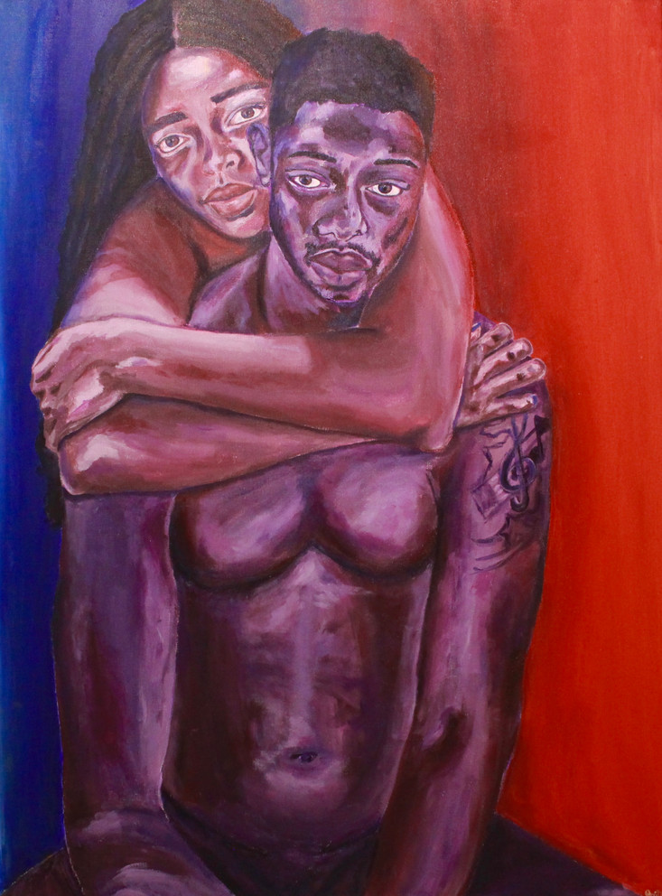
Ariel Dannielle. Be Safe, 2016. Acrylic on Canvas; 30x40in. Image by https://www.byaridannielle.com/paintings.

For context Sterling was selling CDs outside a store and a few days prior began carrying a gun due to recent CD vendor robberies surrounding the area. Two officers responded to a call about a man who was threatened with a gun by a man selling CDs, thus Serling’s red hoodie fit the description. Yet the store owner stands by Sterling stating he was not the one who instigated or in his time of knowing him was looking to cause trouble. Back during 2009 almost the exact same incident involving Sterling selling CDs with police arrival a different store owner also vouched for him saying the same thing. Once Sterling was on the ground officers tased him. Already tased he reaches into his pocket for what the jury claimed to be his gun. After seeing this the now ex officer Salamoni fatally shot him six times in close range. The Department of Justice did not file charges for this case however the officer who shot Sterling was fired two years later before the wrongful death suit began in 2021. 

If Sterling wasn’t shot dead he could have had justice. Perhaps he didn’t address police confrontation properly by resisting and reaching but with the numerous other cases in the media since the Trayvon Martin case of police brutality directed towards people of color it’s no wonder he panicked. Police officers should be seen as trusted professionals but how can they be when they have their own track record? Having the black community fear them is only making the problem grow. 

Ariel Dannielle’s Be Safe, 2016, 30x40in, Acrylic on Canvas is an emotional depiction of the fear behind walking outside as a black man with a target on his back due to police brutality towards people of color. With a blue and red backdrop with the exact same hues of police vehicle lights Dannielle paints herself embracing her male lover. Her expression is fearful and anxious with his being discouraged and hopeless. Along with her other works it is so up close and personal that it has the viewer feeling the emotion it’s intended to portray. Not only is the Black Lives Matter movement about police brutality but it’s also about generational social economic inequality amongst races. What comes with that is besides police brutality, communities of color fear violence from those in their own neighborhood. This piece is very personal and powerful. 

On a lighter note, We Adapt (2020, Acrylic on Unstretched Canvas, 60 × 83 in) has to do with finding the joys within the COVID-19 pandemic that can be found by staying home. The artist pictures herself in her bedroom wearing a facemask in her bathrobe holding up a glass of wine. She looks very happy, comfortable and at home with her dog on the bed with the other hand throwing up the peace sign towards her Macbook. She owns her femininity by including her cheetah print pillow and salt rock lamp. And of course she included a bottle of Purell on the dresser. 

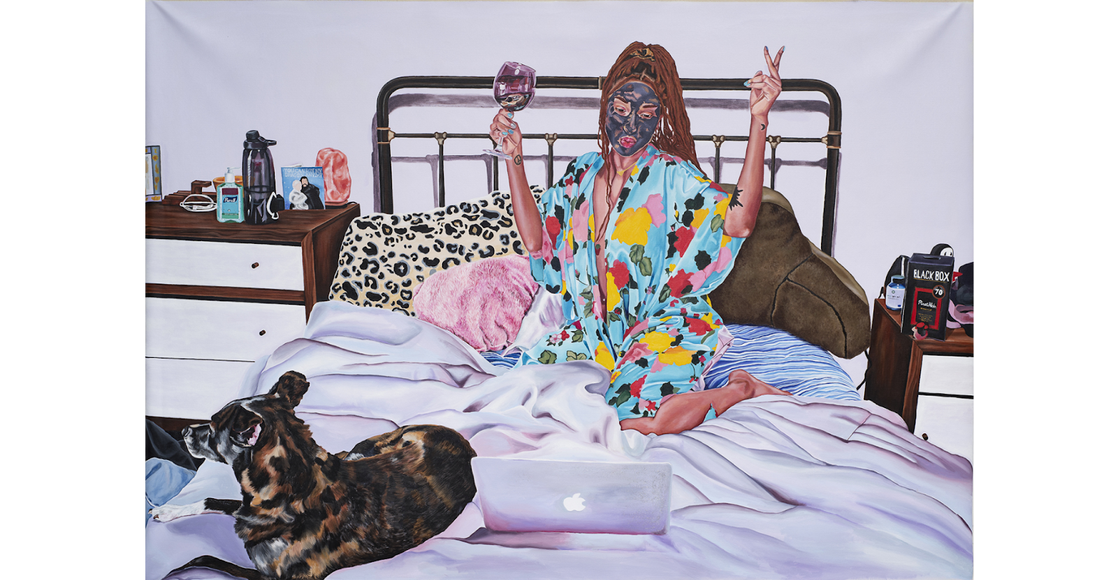
Ariel Dannielle. We Adapt, 2020. Acrylic on Unstretched Canvas; 60 × 83 in. Image by https://www.byaridannielle.com/paintings.

All these three pieces have to do with her artist statement of which challenges gender and racial stereotypes because if a white person was to gain insight into the world of a black woman this would be it. It is simply them trying to enjoy life and loving those around them. This is similar to all human nature that we can all relate to. Being human is something everyone has in common.

Sources

“ABOUT.” Website. July 28, 2021. https://www.byaridannielle.com/about.

“About Faith.” Faith Ringgold. Accessed July 28, 2021. https://www.faithringgold.com/about-faith/.

“Beverly Buchanan, Thornton Dial, and the Gee’s Bend Quiltmakers.” Andrew Edlin Gallery. Accessed July 28, 2021. https://www.edlingallery.com/exhibitions/beverly-buchanan-thornton-dial-and-the-gee-s-bend-quiltmakers?view=slider#4.

Craftinamerica2007. YouTube. May 10, 2012. Accessed December 15, 2021. https://www.youtube.com/watch?v=794M-mcOJY4.

“Faith Ringgold.” Mattatuck Museum. Accessed July 28, 2021. https://www.mattmuseum.org/mattatuck_carousel/faith-ringgold/.

“Faith Ringgold.” Biography.com. November 05, 2021. Accessed December 15, 2021. https://www.biography.com/artist/faith-ringgold.

Hanson, Reviewed By: Debra, and Debra Hanson. “Faith Ringgold: Paintings and Story Quilts, 1964–2017.” Panorama Journal of the Association of Historians of American Art. Accessed December 15, 2021. https://editions.lib.umn.edu/panorama/article/faith-ringgold/.

“Macon Georgia.” The Johnson Collection, LLC. Accessed December 15, 2021. https://thejohnsoncollection.org/beverly-buchanan-macon-georgia/.

Ufoutlier. YouTube. December 31, 2013. Accessed December 15, 2021. https://www.youtube.com/watch?v=GfBZm2QHzi4.

YouTube. June 15, 2020. Accessed December 15, 2021. https://www.youtube.com/watch?v=Ry5_Ns9jRNI.

Who am I: The Art of Self-Expression?

The idea of self-expression can be defined the expression of one’s feelings, thoughts, or ideas. Often these thoughts are expressed through one’s creative side such as dance, writing, and even in their art. Art is frequently thought of to express yourself in a way that speaks to you. Photography is an opportunity to communicate without words with infinite possibilities for expression. This can allow an artist to tell you anything and everything without having to tell you the story behind it instead the viewer can look within and try to find a better understanding of what the artist is trying to tell us without having to say anything.

Portraits have been around for over 5,000 years in a time before photography, these portraits were painted, sculpted, or drawn portrait and the only way to record the appearance and capture the likeness of someone. But even then, portraits have always been more than just a record. They have been used to show the power, importance, virtue, beauty, wealth, taste, learning or other qualities of the sitter.[1] In modern photography, self-portraits are sometimes used for self-expression. In today’s time most self-portraits are portrayed as photographs less then painting as most of us in modern time carry around a camera everywhere and can capture anything with a second’s notice. People today with their embedded cameras, have made self-portraits one of the most popular photographic genre. But the idea of self-portraits still shares the same goal no matter the medium that is used to create them. These self-portraits are meant to show the viewers, the under the skin look on who they are by expression themselves in a way in which the viewers gain insight on who the artist is. Self-portraits can come in all shapes and size that use self-expression to tell us a story that betters our understand on the story the artist is trying to portray.

            In my exhibition Who am I: The Art of Self-Expression? I wanted to focus solely on self-portrait produced by women in the medium of photography. The idea that we can capture something of so much meaning in a second is something that modern technology has really expanded on for us. Over this semester, readings focused on many different topics but one of the most eye opening one was the lecture on feminist art. I wanted to incorporate the art that are produced by women and let them tell their stories using self-expression for my exhibition  Christina Otero takes her creative self portraits to a fun, vibrant level. She uses her artistic abilities to push her photographs to the edge between paintings. Otero said that make up in Americas Next Top Model inspired her to start photography, dreaming that one day she would be able to have elaborate photo shoots like the ones featured in the show.[2] She used her photography and elaborate make up to elevate the simplistic nature of a face to a new category. A self-portrait is a portrait is one of the most relevant self-analysis exercises that an artist can do to help.

The expression captured in these photos can help convey the idea intended by the artist. Self-expression can mean many different things to every person you ask. In Otero’s case, she uses her life to create her work while drawing from everything including readings from her favorite authors, quotes that spoke to her, and even metaphors. Christina started her career as an illustrator, she was most drawn to different facial expressions and even female anatomy. She would use her own face and body as subjects for her drawings while incorporating hyperrealism to give the drawing a photographic feeling. With this technique, she shifted her career to become a photographer he specializes in artistic self portraits. In this process of exploration, Christina found that throughout her search that she was her best muse. [3] Otero created a series called Tutti Frutti, she chooses to focus on the bold vibrant colors of fresh fruit and incorporates fruit not only a prop but also as the inspiration for the make up design that she illustrates on her face for each photo. All photos in the series feature focus on the neck up, centering on her face, she incorporates different facial expressions as well as different posing and head positions to create a whimsical and striking collection of self portraits.

Christina Otero, Mandarina Tutti Frutti. Photograph. ChristinaOtero.com

One of her most popular pieces Mandaria comes from her Tutti Frutti series. [4] This self-portrait features the fruit, tangerine. The tangerine is used as a peeled prop cover up Otero’s right eye and is also featured by using orange make up on her eye and lips with a slice on her face. Her facial expression is relaxed with an open mouth. With the orange make up accenting all facial features she also used black dots as well over these spots, resembling freckles, she also paints these on her tongue so that these dots can be seen with the expression she displays. The vibrant orange of a tangerine contrasts the best against blue when we think about color theory, Otero uses blue eyes, and royal blue hair and eyebrows to really accent against the orange. The idea that she takes such a creative approach on self-expression in her photos was something that really stuck out to me. The idea of using everyday items such a food to create something new is fascinating to me.

Marolyn Minter, Orange Crush, 2009. Enamel on metal; 108 × 180 inches. Contemporary Arts Museum in Houston, Texas. Artsy.net

The idea of this relates to one of my favorite contemporary photographer Marilyn Minter. Marilyn Minter is an American Contemporary visual artist, she is best known for her sensual take on paintings, photographs, and videos where she explores the emotions around beauty and the feminine body in American culture. Minter wanted her work to make the viewer question the overly commercialization of sex and the body.[5] While Minter doesn’t focus on self-portraits, she uses expression with her models to tell us a story that feminists have been challenging for years. Marilyn Minter: Pretty/Dirty is the first retrospective of her work that focuses the aesthetics of high-fashion editorials, often depicting female bodies adorned with jewels, dirt, saliva, and higher end accessories, mixing in the idea of sexuality and food. [6]

One of Minters most talked about photographs is Orange Crush. This piece is nine feet tall, fifteen feet wide and painted in glossy enamels on an extremely large billboard-size metal panel. This large then life display takes up the entire display area and draws the viewers in. Displayed is a faceless woman with her lips open and tongue licking the glass, the mouth is trying to lick up all the brightly colored orange cake that has been smeared across the glass. Minter really shows us her unique method of photography with this piece, I think her entire collection really embodies the idea of over sexualization that many contemporary feminist artists have been influenced by. The self-expression that she puts into her work when it comes to props and posing to speak up against the problems females face is something that I believe would help solidify the exhibition pieces even if its not a self-portrait.

Feminist art is an art movement that really sparked conversation for the equality of women. Artists used the ideas that women shouldn’t be objectified and point out the flaws in our system with their work. Art historian Linda Nochlin was known for her views on feminism and how women should be seen in the same way as men in the art world. “Feminist art history is there to make trouble, to call into question, to ruffle feathers in the patriarchal dovecotes. It should not be mistaken for just another variant of or supplement to mainstream art history. At its strongest, feminist art history is a transgressive and anti-establishment practice, meant to call many of the major precepts of the discipline into question.” [7]

Nochlin’s words paved the way for Feminist photographer Cindy Sherman. For forty years, Cindy Sherman, known as the great chameleon of our time, has created more than 500 photographs. All these photos are photos she takes of herself, but Sherman doesn’t refer to them as self-portraits. She turns herself into a character to express her idea in each photo she takes, she is said to have created almost 500 different characters for herself in the forty years of photography. She has transformed herself into high-society women, bikers and horror babes, lonely-hearts and killer clowns. Each character she creates is a new persona she reflects into her work; she has even portrayed characters in reference to icons like Madonna. [8] Marilyn Minter gives credit to Sherman for being her inspiration into photography, she is quoted saying “you cannot take a photograph without the entire history of Cindy Sherman’s oeuvre behind it.”

Cindy Sherman is a huge part of the foundation that started feminist art, without her work the idea of the male gaze wouldn’t be what it is today and something that most artist focus on when exploring feminist art. Sherman herself said that she doesn’t like to disclose the exact meaning behind her photographs as she prefers the frenzy of different interpretation people give.[9] Having one of Shermans photographs as a apart of this exhibition would help include the idea of where feminist art started. She was someone most of these newer artists followed for inspiration, someone who helped them understand that you can tell whatever you want in your photographs as she told every story she could think of from clowns to classy women. Untitled #574 would be the photograph I would include in my exhibition. Sherman depicts herself a high society woman in this photo, there is a red background with her in the foreground seated in a formal manner in a chair. She is clothed in all blue and turquoise clothing creating a vibrant contrast of colors. She wears a darker blue hat that is fitted to her head with a tiny bit of short orange hair exposed against her face. Her face is angled upward toward the light source but is very plain with make up that furthers the idea of a well-respected women. Her chest is covered in a blue fur shawl that covers her top torso, she places one hand over her chest, and her hands are adorned with royal blue gloves. These blue colors contrast beautifully against her silk turquoise dress. All these different textures and colors make for an interesting composition. Sherman has never expressed the meaning she felt for creating this image but by many sources, the consensus is she is playing the role or a put together high-society women and is posing for a portrait.[10]  

Untitled #574, 2016, dye sublimation metal print. Cindy Sherman artworks courtesy of the artist and Metro Pictures, New York. Montecristo Magaizine

Another turn of the century photographer is Francesca Woodman, best known for her haunting black and white photos. Her work was ignored by most of the art world during her life and she was referred to as tragic. Through her time, she fought with her depression, and unfortunately, she took her own life at the young age of twenty-two. Despite the rough start she had to the art world, after her death her photos became a present part of the world she longed for. Woodman’s work used conceptual and surrealism concepts to create her self-portraits. [11]

Francesca Woodman, Self-Portrait Talking to Vince 1980. Gelatin Silver Print. SCAD Museum, SCADMOA.org

A Woodman self-portrait lets us have a large insight into the mind of someone who was struggling with life. I believe she used this tortured feeling that she had to express a tortured feeling in her work. The photo that I want to have as part of my exhibition is Self-portrait talking to Vince. the overall feeling of the photo is distressed, very dark, it really tells us the story of Francesca life. Considering she isn’t here to explain her work the world looked to her family and friends for explanations. They have said that they feel like her art was telling us how much she was struggling.[12] Depicted in this specific black and white portrait is Woodman sitting with her head tiled up and mouth forced open, in her mouth there is a clear material which seems to be gagging her mouth. The overall photo is dark with little to focus on besides her mouth. It is an extremely tortured look she is giving the viewer; it shows us how she felt during that time, and how she wanted to express the struggle she was dealing with during 1977. Woodman isn’t the only artist that uses her feelings to portray an image in her work.

Much like Francesca Woodsman, photographer Jennifer Kiaba uses her life to tell us the story of her life through self-expression in her self-portraits. Kaiba’s story started at a young age, this is her explanation of herself expression.

“Self-portraiture, for me, is a tool for self-exploration. I use it to peer into my psyche, and to begin to unravel the inner workings there,” she says. “I was born into one of the most notorious cults of the ‘70s and ‘80s in the United States – the Unification Church. That experience warped my perspective on what it meant to be a woman and what my inherent value was. Since extricating myself from the group in my late teens, it has been a long road to healing and rewiring my mind in an attempt to undo the damage of the cult.”[13]

Jen Kiaba. Hold Your Peace, from series Burdens of a White Dress, 2013. Photograph. Soho Photo Gallery JenKiaba.com

Kiaba is very open about her experience and hard upbringing and talking to many people out there who are struggling. She began doing photography to bring clarity into her life so that she could heal from the trauma she suffered. The self-portrait from her collection I want to include is Hold Your Peace, from the series, Burdens of a White Dress. This series helps Kiaba use self-expression to explain the feeling she had while growing up in a cult and the experiences she had to go through. Specifically, this talks about how within the cult she was forced into marriage and this series helped her express her feeling from that forceful experience she had to endure. She described this photo as her way of exploring the issues of forced marriage. Within this photo, Jenn photographs herself in a white dress with her hands, body, and eyes all bound. She uses tight body language to express the discomfort she felt and the rope to explain the torture she had to go through. Kiaba really taught us that self-expression is the technique that she uses to understand how she truly feels about her life. [14]

            All these portraits have different meaning hidden below the surface embracing the artists self-expression. Throughout each of their lives there was always something they wanted to share, whether it be illustrated skill, depression, a flaw in society or even the way you grew up. Each of these female artists show a different side to self-expression, giving us a better idea of who they are and the message they’re trying to portray.[15] The idea of artist expression is a phenomenal experience because as the viewer we can all come up with different interpretations of the message we think the artist is telling. Self-expression is subjective without an explanation for its creator but either way it truly gives us a deeper connection to the artist and what they believe in.

Sources

“16-Year-Old Photographer’s Jaw-Dropping Self-Portraits (Photos).” HuffPost. HuffPost, June 29, 2012. https://www.huffpost.com/entry/cristina-otero-16-year-ol_n_1625715.

Bengal, Rebecca. “What We See Now When We Look at Francesca Woodman’s Photographs.” Vogue. Vogue, January 26, 2016. https://www.vogue.com/article/francesca-woodman-photographs.

Burnett, Craig. “The Complex Characters of Artist Cindy Sherman’s Non-Self Portraits.” MONTECRISTO. Accessed December 10, 2021. https://montecristomagazine.com/magazine/volume-12/cindy-sherman.

Candide McDonald | 24 October 2018. “Look at Me: The Art of Self-Expression.” Capture magazine. Accessed December 10, 2021. https://www.capturemag.com.au/advice/look-at-me-the-art-of-self-expression.

“Cindy Sherman: Moma.” The Museum of Modern Art. Accessed December 10, 2021. https://www.moma.org/artists/5392.

Knight, Christopher. “Marilyn Minter’s ‘Pretty/Dirty’ Show Allures and Repulses All at the Same Time.” chicagotribune.com, April 23, 2016. https://www.chicagotribune.com/la-et-cm-marilyn-minter-review-20160422-column.html.

Luis, Angel Jiménez de. “What Is Self-Portraiture and How to Master It: Blog.” Domestika. DOMESTIKA, November 3, 2020. https://www.domestika.org/en/blog/4352-what-is-self-portraiture-and-how-to-master-it.

“Marilyn Minter: Pretty/Dirty,” Brooklyn Museum: Marilyn Minter: Pretty/Dirty, accessed December 10, 2021, https://www.brooklynmuseum.org/exhibitions/marilyn_minter_pretty_dirty.

Samuelson, Kate. “Are Selfies Art? New Saatchi Gallery Exhibition Says Yes.” Time. Time, March 31, 2017. https://time.com/4718143/selfie-exhibition-saatchi-gallery-london/.

Sehgal, Parul. “The Ugly Beauty of Cindy Sherman’s Instagram Selfies.” The New York Times. The New York Times, October 5, 2018. https://www.nytimes.com/interactive/2018/10/05/magazine/instagram-cindy-sherman-ugly-beauty.html.

Stewart, Jessica. “10 Famous Photographers Whose Self-Portraits Are Much More than Just a Selfie.” My Modern Met, July 13, 2021. https://mymodernmet.com/famous-self-portrait-photographers/.

Tate. “Portrait – Art Term.” Tate. Accessed December 10, 2021, https://www.tate.org.uk/art/art-terms/p/portrait.


[1] Tate. “Portrait – Art Term.” Tate. Accessed December 10, 2021

[2] 16-Year-Old Photographer’s Jaw-Dropping Self-Portraits (Photos).” HuffPost. HuffPost, June 29, 2012. https://www.huffpost.com/entry/cristina-otero-16-year-ol_n_1625715.

[3] Luis, Angel Jiménez de. “What Is Self-Portraiture and How to Master It: Blog.” Domestika. DOMESTIKA, November 3, 2020. https://www.domestika.org/en/blog/4352-what-is-self-portraiture-and-how-to-master-it.

[4] 16-Year-Old Photographer’s Jaw-Dropping Self-Portraits (Photos).” HuffPost. HuffPost, June 29, 2012. https://www.huffpost.com/entry/cristina-otero-16-year-ol_n_1625715.

[5] Knight, Christopher. “Marilyn Minter’s ‘Pretty/Dirty’ Show Allures and Repulses All at the Same Time.” chicagotribune.com, April 23, 2016. https://www.chicagotribune.com/la-et-cm-marilyn-minter-review-20160422-column.html.

[6] “Marilyn Minter: Pretty/Dirty,” Brooklyn Museum: Marilyn Minter: Pretty/Dirty, accessed December 10, 2021, https://www.brooklynmuseum.org/exhibitions/marilyn_minter_pretty_dirty.

[7] Women, Art, and Power and Other Essays, Linda Nochlin

[8] Parul Sehgal, “The Ugly Beauty of Cindy Sherman’s Instagram Selfies,” The New York Times (The New York Times, October 5, 2018), https://www.nytimes.com/interactive/2018/10/05/magazine/instagram-cindy-sherman-ugly-beauty.html.

[9] Craig Burnett, “The Complex Characters of Artist Cindy Sherman’s Non-Self Portraits,” MONTECRISTO, accessed December 10, 2021, https://montecristomagazine.com/magazine/volume-12/cindy-sherman.

[10] “Cindy Sherman: Moma,” The Museum of Modern Art, accessed December 10, 2021, https://www.moma.org/artists/5392.

[11] Stewart, Jessica. “10 Famous Photographers Whose Self-Portraits Are Much More than Just Selfie.” My Modern Met, July 13, 2021. https://mymodernmet.com/famous-self-portrait-photographers/.

[12] Bengal, Rebecca. “What We See Now When We Look at Francesca Woodman’s Photographs.” Vogue. Vogue, January 26, 2016. https://www.vogue.com/article/francesca-woodman-photographs.

[13] Candide McDonald | 24 October 2018. “Look at Me: The Art of Self-Expression.” Capture magazine. Accessed December 10, 2021. https://www.capturemag.com.au/advice/look-at-me-the-art-of-self-expression.

[14] Candide McDonald | 24 October 2018. “Look at Me: The Art of Self-Expression.” Capture magazine. Accessed December 10, 2021. https://www.capturemag.com.au/advice/look-at-me-the-art-of-self-expression.

[15] Samuelson, Kate. “Are Selfies Art? New Saatchi Gallery Exhibition Says Yes.” Time. Time, March 31, 2017. https://time.com/4718143/selfie-exhibition-saatchi-gallery-london/.

The Art of An Adaption

While many people engage with art in meaningful ways, one of the primary ways that the everyday person engages with art is through movies and television, and more often than not, that content is an adaption of something else. It is estimated that over fifty percent of all Hollywood films are adaptions, and they consistently tend to gross higher at the box office than original screenplays. [1] While the films tend to be more popular than their original counterparts, they can often be more controversial. While live action adaptions often strive to adapt various forms of media for financial success, when it comes to adapting comic, manga, or animated original material, they often fail to adapt the spirit and soul of the original media, leaving their adaptions to be pale imitations, leaving the everyday viewer to miss out on the original content.

James Wong. Dragonball Evolution, 2009. Film; 84 Minutes. 20th Century Fox.
Akira Toriyama. Dragon Ball, 1984-1995. Manga; 42 Volumes. Jump Comics, Shueisha.
Minoru Okazaki & Daisuke Nishio. Dragon Ball, 1986-1989. Anime; 153 Episodes. Toei Animation, FNS.

The earliest failed adaption on this list is the 2009 film Dragon Ball Evolution, directed by James Wong and written by Ben Ramsey, an adaption of the Manga Dragon Ball by Akira Toriyama, that ran from 1984-1995, that was received so poorly that the writer offered a public apology in 2016, stating “I went into the project chasing after a big payday, not as a fan of the franchise but as a businessman taking on an assignment. I have learned that when you go into a creative endeavor without passion you come out with sub-optimal results, and sometimes flat-out garbage.” [2] According to the original creator as well, the makers of the film ignored his input as well, “At the time of the Hollywood movie, the live-action Dragon Ball, the script had too little of a grasp on the world and its characteristics, and on top of that, it had a conventional content that I couldn’t find interesting, so I cautioned them, and suggested changes; but in spite of that, they seemed to have a strange confidence, and didn’t really listen to me. What came out in the end was a movie I couldn’t really call a Dragon Ball that lived up to my expectations.” [3] The characters are flat and changed in order to replicate typical high-school film drama woes, despite the fact that the protagonist Goku never went to school at all during the original series. Goku, who is so pure hearted that when hit with an attack that would use his own negative thoughts to destroy him, did absolutely nothing, is instead turned into a self-centered and vain character, not to mention that the character was cast as a white actor, despite the character, while being an alien, was always meant to be interpreted as Japanese. The film, predictably, had terrible reviews, with a current Rotten Tomatoes score of fifteen percent. Critic Steve Biodrowski of Cinefantastique offering, “This film offers further proof, as if any were needed, that Western filmmakers cannot do justice to their Eastern counterparts when it comes to retooling anime and/or Fant-Asia for Occidental consumption.” While Dragon Ball Evolution failed on almost every metric, the manga has several successful anime adaptions, that do the original source much more credit, described by Carl Kimlinger of Anime News Network as “an action-packed tale told with rare humor and something even rarer—a genuine sense of adventure.”[4] Ironically it was the failure of the live action movie that led to the return of the creator to the anime series after years of being uninvolved with his original creation, “Dragon Ball once became a thing of the past to me, but after that, I got angry about the live action movie, re-wrote an entire movie script, and now I’m complaining about the quality of the new TV anime, so it seems that DB has grown on me much that I can’t leave it alone.” [5] While the film was originally planned to be part of a series lasting from three to seven movies, the series was unsurprisingly, canceled.

M. Night Shyamalan. The Last Airbender, 2010. Film; 103 Minutes. Nickelodeon Movies, Paramount Pictures.
Michael Dante DiMartino & Bryan Konietzko. Avatar: The Last Airbender, 2005-2008. Animation; 61 Episodes. Nickelodeon Animation Studios, ViacomCBS Domestic Media Networks.

            In the very next year, we had the adaption of Avatar: The Last Airbender, an anime-cartoon fusion that was created by Michael Dante DiMartino and Bryan Konietzko, and produced by Nickelodeon Animation Studios. The show, while having complex themes and stories is easily summed up by it’s intro, “Water. Earth. Fire. Air. Long ago, the four nations lived together in harmony. Then, everything changed when the Fire Nation attacked. Only the Avatar, master of all four elements, could stop them, but when the world needed him most, he vanished. A hundred years passed, and my brother and I discovered the new Avatar, an Airbender named Aang. And although his Airbending skills are great, he has a lot to learn before he’s ready to save anyone. But I believe Aang can save the world.”[6] The show is often cited as pushing American Cartoons in a whole new direction in terms of storytelling and visuals. [7]As a ratings success it’s no surprise that Nickelodeon wanted to create a live action adaption of the work. It’s also no surprise that the adaption, The Last Airbender, directed and written by M. Night Shyamalan for 2010, was a massive failure, trying and failing to adapt the seven or so hours of the first season, also known as Book One, into a convoluted, hundred-minute mess of never-ending narration and bad 3-D effects. The impressive effects and visuals of the original show demonstrated impressive knowledge of various fighting styles and incorporating them into their different elemental bending styles, Tai Chi being used for Waterbending, Hung Gar for Earth Bending, Northern Shaolin for Firebending, and Ba Gua for Airbending. The film however failed in the endeavor, a review by Lindy West of The Stranger describes the film, saying that, “Airbender’s editing is clunky, its pace glacial. It feels like watching someone’s homemade tai chi highlight reel, if tai chi could be somehow racist.”[8] The fighting styles which were previously smooth and meaningful, every single move creating or redirecting the elements in creative and visually interesting ways are now slow and weak, a notably riffed on moment in the film being when a group of seven Earthbenders take a comedically long, and ridiculously over-choreographed set of movements to move one small boulder, something that, in the original show, would’ve taken one person in the span of perhaps a second. The movement no longer contributes to the actual power of the move, instead simply being martial arts for the sake of martial arts.

Despite the claims of being “the most culturally diverse tentpole movies ever released, period.” By Shyamalan, the film was called to be boycotted by multiple groups, including Saving the World with Postage, Racebending.com[9], and by the Media Action Network for Asian Americans after the casting was announced in December of 2008, revealing that the main characters that were meant to be Tibetan/Hindu and Inuit respectively were instead casted by white actors, and that the fire nation, the main villains of the world, who were depicted with cultural mixes of Chinese and Japanese culture, were instead casted as Indian and Iranian actors. Any depth and culture of the original races of the story were virtually erased, and despite the fact that the original source material had voice acting, several of the names of the characters, even including the titular character, The Last Airbender, Aang, were butchered, M. Night Shyamalan ironically stating the characters Asian origins as the reason, “For me, the whole point of making the adaptation was to ground it deeper in reality. So, I pronounced the names as Asians would. It’s just impossible to pronounce Aang the way it is used in the series. It’s incorrect! I can’t do it. So, I just pronounced it correctly.”[10]  The film, scoring an impressive five percent on Rotten Tomatoes, was originally planned to be part of a trilogy of films, matching with the three seasons of the show. Unlike in Dragon Ball Evolution, Shyamalan refused to take any real responsibility for the failures of the film, stating that he treated the film with only the utmost respect and dedication. [11] The Last Airbender remains the director and writer’s lowest rated movie. Despite the failure of the film, Netflix is attempting another live action adaption of the series, this time in the form of a television series. While the series has released it’s casting which is much more faithful to the original characters, the creators of the original series, who were originally involved with the project, left in 2020, stating creative differences, and that “What I can be certain about is that whatever version ends up on-screen, it will not be what Bryan and I had envisioned or intended to make,” [12] It seems like many of Netflix’s cartoon-anime adaptions, the series is likely to follow many of the missteps of its movie predecessor.

Christopher Yost. Cowboy Bebop, 2021. Television Series, 10 Episodes. Netflix Streaming Services.
Hajime Yayate. Cowboy Bebop, 1998. Anime; 26 Episodes. Studio Sunrise, TXN.

            Another unfortunate sign of the likely issues of the upcoming Netflix adaption of Avatar: The Last Airbender, is the recent release and cancellation of their adaption of the original anime Cowboy Bebop, created by Hajime Yatate and animated by Studio Sunrise in 1998. While the show, developed by Christopher Yost in 2021 for Netflix attempted to follow the anime, much more closely than many adaptions, the series still failed, and the second season was cancelled less than three weeks after the first season’s release, the general consensus of the show being, “what was the point?” [13] Reviewer Angie Han of The Hollywood Reporter stating that “The series’ biggest sin, however, is that even as it dutifully retraces the steps of its predecessor, it captures none of the magic. The zippy pacing has turned leaden, the sharp visuals reduced to muddy CG, the playful humor translated as phony laughter, the lived-in grittiness replaced with shoddy-looking sets. It’s a Cowboy Bebop too fixated on checking off boxes to consider writing its own list.”

None of this is more obvious than with the intro itself, which while it dutifully tried to use both the same music and the same visuals, what previously came off as cool and visually interesting now looks goofy and fan made. While the intro slowly shifts to the show’s own visuals, the change is nearly jarring, rapidly shifting from monochrome to full color visuals, leaving the intro to look like it was created by two completely different studios. [14] Moments in the show that worked in the anime instead seem extremely gimmicky and strange, the actors often being able to replicate the animated personalities of their characters. Sherin Nicole of Geek Girl Riot stating that “The original Bebop is improvisational and a little bit abstract. It has movement and flow and it feels alive. This Netflix adaptation is like a robot playing jazz. All the notes are there, more or less, but they’re not played with feeling.” [15] There is no real fundamental misunderstanding with this show like the others, the cast was, with one exception, all correctly cast, the visuals and plots were almost beat for beat pulled from the anime. So, if the show was, in all technicalities, correctly adapted, then why did it fail. The real problem is that Cowboy Bebop simply shouldn’t be live action. Even if the previously mentioned movies hadn’t had their slew of other issues, they would have likely sat in the same position as Cowboy Bebop, which is currently sitting with a forty-six percent rating on rotten tomatoes, not laughably bad or drastically unwatchable, just not worth the time or effort. Another mediocre adaption in a sea of watchable content.

Jon Watts. Spider-Man: Homecoming, 2017. Film; 133 Minutes. Marvel Studios, Sony Pictures Releasing.
John Romita Jr. Spider-Man, 2001. Comics. Marvel Comics, Marvel Entertainment.
Phil Lord. Spider-Man: Into the Spider-Verse, 2018. Animation, 117 Minutes. Sony Pictures Animation, Sony Pictures Releasing.

            It’s hard to call the next set of film and television adaptions a failure, when all things considered, these adaptions have done incredibly well, with critics, audiences, and the box office. Three of the films in this series are in the top ten of top lifetime grosses. Out of the forty-three pieces of media in this series, only three have ‘splatted’ on Rotten Tomatoes, two of which are still rated well enough by audiences to be considered popular by everyday audiences. [16] So, why is the Marvel Cinematic Universe going to be considered a bad adaption for the sake of this collection?

If you haven’t read comic books, your idea of comic books is probably slightly defined, thick black line art, and neon coloring dots. When Marvel Comics was created in the 1930’s, this comparison would be correct. While comic book visuals have greatly improved over the years, one thing is still true, comic books have a gorgeous use of true black to make their pages pop. While using true black is usually frowned upon in art, seeing as true black never really happens in nature, in comic books, with extremely small exceptions, the comics are lined and shaded with black. However, with the exceptions of Iron Man, Iron Man II, and Thor, Marvel movies don’t even contain true black. After the company switched from film to digital cameras, the films have looked, in one word, dull, thanks to the introduction of digital color grading. Scenes that would have popped in the comics look monotonous and grey.[17] While that isn’t to say that the MCU doesn’t have any good visuals, but they are nowhere on the scale of the comics, because the MCU is meant to be grounded in the real world. Not our world necessarily, but the MCU demands looking like The real world, and apparently in the real world it means dull colors and streamlined costumes that seem like more what “real people” would wear rather than a gaudy scaled suit or giant flowing capes and tights. For all that the MCU tries to be otherworldly, magical, and alien, they refuse to be anything other than ordinary in terms of visuals, other than the occasional interesting use of CGI, often used in series for Thor, Doctor Strange, and Guardians of the Galaxy.

The MCU also struggles with adapting the sheer amount of source material it contains, especially as it also tries to implement content from both the main comic universe, and the Ultimate comic universe, which spanned from 2000-2015, providing the much more modern layout that the MCU tends to use, along with several of its characterization changes. However, a big problem with the MCU, is its rush to get from the original characters of the sixties, to characters who were only created in the last decade, when they barely have any of the original characters introduced in the first place, and have them set up in a way that makes it hard to use the characters in their original respects at all. The upcoming Ms. Marvel show has completely changed the main characters origin and powers, due to the fact that the MCU failed in introducing the Inhumans. Rather than not using a character they can’t properly introduce, they changed the character completely. The MCU already did something similar with their interpretation of Spider-Man, although many people don’t realize it.

Spider-Man, in popular culture, is a nerdy teenaged superhero bitten by a radioactive spider, lives with his Aunt May, who dates a girl named MJ and fights villains in silly costumes while cracking bad jokes. It’s approximately the only thing the MCU actually uses from the character Peter Parker, the rest is instead stolen from another character, the Spider-Man known as Miles Morales. Peter Parker spends most of his canonical, public high school career in Queens getting into petty fights with Flash Thompson over Liz Allen, harassing his villains with his snarky attitude, trying desperately to earn money for his now extremely poor household by working for the Daily Bugle newspaper while his Aunt suffers from constant medical issues, spending every other issue having petty fights with the also teenaged Johnny Storm of the Fantastic Four, dating Betty Brant of the Daily Bugle until he graduates high school approximately three years after being introduced in Amazing Spider-Man #28, until Betty is suddenly proposed to by Peter’s coworker Ned Leeds, who later turns out to be a wifebeater, and the supervillain The Hobgoblin. This doesn’t sound much like the plot of MCU Spider-Man does it? Miles Morales however, who goes to a private school in Brooklyn, who is best friends with an overweight Asian kid named Ganke Lee, who has a love for Legos and does his best to assist Miles with Super-heroing, acting like his backup support both in his personal life, and assisting Miles technologically. Miles later joins the ultimate universe version of the Avengers, known as the Ultimates after that universes equivalent of a civil war, and later ends up dating a young girl who’s the granddaughter of the supervillain The Vulture – well you get the point. [18]

There’s the talk about not wanting to kill Uncle Ben again, not wanting to have the same tale of Peter Parker’s origin story over and over again, and that’s fine. But the MCU had well over sixty years of comic book material to use, from multiple universes and dozens of series. Instead, they chose to steal the story of the one black Spider-Man to make their Peter Parker seem more diverse, while changing the name of his love interest because they were too afraid to actually make Mary Jane Watson a woman of color. They even included Miles’s Uncle Aaron in the movie committing crime, but not even a single named mention of his deceased Uncle Ben, who has always been the basis of Peter’s sense of morals and obligation.

Not only does this affect everything about Peter’s journey, leaving his moral figure to instead become Tony Stark, it also influenced Miles’s debut animated movie, Spider-Man: Into the Spider-Verse 2018, according to Director Peter Ramsey, Spider-Man Homecoming directly led to both the change in Ned’s character design, but also his very short appearance in the film, despite being a major part of Miles’s journey in the comics. [19] [20] But even while ITSV had to work around the MCU, it still managed to create a story that both utilized the original comic characters, but also changed and added to them to make them even more fully developed characters than they were originally, giving Miles an interest in art, Gwen an interest in dance that became a major part of her fighting style in the movie, and letting Peter Parker develop and grow up in a way that his other adaptions simply never let him do, taking advantage of his comic book stories from Amazing Spider-Man Volume 2 where he served as a, not necessarily professional, but well meaning teacher, who while he didn’t have kids of his own and was struggling with his relationship with his wife Mary Jane, cared deeply about the kids in his care and would do anything to help them. ITSV manages to not only tell a story in a way that is good to the characters, it also stylistically uses elements from the comics such as its infamous Kirby Dots, while also developing its own visual style, not just to better emulate the comics that the stories originated from, but to also push 3-D animation in a direction its never gone before, inventive in both the genre, and the industry itself. [21]

An adaption shouldn’t just be about taking a story and recreating it in another medium, or trying to take a piece of something and gentrify it to create something popular, and that’s where live action adaptions always fail. While live action adaptions always must adapt themselves to fit the everyday audience that the box office is bound to, animated features allow for not only experimentation, but a greater allowance into what is or isn’t possible in a way that live action, even with the assistance of CGI, just can’t help to match.


[1] Kuhn, A., & Westwell, G. (2012). “Adaptation.” In A Dictionary of Film Studies. Oxford University Press. Retrieved 27 Mar. 2017, https://researchguides.dartmouth.edu/filmstudies/adaptations

[2] Wade Sheridan, “Dragonball Evolution’ writer apologizes for failed adaptation: ‘I dropped the dragon ball’”, United Press International, May 4th, 2016, https://www.upi.com/Entertainment_News/Movies/2016/05/04/Dragonball-Evolution-writer-apologizes-for-failed-adaptation-I-dropped-the-dragon-ball/8611462366328/

[3] Anna Lindwasser, “’Dragonball Evolution’ Might be the Worst Anime Adaption Ever Made”, Anime Underground, Ranker.com, September 23rd, 2021, https://www.ranker.com/list/dragon-ball-evolution-terrible/anna-lindwasser

[4] Carl Kimlinger, “Dragon Ball – DVD – Season 2 Uncut Set – Review”, Anime News Network, December 14th, 2009, https://www.animenewsnetwork.com/review/dragon-ball/dvd-season-2

[5] Kofi Outlaw, “’Dragonball: Evolution’ Helped Revive the ‘Dragon Ball’ Anime”, Comicbook.com, Popculture.com, January 10th, 2018, https://comicbook.com/anime/news/dragonball-evolution-akira-toriyama-dragon-ball-super/

[6] Avatar the Last Airbender, created by Michael Dante DiMartino & Bryan Konietzko, 2005-2008, Nickelodeon Animation Studios.

[7] Corridor Crew, “Animators React to Bad & Great Cartoons 3”, Corridor Crew, Youtube.com, April 17th, 2021, https://youtu.be/kvfuVXmZZQ4?t=281

[8] Lindy West, “The Last Airbender: It’s Like Tai Chi Meets Racism!”, The Stranger, Index Newspapers LLC, July 1st, 2010, https://www.thestranger.com/seattle/the-last-airbender-its-like-tai-chi-meets-racism/Content?oid=4381522

[9] Adrian Haley, “The Last Airbender”, Racebending in Cinema Blog, Updated on July 5th, 2021, https://www.racebending.com/the-last-airbender/

[10] Scott Thill, “Is This The Last Airbender? M. Night Shyamalan Prays it Won’t Be”, Wired.com, July 1st, 2010, https://www.wired.com/2010/07/shyamalan-airbender/

[11] Lane Brown, “Vulture Reads M. Night his Last Airbender Reviews”, Vulture, Vox Media Network, July 1st, 2010, https://www.vulture.com/2010/07/m_night_shyamalan_on_the_last.html

[12] Rappler, “’Avatar: The Last Airbender’ creators quit Netflix adaption over ‘creative differences’”, Rappler.com, August 13th, 2020, https://www.rappler.com/entertainment/series/avatar-the-last-airbender-creators-quit-netflix-adaptation-creative-differences/

[13] Angie Han, “Netflix’s ‘Cowboy Bebop’: TV Review”, The Hollywood Reporter, Penske Media Corporation, November 15th, 2021, https://www.hollywoodreporter.com/tv/tv-reviews/cowboy-bebop-review-1235047314/

[14] PX Tech, “COWBOY BEBOP OPENING COMPARISON (Netflix v. Original), PX Tech, Youtube.com, September 25th, 2021, https://www.youtube.com/watch?v=-8m8xC8Gswo&t=2s

[15] Alex Bear, “Geek Girl Riot – Cowboy Bebop, The Wheel of Time”, Idobi.com, November 17th, 2021, https://idobi.com/podcast/cowboy-bebop-the-wheel-of-time/

[16] “Rotten Tomatoes: Marvel Cinematic Universe”, Rotten Tomatoes, Fandango, accessed December 11th, 2021, https://www.rottentomatoes.com/franchise/marvel_cinematic_universe

[17] Patrick (H) Willems, “Why Do Marvel’s Movies Look Kind of Ugly? (video essay), Patrick (H) Willems, Youtube.com, November 16th, 2016, https://youtu.be/hpWYtXtmEFQ

[18] Princess Weekes, “How Similar is Marvel Cinematic Universe Spider-man to Miles Morales”, The Mary Sue, August 26th, 2021, https://www.themarysue.com/marvel-cinematic-spider-man-miles-morales-similarities/

[19] Nobelle Borines, “Spider-Man: Homecoming Forced Into The Spider-Verse to Reduce Ganke’s Role”, Epicstream, Gfinity PLC, September 12th, 2020, https://epicstream.com/article/spider-man-homecoming-forced-into-the-spider-verse-to-reduce-gankes-role

[20] Jax Motes, “Art Reveals Ganke Lee Originally Played A Much Larger Role In ‘Spider-Man: Into the Spider-Verse’”, ScienceFiction, January 7th, 2019, https://sciencefiction.com/2019/01/07/art-reveals-ganke-lee-originally-played-much-larger-role-spider-man-spider-verse/

[21] Robbie Janney, “How Animators Turned a Comic Book World into the “Spider-Verse”, Shutterstock Inc, April 4th, 2019, https://www.shutterstock.com/blog/animators-comic-book-world-spider-verse


Sources

‘Avatar: The Last Airbender’ creators quit Netflix adaption over ‘creative differences’. (2020, August 13). Retrieved from Rappler: https://www.rappler.com/entertainment/series/avatar-the-last-airbender-creators-quit-netflix-adaptation-creative-differences/

Bear, A. (2021, November 17). Geek Girl Riot – Cowboy Bebop, The Wheel of Time. Retrieved from Idobi.com: https://idobi.com/podcast/cowboy-bebop-the-wheel-of-time/

Borines, N. (2020, September 12). Spider-Man: Homecoming Forced Into The Spider-Verse to Reduce Ganke’s Role. Retrieved from Epicstream: https://epicstream.com/article/spider-man-homecoming-forced-into-the-spider-verse-to-reduce-gankes-role

Brown, L. (2010, July 1). Vulture Reads M. Night his Last Airbender Reviews. Retrieved from Vulture: https://www.vulture.com/2010/07/m_night_shyamalan_on_the_last.html

Crew, C. (2021, April 17). Animators React to Bad & Great Cartoons 3. Retrieved from Youtube.com: https://www.youtube.com/watch?t=281&v=kvfuVXmZZQ4&feature=youtu.be

Film Studies. (2021, December 11). Retrieved from Dartmouth Library: https://researchguides.dartmouth.edu/filmstudies/adaptations

Haley, A. (2021, July 5). The Last Airbender. Retrieved from Racebending: https://www.racebending.com/the-last-airbender/

Han, A. (2021, November 15). Netflix’s ‘Cowboy Bebop’: TV Review. Retrieved from The Hollywood Reporter: https://www.hollywoodreporter.com/tv/tv-reviews/cowboy-bebop-review-1235047314/

Janney, R. (2019, April 4). How Animators Turned a Comic Book World into the “Spider-Verse”. Retrieved from Shutterstock: https://www.shutterstock.com/blog/animators-comic-book-world-spider-verse

Kimlinger, C. (2009, December 14). Dragon Ball – DVD – Season 2 Uncut Set – Review. Retrieved from Anime News Network: https://www.animenewsnetwork.com/review/dragon-ball/dvd-season-2

Konietzko, M. D. (2005-2008). Avatar: The Last Airbender. USA: Nickelodeon Animation Studios.

Lindwasser, A. (2021, September 23). ‘Dragonball Evolution’ Might be the Worst Anime Adaption Ever Made. Retrieved from Ranker: https://www.ranker.com/list/dragon-ball-evolution-terrible/anna-lindwasser

Motes, J. (2019, January 7). Art Reveals Ganke Lee Originally Played A Much Larger Role In ‘Spider-Man: Into The Spider-Verse’. Retrieved from ScienceFiction: https://sciencefiction.com/2019/01/07/art-reveals-ganke-lee-originally-played-much-larger-role-spider-man-spider-verse/

Outlaw, K. (2018, January 10). ‘Dragonball: Evolution’ Helped Revive the ‘Dragon Ball’ Anime. Retrieved from Comicbook: https://comicbook.com/anime/news/dragonball-evolution-akira-toriyama-dragon-ball-super/

Rotten Tomatoes: Marvel Cinematic Universe. (2021, December 11). Retrieved from Rotten Tomatoes: https://www.rottentomatoes.com/franchise/marvel_cinematic_universe

Sheridan, W. (2016, May 4). ‘Dragonball Evolution’ writer apologizes for failed adaption: ‘I dropped the dragon ball’. Retrieved from United Press International: https://www.upi.com/Entertainment_News/Movies/2016/05/04/Dragonball-Evolution-writer-apologizes-for-failed-adaptation-I-dropped-the-dragon-ball/8611462366328/

Tech, P. (2021, September 25). COWBOY BEBOP OPENING COMPARISON (Netflix v. Original). Retrieved from Youtube.com: https://www.youtube.com/watch?v=-8m8xC8Gswo&t=2s

Thill, S. (2010, July 1). Is this the Last Airbender? M. Night Shyamalan Prays it Won’t Be. Retrieved from Wired: https://www.wired.com/2010/07/shyamalan-airbender/

Weekes, P. (2021, August 26). How Similar is Marvel Cinematic Universe Spider-Man to Miles Morales. Retrieved from The Mary Sue: https://www.themarysue.com/marvel-cinematic-spider-man-miles-morales-similarities/

West, L. (2010, July 1). The Last Airbender: It’s Like Tai Chi Meets Racism! Retrieved from The Stranger: https://www.thestranger.com/seattle/the-last-airbender-its-like-tai-chi-meets-racism/Content?oid=4381522

Willems, P. H. (2016, November 16). Why Do Marvel’s Movies Look Kind of Ugly? Retrieved from Youtube.com: https://www.youtube.com/watch?v=hpWYtXtmEFQ&t=411s

The Art and Science of Aquascaping

Since the late 1800s, aquascaping has become a progressively popular form of art among those in the aquarium-keeping hobby. No longer do serious hobbyists simply lay some sand or gravel at the bottom of a tank, place a few decorative ornaments, and call it a day. These aquarists have cultivated a community of artists that create natural ecosystems as living works of art within the confines of a glass aquarium. Aquascaping is the art of methodically arranging aquatic plants, rocks, wood, and substrate, in a specific stylistic manner. Simply said it is the art of underwater gardening, but creating any type of aquascape requires the artist to have abundant scientific knowledge. Without proper water parameters and knowledge of various plant and aquatic species, the aquascape will quickly decompose. Because of the innate relationship aquascaping has with art and science, it can communicate and spark conservation efforts among serious aquarists. Therefore, by creating aesthetically pleasing underwater gardens as works of living art, aquarists create a relationship between art and science while increasing conservation ethics. This all starts with an artist choosing what style of aquascape they want to create. There are various styles that guide the design process and different styles come with different goals that the artist strives to achieve. 

Three of the most prominent styles are iwagumi, the nature aquarium, and biotope. Iwagumi translates from Japanese to mean “rock formation” and tends to be the most visually minimalistic style. Unlike other styles, the main goal of an iwagumi aquascape isn’t necessarily to emulate a real-looking environment, but rather to create a perfectly balanced arrangement of stones. This harmonious style is heavily based on mathematics and is achieved by following the golden ratio or the rule of thirds. The golden ratio is a unique mathematical proportion often found in nature that has been theorized to be the most aesthetically pleasing to the eye. According to the golden ratio, a stone should have a length roughly one-point-six times its width. The rule of thirds helps the artist in organizing the arrangement by dividing the composition into thirds both vertically and horizontally. Stones should be placed along the hypothetical lines or points where the lines intersect. Iwagumi aquascapes always utilize an odd number of stones to avoid symmetry and place importance on the scale of each stone in relation to the other. This style was developed by Takashi Amano, a well-known photographer, and aquarist. Amano always took fine details into great consideration when building his aquascapes and once said that “to know Mother Nature, is to love her smallest creations.” His appreciation for nature and cultural background lead him to create the iwagumi style. 

Takashi Amano. Untitled, 2009. Aquascape. Photo by Takashi Amano.

Amano’s untitled iwagumi piece from 2009 features an arrangement of three senmigawa stones planted on a bed of low-laying aquatic plants known as carpeting. The primary stone in the center of the composition is called Oyaishi. This stone is always the largest and acts as the focal point of the piece. Often times it is also placed slightly tilted in the direction of water flow to mimic the position of natural river rocks. To the left of Oyaishi is Fukuishi, the second largest stone and often resembles Oyaishi in color and texture. This stone is used to balance the primary stone and create tension in the composition. Lastly, on the right side of Oyaishi is Soeishi, the smallest of the three stones and is used to accentuate the strength of the primary stone. This arrangement satisfies the golden ratio and pays tribute to traditional Japanese concepts of culture and simplicity as seen in other types of Japanese gardening like zen rock arrangements. The carpet of Amano’s piece is made up of echinodorus tenellus, located on either side of Oyaishi between the outer two stones, and hemianthus callitrichoides in the surrounding scape. Although this style is visually minimalistic and may appear to be simple to recreate, to do so successfully is very difficult requiring extensive knowledge of related mathematics. 

To maintain such an aquascape is even more difficult, the artist must also understand the scientific factors. The aquatic plants most commonly used in this style of aquascape are heavy root feeders, meaning they grow intricate root systems that require additional fertilizer in the substrate. The artist must choose a substrate that can account for this need such as aquarium soil which is rich in nutrients or use the water column method by adding additional liquid plant fertilizer. The biggest issue most aquarists who attempt this style face is algae formation. To battle this, aquarists must be cautious in their choice of water filtration, lighting, and tank nutrients. Too much light or excessive nutrients and the algae will rapidly grow. A proper water filtration system is also key to balancing water parameters and avoiding such algae growth. The delicate balance of math and science makes an iwagumi aquascape both difficult to create and maintain. 

Zhuang Yi. Underwater Caves in the Peninsula of Yucatan, Mexico, 2020. Aquascape; 60 x 40 x 40 cm. Photo by Zhuang Yi.

Unlike iwagumi, the goal of a biotope aquascape is to perfectly emulate a natural environment both visually and physically on a scientific level. For a successful biotope, accuracy is key. Elements include creating authentic water conditions and choosing aquatic plants and hardscapes native to the environment being recreated. Aquarist Zhuang Yi utilizes this style in his piece promptly titled Underwater Caves in the Peninsula of Yucatan, Mexico. This aquascape imitates the environment found in the underwater caves in the peninsula of Yucatan, Mexico. The scape includes an assortment of stalactites that enter the composition from the top and bottom with water that appears to have a blue tint. The artist also added a possum skull which he placed on top of the substrate between stalactites and added blind cavefish to inhabit the scape. The artist’s inspiration for this piece stems from the fish which naturally inhabit this type of environment. He says, “The first time I saw blind fish, I was deeply attracted, so I looked up a lot of information and decided to restore the Maya underground cave in Mexico’s Yucatan Peninsula. There are a lot of mammal bones in the cave, so they stay in the water for years, and I used a possum skull in the water to simulate them.” In 2020, this aquascape won first place in the 96L Biotope Aquascape category of the Aquatic Gardeners Association International Aquascaping Contest. However, one judge pointed out that the piece, “suffers from a lack of biodiversity. Cenote ecosystems are special because in part of the community of organisms that live there. Including only one species of fish is not a complete biotope.” The judge who made this observation, Ted Judy, carries forty-plus years of experience keeping aquariums, and his comment proves just how serious accuracy is to this style of aquascape. In order to ensure the artist captures the environment accurately, many times they visit the location or a similar environment to fully understand its natural composition. Prior to the creation of this piece Yi visited many local caves to get a true “feel” for the stalactites in the environment. However, it is unclear whether or not the artist utilized real stalactites for his aquascape or if they are man-made replicas. 

Alex Wenchel. Flooded Forest Tributary of the Rio Negro, 2021. Aquascape. Photo by Alex Wenchel.

Alex Wenchel’s Flooded Forest Tributary of the Rio Negro, which won first place in the 2021 90L Biotope category of the Aquatic Gardeners Association International Aquascaping Contest, is another exceptional example of a biotope aquascape. This biotope represents a flooded forest floor which the artist witnessed while on a trip to see the small tributaries of the Rio Negro River, the largest remaining tributary of the Amazon River. It utilizes materials such as “fallen” logs, leaf litter from a willow oak, and blended almond leaves among other botanicals. This piece displays the process of decay encapsulated by clear amber water. The amber water gives this piece warmth and the several “fallen” logs and stumps create various shadows within the scape. Aquarists like Wenchel who utilize shadow in their composition achieve a dramatic effect that can create a feeling of suspense, mystery, or moroseness. The shadows of Wenchel’s biotope are fitting with the theme of decay which resonates with the gloomy feelings one may feel while viewing this piece. 

Although Wenchel’s piece explores the theme of death and decay, it still required the artist to carefully consider the science behind his tank’s water parameters. He shares that, “While the water is a crystal clear amber, a layer of mulm coats everything, and the slightest disturbance will fill the water with flecks of brownish grey.” Mulum is the layer of debris formed by the decomposition process of organic materials. This layer of mulum sits on top of all of the elements found within Wenchel’s piece and even the slightest touch or blow will send particles floating, damaging the appearance of the crystal clear water. Both the clear amber water and mulum are elements of Wenchel’s composition and he manages to have both in the same space without disturbance, but there is more to consider when it comes to mulum. Because mulum is a waste compound it can create harmful levels of nitrogen which can harm any live aquatic animals in the tank. This piece harbors cardinal tetras as inhabitants, meaning it’s important to keep nitrates low for the health of these fish. To prevent the adverse effects of mulum, the artist must have enough biological filtration such as beneficial bacteria to break down the nitrogen waste. The artist also recognizes that the size of his tank and quantity of fish will also have an effect on water parameters. The artist chose to include only ten tetras in his biotope due to the limited size of the tank. More fish means more waste being produced which must be accounted for. If too many fish are placed in a single tank it can have detrimental effects on the water parameters causing spikes in ammonia and nitrates, preventing the fish from being able to survive. Wenchel’s careful attention to such scientific aspects within his tank is an indication that his biotope is a success. His biotope meets the goal of creating a truly thriving ecosystem that can support live aquatic animals and process organic waste without affecting water quality. 

Unlike the biotope style, the nature aquarium style does not strive to accurately represent an underwater ecosystem. The basis of this style is recreating terrestrial landscapes such as mountains, valleys, and deserts among other environments one would normally see above water. These styles of aquascapes tend to have many different species of plants and elements to convincingly create a realistic environment. The nature aquarium style also tends to be the one that receives the most attention from viewers due to its whimsical traits and is a popular focus of many aquascaping competitions.

Serkan ÇETİNKOL. Whisper of the Pines, 2013. Aquascape; 75 x 50 x 40 cm. Photo by Serkan ÇETİNKOL.

Whisper of the Pines by Serkan ÇETİNKOL shows just how incredible this style truly is. This aquascape resembles a mountain valley with pine trees, hiking paths, and mountains.  The artist uses a concave shape layout which places the height at the sides and a central lower point in the center to guide the viewer’s eye to the path created by the artist with sand. The path weaves its way from the foreground all the way into the background until it is no longer visible. This leads the viewer’s eye to the focal point and creates a sense of depth within the composition. The ability to create a sense of depth is a sought-after element utilized by advanced aquarists. However, to create such an aquascape requires the artist to have considerable knowledge of aquatic plant species to create a realistic-looking mountain valley. The plants and materials used in this piece include ​​taxiphyllum barbieri, vesicularia dubyana, taxiphyllum sp. flame, utricularia graminifolia, glossostigma elationides, hemianthus callitrichoides, ammania sp. bonsai, eleocharis parvula, leptodictyum riparium, and various sands. ÇETİNKOL’s knowledge in botany led to his choices in plants to be a success in creating a sustainable environment within the tank. 

Stjepan Erdeljic. Wild West, 2013. Aquascape; 100 x 40 x 40 cm. Photo by Stjepan Erdeljic.

A similar aquascape titled Wild West by Stjepan Erdeljic although vastly different in theme of terrestrial landscape, shares its requirement of deep botanical knowledge. The plants and materials used in this piece include java moss, flame moss, fissiddens fontanus, HC cuba, elocharis parvula, gravel sand, stones, and “DIY cactus material.” Aquarists who utilize a variety of aquatic plants to densely fill their composition must also be aware of the nitrogen cycle. Aquatic plants effectively use nitrogen and can incredibly diminish the degrees of nitrate in a balanced aquarium. Meaning that these aquascapes benefit from the presence of aquatic wildlife to naturally continue on the nitrogen cycle. Erdeljic’s nature aquarium resembles a scene such as those found in the Arizona deserts. To compose this aquascape Erdeljic opted for a triangle shaped layout which creates a gradual slope from left to right. This composition gives the aquascape realistic variation in landscape elevation, verisimilar to that which would be seen in a real desert. The tiny yet realistic-looking cacti found scattered across the desert-scape are formed by shaping and grooming aquatic plants into a cactus-like shape. This addition makes the theme of the aquascape immediately recognizable to the viewer and adds to the success of this piece. Both Erdeljic and ÇETİNKOL achieve success in creating miniature underwater versions of our world above water in tandem with botanical science.    

Not only do these aquascapes create visually captivating works of art and explore elements of science, but according to Elizabeth A. Marchio (a researcher from Texas A&M University), they also work to communicate conservation ethics. Conservation ethic is the moral way of thinking and preservation zeroed in on shielding species from elimination, restoring natural habitats, upgrading environment benefits, and protecting diversity among biological elements. In the study which Marchio conducted, she found that “(1) caring for a home aquarium communicates science latently, (2) over time, latent science communication becomes activated, and (3) long-term aquarium keeping leads to a personal response in science, as well as conservation.” Marchio shares that aquarists new to the hobby, and those with a relaxed direction, know nothing about protection suggestions and tend to participate in unwanted behavior. Such conduct includes buying species that become excessively enormous for tank captivity, buying creatures without first exploring their requirements or needs, overloading an aquarium, and so on. Public web forums have consistent and enthusiastic discussions, regarding these matters. Unlike novice aquarists, experienced aquarists comprehend the significance of granting a preservation ethic to new aquarists. Marchio says that “It seems it is up to the aquarium community to “police” the consumption and behavior of other aquarists.” The individual meaning of science and preservation realities is affected by “cultural, social, and political conditions in which they are produced and/or promoted.” Further, it is basic to include all aquarists in logical correspondence to contextualize and outline their collaborations with the captive ecosystem and its inhabitants. Marchio believes that gatherings of individuals interested in the aquarium keeping hobby, like clubs and meetings, are ideal spots to work on a science and preservation ethic. Zhuang Yi’s aquascape Underwater Caves in the Peninsula of Yucatan, Mexico (fig 2) is an important example of how aquascaping sparks conversation about conservation efforts. As mentioned previously, it is unclear whether or not the artist used real stalactites to create his biotope. If the artist did in fact utilize real stalactites which he harvested from a natural cave would mean having destroyed a structure which took over a thousand years to form. If everyone harvested pieces of underwater caves, the natural habitat would go extinct creating a detrimental effect on the local ecosystem. This makes it typically illegal to touch or harvest such things as stalacites from caves. The judges reviewing his work expressed their concern over the idea of using real stalacites and informed Yi of the potential implications his behavior had on conservation. 

From mathematically intricate aquascapes, to those that accurately recreate underwater environments, and those which mirror the world above water, each utilizes elements of art and design concurrent with scientific processes. These artists continue to push the boundaries of what is possible to create within constricted and initially sterile glass aquariums. This continuation of innovation in design has popularized aquascape competitions around the world and intrigued many in the art form. The community formed around the art and hobby of aquarium keeping has communicated scientific knowledge and morals of conservation among those who are experienced and new to the art. Such conversation and practices of conservation will lead to a better practice of aquascaping. 

Sources

Bearly, Irene. “What Is Mulm or Detritus in Aquariums?” Aquarium Co-Op, October 19, 2020. https://www.aquariumcoop.com/blogs/aquarium/mulm.

“Bio-Ted-Judy.” Raleigh Aquarium Society. Accessed December 11, 2021. https://www.raleighaquariumsociety.org/biotedjudy.

ÇETİNKOL, Serkan, “#427: 150L Aquatic Garden Whisper of the Pines,” AGA Aquascaping Contest, 2013. https://showcase.aquatic-gardeners.org/2013/show427.html.

Duke University. “Mystery of golden ratio explained.” ScienceDaily. http://www.sciencedaily.com/releases/2009/12/091221073723.htm (accessed December 10, 2021).

Edmond, Adam. “7 Aquascaping Styles for Aquariums.” The Aquarium Guide, May 16, 2019. https://theaquariumguide.com/articles/7-aquascaping-styles-for-aquariums.

Erdeljic, Stjepan. “#248: 160L Aquatic Garden Wild West,” AGA Aquascaping Contest, 2013. https://showcase.aquatic-gardeners.org/2013/show248.html.

Farmer, George. “Aquascaping Styles: Nature Aquarium, Iwagumi, Dutch Aquarium.” Aquascaping Love, 2020. https://aquascapinglove.com/learn-aquascaping/aquascaping-styles/#iwagumi.

“Legendary Aquarist Takashi Amano.” Aquarium Architecture, October 2013. https://www.aquariumarchitecture.com/archive/legendary-aquarist-takashi-amano/.

Marchio, Elizabeth A. “The Art of Aquarium Keeping Communicates Science and Conservation .” Frontiers in Communication 3 (2018): 1–17. https://doi.org/10.3389/fcomm.2018.00017.

Micalizio, Caryl-Sue. “The Golden Ratio.” National Geographic Society. National Geographic Society, November 20, 2012. https://www.nationalgeographic.org/media/golden-ratio/.

Reich, Thomas. “Nitrogen Cycle in Aquariums – Understanding the Basics.” The Spruce Pets. The Spruce Pets, November 27, 2019. https://www.thesprucepets.com/nitrogen-cycle-understanding-1380724.

“The Iwagumi Layout: An Introduction.” Aquascaping Love, August 6, 2019. https://aquascapinglove.com/basics/introduction-iwagumi-layout/.

Wenchel, Alex. “#976: 90L Biotope Aquascape ‘Flooded Forest Tributary of the Rio Negro.” AGA Aquascaping Contest, 2021. https://showcase.aquatic-gardeners.org/2021/show976.html.

Yi, Zhuang. “#448: 96L Biotope Aquascape ‘Underwater Caves in the Peninsula of Yucatan, Mexico.” AGA Aquascaping Contest, 2020. https://showcase.aquatic-gardeners.org/2020/show448.html.

The Fragmented Portrait

The Fragmented Portrait is a digital exhibition composed of large scale oil paintings that capture and express the ever-changing fragments that accumulate and compose an individual’s identity and personality. The term fragmented has been selected to express the symbolic pieces we carry and accumulate as we age. From birth, we are subjected to influential factors that shape and define who we are today, with works from Kai Samuels-Davis, Ann Gale, and Andrew Salgado, this theme is portrayed through their unique artistic perspectives and concepts. They depict the common man, woman, and minority groups through styles reminiscent of Abstraction, Impressionism, and Expressionism. Each artist contributes two works of art, creating a six-piece collection that uncovers and visualizes how one can be shaped by time, emotion and events. By documenting the accumulations of fragments one gathers throughout their lives, rather than recording one’s solid appearance, The Fragmented Portrait exhibits the multitudes of perceptions, psychology, and emotions of the human race. Continue reading →

The Fine Art of Illustrating for Children 

What is the first piece of art you can remember seeing? As children, we aren’t expected to appreciate “high art”, but rather simple appeals to what are considered childish delights: flashy colors, simplified forms, and characters with big, sickeningly-cute eyes. Children’s book illustrations are a form of imagery we so often find ourselves consuming during the most impressionable stages of our lives, yet illustration is altogether viewed as unworthy and largely excluded from the “gallery art” world. Despite their apparent inferiority, few pieces of art resonate so strongly or remain in our memories so long as the images of our childhood. Art with the potential to have such long-term influence should at least be afforded our consideration and respect. Although children’s book illustrations serve a different audience and set of preferences, they are no less valuable as a genre of art history. Additionally, children’s book illustrators have demonstrated a wider range of technique and style than many would give them credit for. Art created for children can be just as if not more influential than the “fine art” deemed by the mainstream art establishment to be approved for adult consumption.

Sir John Tenniel, born February 28, 1820 in England, was an illustrator and satirical artist (political cartoonist). His early style was associated with the German Nazarene movement of the 19th century. This movement was characterized by “shaded outlines” on the sides of figures or objects which were drawn twice as thick to suggest shading or volume[1]With this style as the foundation for his style, it soon evolved and modernized to incorporate more detail into backgrounds and figures. Tenniel was also known to draw from life rather than from nature, a divergence from the pre-Raphaelite theory which had dominated art for decades and dictated that “drawing from nature was the only way to produce truthful art[2].” Tenniel felt that he worked best when referring to his own visual memory rather than observation. He was the principle cartoonist at Punch magazine , contributing around 2300 cartoons over his tenure there[3]. The politically charged illustrations were known for expressing the viewpoints of the British public, sometimes including offensive Anti-Irish sentiment. Irishmen were depicted as grotesque monsters while Ireland itself was personified through the character of a helpless young girl. It is perhaps this series of images which inspired author Lewis Carroll, who was drawn to Tenniel’s “grotesqueness”, to take an interest in his illustrations.  

Carroll, a regular reader of Punch, had written Alice’s Adventures in Wonderland and was seeking a professional illustrator. Tenniel agreed but was resolute when it came to his artistic vision, attempting to steer Carroll in a different direction at every turn. It was Tenniel who insisted that the creatures in Alice should not look like real animals, but rather fanciful creations. Carrol would go on to state that, “Mr. Tenniel is the only artist who has drawn for me who resolutely refused to use a model and declared he no more needed one than I should need a multiplication table to work a mathematical problem.[4]” Despite this, Tenniel’s risk would pay off through the now iconic imagery of the Alice’s first edition illustrations. The engraved wood-block prints were a bit grotesque, a bit comical, and would represent the dark and somewhat disorienting nature of Alice’s adventures well. The odd character designs of his illustrations would spurn innumerous adaptations over the years, including the famed Walt Disney animated film adaptation, Alice in Wonderland. It didn’t stop there, further inspiring the surrealist works of artist Salvador Dali and being adapted into a live-action Disney movie directed by Tim Burton. Tenniel’s illustration of Alice meeting the bizarrely proportioned Red Queen and her court represents the cornerstones of Tenniel’s work. His line work, grotesquely rendered character designs, and highly detailed shading style have solidified this and his other works for Alice in the minds of millions. 

EH Shepard’s work for 1926’s Winnie-the-Pooh is a harsh diversion from the works of Tenniel for a number of reasons. His subject matter is quite a bit more innocent, less surreal and disconcerting. However, the two artists bear more similarities than one might think. EH Shepard started as a painter, the way many artists do, but eventually began submitting illustrations to Punch magazine. Once accepted, his professional career as an illustrator took off. After being drafted into the Royal Artillery during World War 1 he continued to submit ideas tirelessly, and was offered a full time position at Punch when he returned[5]Shepard was ecstatic for the very reason that he would get to sit where his idol Sir John Tenniel once had[6]. The work that would popularize Shepard’s name was a story about a little boy and his stuffed bear come to life, Winnie-the-Pooh. It’s author, A. A. Milne was recommended to Shepard through one of his colleagues at Punch, and the rest was history. The two would form a mutually beneficial and tender working relationship, quite unlike Tenniel and Carroll’s. Shepard’s style, though influenced by his background as a political cartoonist to consist of un-colored ink drawings, was delicate. He utilized a great deal of white space to draw the viewer’s attention to certain aspects of his illustrations and create an almost snapshot-like composition.  

His character design for Pooh would play a vital role in the book’s success, and he worked closely with Milne to ensure this. Milne’s story was inspired by his own son’s love for his nursery toys, and Shepard would reference his own childhood attachment to a wooden horse in creating a character that conveyed this feeling[7]. Shepard’s illustration of the One Hundred Acre Wood, the familiar setting for Pooh’s story, was an impressive exercise in world-building. Shepard actually opted to visited Milne’s country home in Essex to observe the area that inspired the setting[8]. On top of his iconic depiction of Pooh bear, it would cement the tale and its imagery in the hearts and minds of children for years to come. It would inspire Disney’s animated TV series and movies, and even a Disney live-action remake. 

In 1939, author and illustrator Ludwig Bemelmans released his most beloved children’s book, Madeline. Featuring a plucky young girl with red hair and a knack for getting into trouble, Madeline was based upon the women in his life along with himself. Growing up in France, his mother had told him stories of her own childhood in a convent school, which he reimagined as the “old house in Paris that was covered in vines.[9]” As for Madeline’s aptitude for getting into trouble, that was self-referential. When he reached adolescence, he was sent to work for his uncle in a series of hotels, forcing him to deal with a colorful cast of hotel patrons and workers. In 1941, Bemelmans told the New York Times about the time a headwaiter at one hotel pushed him too far. “He wanted to beat me with a heavy leather whip, and I told him that if he hit me I would shoot him. He hit me, and I shot him in the abdomen. For some time it seemed he would die. He didn’t. But the police advised my family that I must be sent either to a reform school or America.[10]” After moving to America, he eventually found Illustration work in the Saturday Evening Post, The New Yorker, and Vogue. Many years later, a family trip to France would push him to write his own story, 1939’s Madeline 

The illustrations he created to accompany the work were memorable primarily for Bemelmans’ unique style. It featured vibrant, impressionistic paintings with slightly abstracted figures and objects mostly outlined in black ink to make them stand out from the background. The overall mood of the illustrations is playful yet sensitive, both fabulous qualities to intrigue children and keep them reading. This illustration, from Bemelmans second book in the series, Madeline’s Rescue, features Madeline looking out her window at the stunningly depicted town below. She stands out against the black background of the room she is standing in, but it is evident in the scene’s composition that the background is the focus in this particular illustration. Bits of the buildings, street, and window around her are accented by black ink. It captures the emotion of being stuck inside rather than being allowed to explore the lush landscape of one’s surroundings. This piece, a much more abstracted and perhaps fine-art resembling example of children’s book illustration, highlights all the cornerstones of Bemelmans’ work. Madeline has gone on to inspire an animated tv series and live-action movie. 

Eric Carle is an illustrator whose name resonates with a good many. Even still, those whose memories his name escapes would most likely know him by his illustrations for Brown Bear, Brown Bear, What Do You See? along with The Very Hungry Caterpillar. Carle grew up in New York, but moved to Germany when he was just 6 year old. There he studied and graduated from art school before moving back to America to pursue a career in graphic design. He was still known primarily for his work in advertising and graphic design when he was contacted by author Bill Martin Jr. about illustrating his children’s book Brown Bear. It is this collaboration which cemented both Martin Jr.’s stories and Carle’s illustration style in the minds of those who were read it growing up.  

He creates his illustrations using a collage technique, wherein hand-painted papers are cut and layered to form bright and textural images[11]. This added element to what would otherwise be flat illustrations makes the book more fun and engaging for young children. As Brown Bear and Caterpillar heavily feature animals and nature, they resonate well with small children who are beginning to discover the natural beauty and unfamiliarity of the world around them. Carl has said, “With many of my books I attempt to bridge the gap between the home and school. To me home represents, or should represent, warmth, security, toys, holding hands, being held.  School is a strange and new place for a child.  Will it be a happy place? There are new people, a teacher, classmates – will they be friendly?  I believe the passage from home to school is the second biggest trauma of childhood; the first is, of course, being born.  Indeed, in both cases we leave a place of warmth and protection for one that is unknown.  The unknown often brings fear with it.  In my books I try to counteract this fear, to replace it with a positive message.  I believe that children are naturally creative and eager to learn.  I want to show them that learning is really both fascinating and fun.[12]” Both this sentiment and his style are echoed in this iconic image from Brown Bear, Brown Bear, What Do You See. The brown bear is represented as colorful and smiling to draw children in rather than steer them away from a large animal with claws. The textures in the layered paper resemble the bark on a tree, another brown object that they may already be familiar with and that can help teach them their colors. Carle’s work shows a keen understanding of early child psychology and the elements that he can employ to provide lasting learning connections. 

The iSpy books are a bit of an anomaly in the children’s book universe. Written by Jean Marzollo and first released by Scholastic in 1992, the books prompt the reader to search within a large and convoluted image to find visual representations of the words in a word bank. While they undeniably feature photographs rather than traditional illustrations, Connecticut-born artist Walter Wick considers himself a “photographic illustrator”[13]. He got his start as a commercial photographer before he started his own studio in New York City and served clients such as Psychology Today, Discover, and Newsweek[14]. It was his series of search-and-find picture books, iSpy, that garnered him massive success as a photographer.  

To create his images, Wick must first construct complex dioramas that are often quite large in scale. As a young boy he had loved to “tinker” and eventually started attempting to make his drawings pop out in 3D. This primed him well for the sets he would eventually create for his iSpy illustrations, which involve collecting and making props, arranging objects, and adjusting lights. This piece, from the iSpy Fantasy book entitled City Blocks is a good example of the elaborate set design involved in Wick’s craft. He has assembled many objects that young children will be familiar with: wooden blocks, toy cars, and other beloved children’s toys. However, they are arranged so extravagantly as to depict a very elaborate scene more reminiscent of an actual big city highway than a children’s creation. His attention to backdrop and lighting, where a realistic sky at twilight contrasts against the city diorama, further demonstrate this marriage of real-life and fantasy. Wick has stated that, “When I do talks in schools I challenge students to solve puzzles. The teacher is often surprised to see how certain kids whiz through the puzzle in front of the whole assembly. When that kid swaggers back to his or her seat with high fives all the way, I think of the recognition I got for my talent when I was young. Not for high marks on a report card, but for learning how to solve problems and think creatively on my own. It’s my mission to stimulate that kind of learning with my books.[15]” His photographic illustrations both inspire creativity and learning in children of all ages, and the iSpy series has even been adapted into a series of computer video games. On top of education, his work shows a key capability of children’s book illustration: entertainment.  

Anoosha Syed is a freelance illustrator and character designer for animation who represents a more current and culturally relevant perspective on children’s book illustration. The Pakistani-Canadian artist got her BFA at CeruleumEcole d’arts Visuels in Switzerland. She has since been asked to illustrate a number of popular children’s books, including Daring Dreamers ClubKid Scientists, and Bilal Cooks DaalHer latest book is in collaboration with Karamo Brown, the Culture Expert from the popular Netflix series Queer Eye. I Am Perfectly Designed features a young African-American boy and his father enjoying a walk through the city. On her website, Anoosha describes the book as “an exuberant celebration of loving who you are, exactly as you are.[16]” On their walk, they observe the many different shapes that modern families take on. This and much of Anoosha’s work represent modern day society and the somewhat recent move toward inclusive children’s content, celebrating all different races, gender identities, sexual orientations, cultural backgrounds, and disabilities. Anoosha illustrates her work digitally, a practice which has come to dominate the current children’s book market. Her style features bright, playful colors that highlight important characters and objects. In this illustration, characters in the background have a more limited color palette so that they don’t draw attention away from the foreground. It is sweet and playful yet detailed enough to keep young readers turning pages to see what’s next 

Art forms stuck with the “commercial” label have long been seen as lesser by fine artists, their consumers, and critics. “Fine art” is validated for its often somewhat elusive meaning, context, and role as a reflection of the artist’s unique point of view. In contrast, illustrators are often paid up-front to convey a client’s ideas. Are illustrators, then, lesser artists as a direct effect of choosing to convey the message and perspective of another?  I argue that illustrators work, especially children’s book illustrators, must adhere to an even wider set of requirements that make them worthy of recognition from the fine art world. Their work can have a long-lasting impact on the developing brains of children, including through learning, memory, and cultivating a lifelong interest in art. Their bodies of work are versatile in medium, purpose, and style. They also possess a unique skillset that is less common with fine artists. They must always meet strict deadlines, have to collaborate with clients throughout development on top of satisfying their prompt, and can even be asked to modify their personal style whereas most fine artists are hired specifically to demonstrate it.  Unlike the vast majority of fine art, the imagery within children’s book and the stories they accompany are often adapted into massively popular and successful animated and live-action movies and tv series, and even video games. For this I believe illustrations, even children’s illustrations, deserve a place at the fine art table and a larger platform within galleries and museums. 


Proposed Exhibition Image List

John Tenniel – Alice’s Adventures in Wonderland (1865)

E.H. Shepard – Winnie-the-Pooh (1926)

Ludwig Bemelmans – Madeline’s Rescue (1953)

Eric Carle – Brown Bear, Brown Bear, What Do You See? (1967)

Walter Wick – “City Blocks” (1994)

Anoosha Syed – I Am Perfectly Designed (2019)


Bibliography

“About.” Walter Wick Studio. Accessed May 14, 2019. http://www.walterwick.com/about.

Bland, David. A History of Book Illustration. Cleveland: The World Publishing Company, 1958. 

Bromwich, Jonah Engel. “How the Author of ‘Madeline’ Created His Most Famous Character.” The New York Times. April 27, 2018. Accessed May 14, 2019. https://www.nytimes.com/2018/04/27/style/madeleine-author-illustrator.html.

“E.H. Shepard.” Illustration History. Accessed May 14, 2019. https://www.illustrationhistory.org/artists/ernest-howard-shepard.

“Eric Carle.” The NCCIL. Accessed May 14, 2019. https://www.nccil.org/artists/eric-carle.

Morris, Frankie (2005). Artist of Wonderland: The Life, Political Cartoons, and Illustrations of Tenniel. Charlottesville: University of Virginia Press. p. 37.

“Sir John Tenniel.” Illustration History. March 2018. Accessed May 14, 2019. https://www.illustrationhistory.org/artists/sir-john-tenniel.

Syed, Anoosha. “Published Works.” Anoosha Syed. Accessed May 14, 2019. http://www.anooshasyed.com/books-1#/i-am-perfectly-designed/.

“Walter Wick.” The NCCIL. January 19, 2017. Accessed May 14, 2019. https://www.nccil.org/artists/walter-wick.