Yuko Shimizu: Talented Trailblazer

Yuko Shimizu is an acclaimed Japanese-American illustrator who finds inspiration from both comic books and traditional Japanese woodblock prints in the creation of her own unique style. She is both a successful modern artist as well as a successful business women thanks to over three decades of hard work and dedication.

Before becoming the talented illustrator she is today, Shimizu worked in personal relations for a large Japanese corporation for over a decade. She eventually became sick of the mundane corporate atmosphere and also began to feel trapped without much upward mobility in her position. Combined with her growing fear that she would regret not trying to do something more with her life, Shimizu quit her PR job to move halfway across the world to follow her dream of becoming an illustrator. Continue reading →

Wendy Red Star – “Red Star’s Resistance”

Wendy Red Star is part of an emerging network of contemporary artists who seek to push back against stereotypical depictions of Native Americans in both art and society. Growing up as a part of the Crow Nation, Red Star remembered seeing Native Americans, especially Native women, showcased in a variety of degrading roles by white Westerners[1]. The motivation for much of her work comes from her desire to satirize this flawed perception. Known best for her self-referential photographs, she’s able to decontextualize Western misconceptions of Native life through her work.

The first piece, entitled Twin Peaks or Bust #9 from the series White Squaw is one of her most outrageous. It references a series of adult Western romance novels she’d seen and immediately knew she wanted to parody[2]. She casts herself as its brash, over-sexualized heroine, suggestively licking the crude reproduction of a tomahawk. Tomahawks are often coded as a symbol of Native American warfare and resistance to colonization[3]. The catchphrase “hard pressed for revenge, she knows all the right moves!” sits alongside the image, a further trivialization of Native stereotypes. It seems to comment upon the “savage” label imposed upon them by early colonizers. Even in the 80’s and 90’s, when cheesy romance novels such as this abounded, that label of “savage” persisted and was even capitalized upon to create a sense of sexual danger. A clearance sticker marks the book down to only $1.00, perhaps to comment on how cheapened Native culture has become through the white Western gaze.

The piece is undeniably over the top as if to double down on the absurdity of Western fetishization of Native women. Its composition harkens back to the cringe-worthy covers of 80’s & 90’s-era romance novel covers, and is in effect quite unappealing as an image. The foreground of the image is an illustration of several unrelated scenes involving early Native Americans. These scenes include a Native American couple in the throes of passion, a screaming, gun-toting Native man, white soldiers on horseback, and what appears to be a white saloon girl hiking up her dress. It’s clearly hand-drawn, evident of a time before digital cover art. In contrast, Red Star’s Native woman is a sloppily cut silhouette from a photograph. She wears bright red lipstick, with heavy, modern eye makeup. The fake yellow feather poking straight out of her headband alludes to the inauthenticity of her Native-inspired clothing, causing her to appear more like an offensive Halloween costume or adult film star than an actual Native American woman. I find that in her efforts to create this intentionally disconcerting image, she takes a more clear stand against the stereotypes she’s embellishing. Its unpleasantness almost holds a mirror up to non-Native viewers, as this must be how appalled actual Native Americans feel when viewing images of their own culture from the un-educated Western perspective.

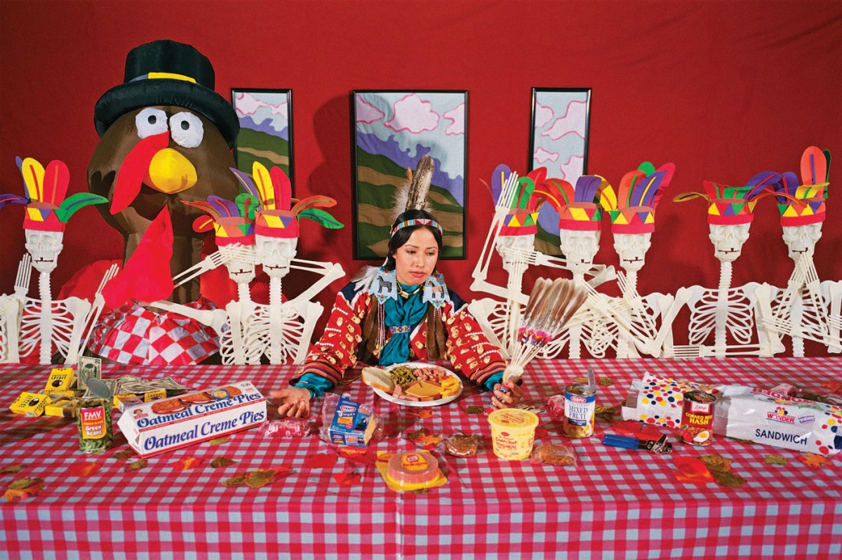
The next image, The Last Thanks, offers a more traditionally acceptable style of photography, while staying unflinchingly true to Red Star’s message. It confronts Western presumptions of the first Thanksgiving dinner. Red Star sits dead-center at a picnic table, wearing what appears to be authentic Native-American dress and staring questioningly at the feathered fan in her hand. She is surrounded by objects which commodify Native American culture as related to the concept of Thanksgiving. On either side of her is a line of anatomical skeleton models adorned with fake feathered headdresses, the sort of construction paper DIY almost every child in the United States has been made to craft at some point in their early education. One seat at the table is reserved for a giant inflatable turkey wearing a novelty pilgrim hat. The table itself is adorned with the plastic, red-checkered cloth which is cheapest and most widely accessible to Americans.

The table is littered with highly processed food such as pre-packaged Oscar Meyer bologna, Little Debbie Oatmeal Cream Pies, canned green beans, Wonder Bread, and Kraft singles. Like dumbed-down stereotyping of Native American culture, we have commodified our food to make it cheaper, more convenient, and easier to swallow. This may also allude to early indigenous hunting practices, where hunting was a way of live and a means of survival that necessitated using all parts of the animal. This mentality promoted respect of the animal which had died to provide them sustenance. In contrast, much of the meat we eat today hardly seems to have come from an animal at all.

Another very intentional pile of items sits at one corner of the table. Several cigarette boxes are strewn about. They are American Spirits, a brand whose logo helped to popularize the image of a tobacco-smoking Native American man. This brand is known for utilizing the stereotypes and iconography of Native Americans to promote the perception that their cigarettes are more ethically-sourced and natural. In reality, the brand is still peddling a carcinogenic product with zero affiliation to any American Indian groups[4]. Beside the cigarette boxes is a pile of paper money, perhaps a reference to Native Americans as gamblers and their culture as an avenue of gambling for Westerners. The prominence of casinos was made possible through Indian reservation laws which existed independently of state laws[5]. As a result, many Native Americans are perceived as greedy facilitators of gambling, an undeniably dangerous habit. However, this practice is no more dangerous nor complicit than the culture surrounding alcohol consumption across the United States. It is one of the few ways Native Americans were able to gain a leg up in the wake of colonization and the resulting loss of their land and people.

To non-Native Americans across the United States, Thanksgiving is just an excuse to eat turkey and visit extended family. The concept of the First Thanksgiving, where Natives and colonists supposedly shared a pleasant meal together to celebrate their budding relationship, is just watered down history for the sake of easier consumption by children and non-Natives. In truth, there was no such event. The First Thanksgiving was no more than a story told by President Lincoln to ease the minds of Americans during the time of political unrest which surrounded the Civil War[6]. The title of this piece, The Last Thanks, applies a darker implication to our celebration of the holiday, implicating it as a tool for the erasure of American history as it relates to the Native American experience.

The Last Thanks is a more fully realized product of Wendy Red Star’s artistic vision. It pokes fun at numerous aspects of white Americans’ misrepresentation of Native American culture, tying it all together with a strong cultural reference (the First Thanksgiving) which is recognizable to Natives and Westerners alike. It also provides a more comprehensive deconstruction of Native American stereotypes, including use of the Native American image to promote sales for non-Native businesses. WhileTwin Peaks or Bust #9 offers a comical yet scathing critique on the over-sexualization of Native Americans, it is less hard-hitting as a result. It’s also less visually appealing as a result of its subject matter. Red Star creates her strongest work when she employs her signature satire while still creating highly-referential and visually coherent art.


Images Referenced

Twin Peaks or Bust #9
The Last Thanks


Sources

  1. Thompson, Chuck. “Wendy Red Star and the Indigenous Voice – C&I Magazine.” Cowboys and Indians Magazine. January 30, 2018. Accessed March 26, 2019. https://www.cowboysindians.com/2018/01/wendy-red-star-and-the-indigenous-voice/.
  2. Beck, Abaki. “Decolonizing Photography: A Conversation With Wendy Red Star.” Aperture Foundation NY. December 14, 2016. Accessed March 26, 2019. https://aperture.org/blog/wendy-red-star/.
  3. Alchin, Linda. “The Tomahawk.” Native Indian Tribes. January 16, 2018. Accessed March 26, 2019. https://www.warpaths2peacepipes.com/native-indian-weapons-tools/tomahawk.htm.
  4. “American Spirit Cigarettes: Not Healthy and Not Native.” Ethical Shopping. Accessed March 26, 2019. http://www.ethicalshopping.com/food/packaged-products/american-spirit-cigarettes.html.
  5. Israel, David K. “10 Things You Need to Know about Indian Reservation Gambling.” Mental Floss. July 08, 2010. Accessed March 26, 2019. http://mentalfloss.com/article/25137/10-things-you-need-know-about-indian-reservation-gambling.
  6. Toensing, Gale Courey. “What Really Happened at the First Thanksgiving? The Wampanoag Side of the Tale.” Indian Country Today. November 24, 2017. Accessed March 26, 2019. https://newsmaven.io/indiancountrytoday/archive/what-really-happened-at-the-first-thanksgiving-the-wampanoag-side-of-the-tale-iTFzfinx_Eiclx573os-yg/.


Antony Gormley: Spirituality and the Body

Antony Gormley is a sculptor who is widely acclaimed for his installations that investigate the human body and condition. Throughout his artistic career, Gormley has been awarded many prizes, including the Turner Prize in 1994, the South Bank Prize for Visual Art in 1999, and the Bernhard Heiliger Award for Sculpture in 2007, among many more. Gormley critiques the human-centric beliefs of Catholicism, with the beliefs of cosmology where the human presence is seen as irrelevant to the greater whole. Continue reading →

Artificial Intelligence or Intelligent Artifice?

Artificial Intelligence is an emerging medium in the contemporary art world. Only recently has technology improved enough to allow the creation of algorithms capable of preforming complex tasks like generating an original image. AI art is pivotal within the history of contemporary art because it gives artists a new medium by which to create unique works, and a new framework through which they can explore and extrapolate upon on the role of the artist in the creation of a work. The Bauhaus idea of the artist as an engineer is invoked, as to code AI one must be intensely familiar with computer science and coding. It also allows artists to further explore ideas of randomness, iteration, and artistic authorship that the Abstract Expressionists and Surrealists experimented with before them. Continue reading →

Chiho Aoshima – “Chiho in the City Glow”

Debates centering around the necessity of attending art school in the digital age have recently surged across all online spheres, but art school purists may’ve met their match in the provocative and inspired works of Economics major turned pop artist Chiho Aoshima. Aoshima taught herself how to illustrate digitally, and after having work featured in Takashi Murakami’s Tokyo Girls Bravo,was invited to work in his factory as part of the Kaikai Kiki Collective. Murakami, founder of the Japanese post-modern Superflat art movement, would act as a surrogate professor in her artistic endeavors.[1] Aoshima’s career is proof that ambition and a compelling artistic vision are all one needs to achieve success in the arts.

After finding her place among the well-known KaiKai Kiki Collective, Aoshima would go on to have works included in the Ackland Art Museum in Chapel Hill, the Museum of Contemporary Art in Chicago, the Carnegie Museum of Art in Pittsburgh, and the Seattle Art Museum.[2] This acclaimed work would inspire a collaboration with famed Japanese designer Issey Miyake on his 2003 Spring/Summer collection.[3] Other high-profile projects include a series of works which was featured in numerous ad-spaces throughout the Union Square subway station in New York, and a 2005 solo show in which she presented a 5-screen 7-minute animation piece along with her first sculptural piece.[4] While the transition from confused university student to successful artist may appear seamless on Aoshima’s resume, her unconventional path was, in reality, difficult to navigate.

Aoshima struggled considerably in her time as an Economics student, having been quoted as saying “When I was going to university, (Department of Economics) I was bored to death, even when I was hanging out with my friends. I was eager to create something but didn’t know what to create, every day time passed so slowly and I felt like I was going to die.Since I have had that experience, even in situations where I’m extremely busy and don’t have the time to sleep, I can still think to myself ‘it is better this way than to have nothing to do.”[5] Although she majored in economics, she wasn’t sure what she wanted to do and didn’t feel overly attached to her studies. Instead, she took on a number of part-time jobs to keep her mind busy. One, a job in the graphic design department of a company, required a basic knowledge of Adobe Illustrator which she would learn through her colleagues. From there, she taught herself how to create art with the program and fell in love with the medium.

Much of her thought process can be discerned through her charming use of words. When asked to describe her inspiration, she states, “My work feels like strands of my thoughts that have flown around the universe before coming back to materialize.”[6] It’s evident that she gives ample thought to every piece she creates, easily breathing life into them through her fanciful imagination and conviction of character. In an interview for TimeOut Tokyo, Aoshima further displays her thoughtful nature when asked what initially intrigued her about the relationship between mankind and nature, a common thread throughout her work. Aoshima responded that, “In a big city like Tokyo, it is difficult to get in touch with nature. But in cemeteries, you can see insects, cats and other animals running around amid wild trees and bushes. I like to think of them as oases in the middle of the concrete jungle.”[7] Clearly, Aoshima is far too introspective a person for these thoughts to be contained, and they have been beautifully realized through her art.

Aoshima’s work is sophisticated and intentional, never shying away from obscure or disturbing imagery, yet maintaining pleasantly balanced composition and use of color. Her work is true to the Superflat genre, which is often associated with criticism of post-war Japanese culture, including consumerism and the sexual fetishization of young girls.[8] In pieces like City Glow, Aoshima shows off an astute ability to marry the synthetic and natural world. Flora and fauna are set against a night skyline, the buildings warped to resemble young girls with eerily glowing eyes. She questions the ability of mankind, nature, and the spiritual world to coexist and imagines what our reality might resemble in a utopian future where these elements have collided.[9] In a number of other pieces, she takes to creating surreal and intriguing worlds inhabited by young girls. These young girls, while illustrated in a traditionally cute anime style, are in many cases unclothed and in compromising positions. All the while appearing unbothered and docile, the grotesque way these girls are sometimes presented calls into question their over-sexualization within popular culture and media and its disturbing implications. Aoshima’s work resembles traditional Japanese ukiyo-e art in its use of flat colors and bold, thick lines. Together with her use of bright colors and cartoonishly cute depictions of people and objects, Aoshima’s style itself contrasts with her often nightmarish subject matter.


Images Referenced

City Glow


Sources

  1. https://web.archive.org/web/20141114070909/https://www.blumandpoe.com/sites/default/files/press/Juxtapoz0106.pdf
  2. http://www.artnet.com/artists/chiho-aoshima/
  3. http://english.kaikaikiki.co.jp/artists/list/C6/
  4. http://english.kaikaikiki.co.jp/artists/list/C6/
  5. https://web.archive.org/web/20150504060230/http://magazine.saatchiart.com/culture/reports-from/los-angeles-reports-from/interview_chiho_aoshima
  6. http://english.kaikaikiki.co.jp/artists/list/C6/
  7. https://www.timeout.com/tokyo/art/interview-chiho-aoshima
  8. http://www.artnet.com/Magazine/features/drohojowska-philp/drohojowska-philp1-18-01.asp
  9. http://www.seattleartmuseum.org/chiho

Exploring Automatism

Surrealism is an art movement that took Europe by storm in the 1920s. The intriguing yet controversial subject matter would influence art styles to come. One art movement that greatly influenced by Surrealism was Abstract Expressionism, a movement that was founded twenty years after Surrealism. Abstract Expressionism was an American art movement that focused on applying automatic drawing and painting as a form of expression. Although both art movements have vastly different appearances, the fundamental core of both are identical. Continue reading →

Purification

De Stijl remerges almost half a century later in the Minimalist art movement, stripped from its fundamental depths and classic red, blue and yellow palate. Instead, Minimalism takes on the classic shapes and lines to redefine the purest abstraction. The attempt to remove all recognizable aspects in our life is displayed through Minimalism’s clarity, much like De Stijl’s harmony: “I wish to approach truth as closely as is possible, and therefore I abstract everything until I arrive at the fundamental quality of objects,” Piet Mondrian once said. Continue reading →

James Turrell at the MASS MoCA – Existential Crisis with a Queue

James Turrell’s Into the Light exhibition at MASS MoCA is a must-see exhibition. The artwork on display is jaw-dropping both visually and intellectually. James Turrell doesn’t just deconstruct light, but the very nature of seeing. While slightly hindered by the labyrinth-like venue, the mind-numbing wait to see certain works, and the lack of educational value, Into the Light is an extraordinary exhibition that must not be missed. Continue reading →

Dada vs. Neo-Dada – Contextualizing Contemporary Art

The Dada art movement or “Dadaism” began around 1914 in Europe. The movement was itself created in reaction to World War 1, as artists began to question the society that had allowed the atrocities of the war to occur (Dada 2019, par. 1). They placed most of the blame upon conformity and traditional values in both art and society, and therefore sought to completely reject traditional approaches to art. In this way Dada could be considered an art movement which embraced “anti-art” (Dada 2019, par. 3), and was framed as a critique on society. It accomplished this through emphasis upon the message conveyed by the art rather than just it’s appearance or façade. A major art concept popularized by Dada artists in the early 20th-century was the readymade: an “ordinary article of life” stripped of its traditional uses and significance and presented so as to create a “new thought for that object” (Ray and Duchamp 1917). The most famed example of the readymade is Marcel Duchamp’s Fountain. Duchamp submitted a signed urinal to an art exhibit in New York City and was promptly denied inclusion in the exhibition. Fountain became a huge symbol for the Dada art movement as a whole. By effectively removing the urinal’s usefulness, the purpose of the object became entirely aesthetic and Marcel believed it should therefore be considered art. This brought up a common thread throughout the Dada art movement: that the artist themselves defined what should be considered art. The act of choosing and labeling a “readymade” object for presentation as art was just as much an act of creation as a painting or handmade object would be. Fountain epitomized Dada’s rejection of conventional art practice, and many found it to be debase and meaningless as a result. Nonetheless, it has had an immense impact on art throughout the 1900’s and into the modern day.

Decades later, the 1950’s saw a resurgence of the Dadaism style in what was coined “Neo-Dada”. It began and ended in America alongside the Pop Art movement, meaning Neo-Dada drew from both Dada and Pop Art. Pop Art, in many ways exemplifying commercialism and conformity, was a stark contrast to the core principles of Dada, which offered criticism of these same principles. Some former Dada artists didn’t see Neo-Dada as an homage to Dada, but rather a derivative – a less impactful copy. While Dadaism was a rejection of traditional artistic form and practice, Neo-Dadaism was a rejection of art altogether. It leaned on absurdity and often seemed to have no meaning or message at all. Although some pieces might’ve appeared absurd or random upon first glance, at the heart of Dada artwork was a message which rejected societal norms and the boundaries set for what could be considered art. To some, Neo-Dadaism was absurd art for the purpose of absurdity, stripped of the underlying message behind its predecessor.

Neo-Dadaists, on the other hand, believed their art to have meaning through the viewer’s interpretation (Neo Dada 2019, par. 5). They accepted that art could have multiple meanings or no meaning at all, and placed more emphasis upon anti-art and anti-aesthetic than Dada had. Their work juxtaposed absurd imagery with modern materials and Pop Art to effectively question their relationship or lack thereof (Chilvers and Glaves-Smith 2009). Neo-Dadaism expanded upon the somewhat paradoxical nature of Dada. One such example is Ushio Shinohara’s “Ashura” (“Ushio Shinohara” 2019), a sculpture made from found objects. The found objects are assembled so as to depict a cartoonish man with several extra appendages: one holding a sword, another a flower, two more gripping the handlebars of the rusted-looking motorbike he sits atop. Segments of the piece are garishly painted in the same bright colors one might see in an Andy Warhol piece, while others retain their naturally dingy appearance. These found objects (often literally discarded trash) earned much of Shinohara’s work the label “junk art” (Lansroth 2015, par. 6), much like Duchamp’s repurposed urinal may’ve been regarded by some in its day. It is the inherent contrast between these aesthetically derelict found objects and the neon colors that accompany them which add another layer to fundamental Dadaism and create something entirely new.


Images Referenced

Fountain
Ashura


Sources

Chilvers, Ian and John Glaves-Smith. A Dictionary of Modern and Contemporary Art. Oxford University Press (2009), p. 503.

“Dada Movement Overview.” The Art Story. Accessed February 12, 2019. https://www.theartstory.org/movement/dada/.

Lansroth, Bob. “10 Neo Dada Art Pieces That Influenced and Shaped This Groundbreaking Art Movement.” Widewalls, October 3, 2015. https://www.widewalls.ch/neo-dada-artworks/.

“Neo-Dada Movement Overview.” The Art Story. Accessed February 12, 2019. https://www.theartstory.org/movement-neo-dada.htm.

Ray, Man and Marcel Duchamp. “The Richard Mutt Case.” Edited by Marcel Duchamp. The Blind Man, May 1917.

“Ushio Shinohara | Ashura (2014) | Available for Sale | Artsy.” 11 Artworks, Bio & Shows on Artsy. Artsy. Accessed February 12, 2019. https://www.artsy.net/artwork/ushio-shinohara-ashura.