The Importance of Documentary Photography

         Photography has been used to document important moments for as long as cameras have been around. However, it has begun to transform into a contemporary art form in recent years. With picture-focused social media sites like Instagram and Snapchat being as popular as they are, photography is constantly changing and becoming more integrated into our lives everyday. We get to see into people’s daily lives, and there has been a shift towards desiring authenticity and realness. Documentary photography captures these real everyday events that happen in people’s lives. Documentary photography is a broad term, but the National Galleries Scotland describes it as, “…art which captures a real moment, conveying a message about the world. As opposed to photojournalism, which concentrates on breaking news events, it typically focuses on an ongoing issue or story seen through a series of photographs, drawing attention to difficult or dangerous world issues which require some form of remedial or political action.” Documentary photography can be about anything, as long as it is centered around people. Through this art form, we can learn about history, social issues, and feel connected to people we may not even know in real life.

James F. Gibson. Contrabands at Headquaters of General Lafayette, 1862. Photograph; 11.5 x 15 cm. Liberty of Congress, Washington, D.C. Image by Library of Congress Prints and Photographs Division. 

         Documenting important events used to only happen through writing. When cameras were first invented in the early 19th century, people saw this as a new way to pass on pieces of history. The earliest record of documentary photography dates back to the Civil War as this was the first big historical event since the emergence of the camera. There are a plethora of photos of the Union and Confederate soldiers, battles, slaves and ordinary life. One photograph titled Contrabands at Headquarters of General Lafayette shows a group of escaped enslaved people holding wash basins standing in front of a line of soldiers who have their arms crossed, and they are all posed in front of an old house, assumingly owned by General Lafayette. General Lafayette was the Confederate Army general, and it is implied that the soldiers had just captured the slaves standing in front of them. Reading about what the Civil War was like can paint a vague picture in your mind, but photographs like these bring on a new perspective. With documentary photography, people could see the realities of it with their own eyes. 

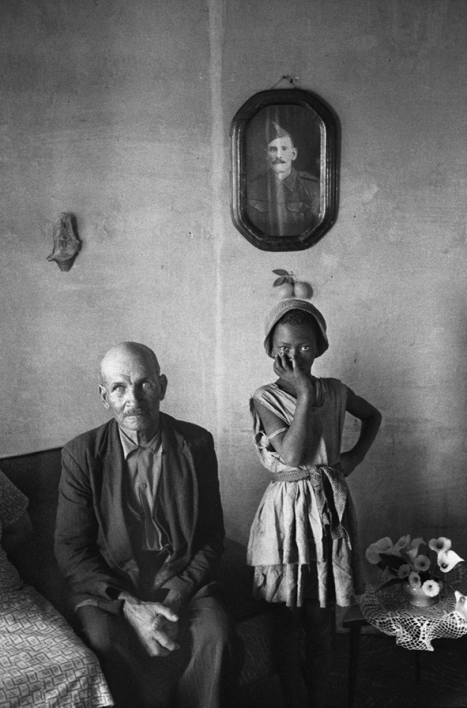
        Knowing how powerful documentary photography can be, many photographers decided to use it to inspire social change. David Goldblatt was a South African photographer who documented the effects of apartheid on both Black and White people. To describe the aim behind his photography he once said, “I was very interested in the events that were taking place in the country as a citizen but, as a photographer, I’m not particularly interested, and I wasn’t then, in photographing the moment that something happens. I’m interested in the conditions that give rise to events.” One photograph titled A plot-holder with the daughter of his servant, Wheatlands, Randfontein (1962) depicts an older White man sitting next to a young Black girl. It is clear from this picture they are not close with each other. The man is clasping his hands together while the girl is standing with one hand covering her mouth. They both look visibly uncomfortable standing close to each other. This image illustrates the tension that apartheid has created between everyone. With social media, using photography to spread awareness of social issues has become the norm. In recent events, the riots and peaceful protests that took place after the police killing of George Floyd, an unarmed Black man in May 2020 brought on many powerful photos. For example, protesters in Minneapolis where the killing took place set multiple public buildings on fire in retaliation. In one photo, there is a multi-story building engulfed in flames with billows of smoke coming from the top. There are also two people running away from the building. This picture and others like it went viral, and brought more awareness to the severity of George Floyd’s death and more protests and riots around the U.S. followed suit.

David Goldblatt. A plot-holder with the daughter of his servant, Wheatlands, Randfontein, 1962. Gelatin silver print; 21 × 14.1 cm. The Art Institute of Chicago, Chicago, IL. Image by Huis Marcielle.

         Being able to connect with people like David Goldblatt did is an important part of being a documentary photographer. Not everyone will just allow a random stranger to take their picture. Humans of New York is a photoblog turned Instagram account that focuses on ordinary people’s lives. For this project, photographer Brandon Stanton and his team interview random people off of the street and take casual photos of them. They are never planned or overly edited, and this captures the beauty of everyday people. The subjects are allowed to talk about whatever they want in these interviews, and some people even tell their life story. It gives a sense of humanity to people who you may not know. Photographer Hannah La Follette Ryan has a similar mission with her blog, although she does not usually talk to the people she photographs. Like Brandon Stanton, Ryan also uses Instagram for her documentary photography on the page @subwayhands. Each of her photos is a different pair of hands, or multiple pairs in some cases. Set in a random New York City subway, her subjects are unaware that their hands are being photographed. Journalist Helen Rosner who interviews Ryan states, “The hands that La Follette Ryan captures tell dense emotional stories; in their poses and grips, they take on the surreal semi-humanity of sculpture… They also, over months and years, tell collective stories of what we wear and carry: trends in manicured nails, watches, and rings; new models of phones and headphones. But the story told in her latest photos came on suddenly and is all-encompassing—a collective, simultaneous adjustment in how we interact with the city and with one another.” Although hands may not seem important in pictures, they are. People use them for everything, and they are a huge part of conveying body language. Through her photos, Ryan and viewers of her art and can connect with people without even saying a word.

        Documentary photography is centered around people and their lives, whether they are extravagant or mundane. Its importance lies in the fact that it holds pieces of history, inspires social change, and helps us to feel more connected to others.

Sources

Arnold, Brooke. “What is Documentary Photography.” Modula. Last modified December 2, 2021.  https://wp-modula.com/what-is-documentary-photography/ 

ArtNet. “David Goldblatt.” ArtNet. Accessed December 13, 2021. http://www.artnet.com/artists/david-goldblatt/

Gibson, James F. Contrabands at Headquaters of General Lafayette. 1862. Photograph; 11.5 x 15 cm. Liberty of Congress, Washington, D.C. https://www.loc.gov/item/2014646902/

Goldblatt, David. A plot-holder and the daughter of a servant, Wheatlands, Randfontein. 1962. Gelatin silver print, 21 x 14.1 cm. The Art Institute of Chicago, Chicago, IL. https://www.artic.edu/artworks/258962/a-plot-holder-with-the-daughter-of-his-servant-wheatlands-randfontein-transvaal

Kuroski, John. “America’s Darkest Hour: 39 Haunting Photos Of The Civil War.” Ati. Last modified February 24, 2020.  https://allthatsinteresting.com/civil-war-photos#2.

National Galleries Scotland. “Documentary Photography.” National Galleries. Accessed on December 13, 2021. https://www.nationalgalleries.org/art-and-artists/glossary-terms/documentary-photography.

Rosner, Helen. “The Anxious Hands of New York’s Subway Riders in the Face of the Coronavirus.” The New Yorker. March 14, 2020. https://www.newyorker.com/culture/photo-booth/the-anxious-hands-of-new-yorks-subway-riders-in-the-face-of-the-coronavirus.

Woltman, Nick. “Protests erupt in Twin Cities over death of George Floyd.” Twin Cities. Last modified May 28, 2020. https://www.twincities.com/2020/05/27/2nd-night-of-violent-protests-over-minneapolis-mans-death/.

Art In Focus: Women from the Center Is Worth the Visit

Vanessa Bell. The Artist in her Studio, 1952. Oil on canvas; 24″ x 20″. Paintings and Sculpture Collection at Yale Center for British Art, New Haven, CT. Image by Yale Center for British Art.

        The Yale British Art Gallery’s Art in Focus: Women from the Center is an exhibit that took place from January 14th, 2021-October 10th, 2021. It was curated by current Yale University students Emma Gray, Sunnie Liu, Annie Roberts, Christina Robertson, and Olivia Thomas. According to the curators the exhibit is, “Inspired by Yale University’s celebration of 50 years of coeducation in Yale college and 150 years of coeducation in Yale graduate programs, Art in Focus: Women From the Center highlights women artists whose inventive art practices have enabled them to stake out space in the art world.” An exhibit like this is very important, because it showcases the importance of diverse female representation in art. When discussing art history, women artists, especially women of color, are usually left out of the picture and men are in the forefront. Finally, women of all backgrounds are taking the stage and are finding their place in the art world. One unfortunate downside of the exhibit is that it felt incomplete. Walking around, there seemed to be something missing, as if some pieces were taken down. However, the artwork that was showcased makes up for this. 

        One of the first things that is noticeable about the exhibit is that it is more diverse than most. The art world is notorious for not being very inclusive. For many years, women and people of color artists have been excluded from art museums. According to a 2018 study done on diversity in museums, researchers found that in 18 major art museums, 87% of artists represented were male, and 85% were White. In this exhibit, there are pieces from artists who are women of color such as Joy Gregory, a Black woman, and Rina Banerjee who is Indian American. Often, non-white artists are not showcased as much in art galleries; especially in galleries that focus on British art, where work from white artists is usually prioritized. Yale made a genuine effort to include women from different ethnicities, which is appreciated.

        The stand-out part of the exhibit was Women as Muses. The female muse is the most prevalent theme in Western art. Throughout history, muses have been idealized and objectified by the male gaze, but these works challenge our understanding of the relationship between the artist and the muse. Often in Western art, artists’ muses (who are mainly women) are subject to being seen purely as objects. The onlooker does not see the muse as a whole person, but instead, only someone to gawk at and admire. Muses can also be used for male artists to project their sexist feelings onto. An example of this would be Pablo Picasso and the many women who inspired his works. Les Demoiselles d’Avignon (1907) which translates to “The Young Ladies of Avignon,” is a painting by Picasso that shows unflattering depictions of his five female subjects, who worked as prostitutes. The ladies are posed naked together, their bodies are abstract form, and their faces are deformed with traditionally masculine features. This work has been criticized for being dehumanizing to the women, especially because of the stigmatization around sex work in the 1900s. When discussing the meaning behind the painting, Rachel Higson states, “In Les Demoiselles, the women working in the brothel have angular vaginas and powerful poses expose the dangers of liberated female sexuality. This painting is about women, not for women—a formula on which so many patriarchal institutions rely. The phallic orientation of the pear and apple at the bottom center of the canvas reveals how exposed the genitalia and in essence the male viewer is when up against an independent woman.” Many people feel that Les Demoiselle d’Avignon and his other works with female subjects tap into Picasso’s fear of women’s sexual freedom.

Neeta Madahar. Sharon with Peonies, 2009. Chromogenic print on photographic paper; Sheet: 39 3/4″ × 30″ and Image: 34 7/8″ × 28″. Prints and Drawings Collection at Yale Center For British Art, New Haven, CT. Image by Yale Center for British Art. Photo by Neeta Madahar.

        In Women as Muses, female artists are reclaiming their power and depicting themselves through their own gaze, also known as the feminine gaze. Vanessa Bell’s 1952 painting The Artist in her Studio shows the artist herself sitting on a chair in front of an easel and canvas looking back at the viewer. She is holding paint brushes, suggesting that she is about to paint something, or is in the process of doing so. The color palette is muted, giving the painting a quaint and still feel. Bell perhaps was inspired by looking in the mirror and decided to paint herself. She may have also wanted to showcase what her painting process looks like. Another standout piece in the exhibition is Neeta Madahar’s Sharon with Peonies (2009) This piece is a part of a greater collection of works called Flora, which contains seventeen images of Madahar’s friends. She describes the goal of this project as, “The portraits, shot in a style reminiscent of 1930-50s glamor images, are not concerned with nostalgia, but anchored in the present, aware that fantasy personas are shams that can be superficially occupied and manipulated in front of the camera.” In this photograph, a dark skin Black woman with giant cream-colored peonies in her hair, wearing an asymmetrical blue metallic top. Her head is turned to the side and her eyes are closed, with one of her hands on her chest. Rarely in famous historical pictures and paintings are Black women the muses; this photograph subverts that.        

Women being included in the art discussions is extremely important. A gallery as influential as Yale highlighting women of all backgrounds will hopefully inspire change in the art world. Women in Focus, although small, is worth the trip to the Yale British Art Gallery. There are very compelling artworks, and there is also diversity and representation for all women.

Sources

Bell, Vanessa. The Artist in her Studio. 1952. Oil on canvas. 24″ x 20″. Yale Center For British Art, New Haven, CT. https://collections.britishart.yale.edu/catalog/tms:61974

Brooklyn Museum. “Neeta Madahar.” Accessed on December 13, 2021. https://www.brooklynmuseum.org/eascfa/about/feminist_art_base/neeta-madahar

Higson, Rachel. “Reframing Picasso: Hannah Gadsby and ‘Separating the Man from the Art.’” The Prindle Post. Last modified August 2, 2018. https://www.prindlepost.org/2018/08/reframing-picasso/

Madahar, Neeta. Sharon with Peonies. 2009. Chromogenic print on photographic paper, 39 3/4″ × 30″ and 34 7/8″ × 28″. Yale Center For British Art, New Haven, CT. https://collections.britishart.yale.edu/catalog/tms:81309

Yale University. “Art in Focus: Women from the Center.” Accessed December 13, 2021. https://britishart.yale.edu/exhibitions-programs/art-focus-women-center.

Topaz, Chad M., Bernhard Klingenberg,Daniel Turek,Brianna Heggeseth,Pamela E. Harris,Julie C. Blackwood,C. Ondine Chavoya,Steven Nelson, and Kevin M. Murphy. “Diversity of artists in major U.S. museums.” PLOS One. Last modified March 20, 2019. https://journals.plos.org/plosone/article?id=10.1371/journal.pone.0212852.

Vladimir Kush: Awakening the Subconscious

An exceptional Surrealist painter and sculptor would be Russian-American artist Vladimir Kush. His artwork falls into the Surrealist category for its themes involving awakening the subconscious through juxtapositions, thus the merging of dreams with reality. He states how his works emphasize the use of metaphors. His works involve bright, upbeat, whimsical, creative, subjects rather than dark or destructive ones, invoking the viewer’s imagination and inner child. Because of this, according to his website, “The Cleveland Clinic Neurological Institute’s Lou Ruvo Center for Brain Health uses Vladimir Kush’s intellectual paintings with dementia and Alzheimer’s patients.” In 2011 the artist was awarded the painter of the year presented by Picasso’s granddaughter. Along with his subject matter it makes sense that the euphoric, imaginative, dream state types of subjects are primarily sold through his galleries in Laguna Beach, California, Las Vegas, Nevada and Maui, Hawaii as giclée prints, jewelry, handbags and face masks which are also sold on his website. These locations are on brand for the artist because the vibrant tourist destinations match the embodiment of his artworks.


Vladimir Kush was born in Russia, near the Moscow forest-park, Sokolniki. He began his artistic study and practice as early as age seven, then spending approximately a year at the Moscow Higher Art and Craft School. This time was short lived because he was drafted into the Russian Army. Six months into training, his unit commander encouraged him to use his artistic talent for propaganda posters. Perhaps his artworks to come after were a therapeutic escape from the harshness from training for the Cold War and also claims how during his time in Russia he could not travel due to government regulations thus resorting to the use of his imagination. After his service he finished his education with a degree from the Institute of Fine Arts. Thereafter he created portraits on Arabat Street in Russia to support his family. “In 1987 Vladimir began partaking in his first exhibitions organized by the Union of Artists. In 1990, at an exhibition in Coburg, Germany, almost all of his displayed paintings were sold. After the exhibition’s close, Vladimir flew to Los Angeles, CA, where 20 of his works would be exhibited.” Still working his way up he’d freelance portraits on the Santa Monica pier. His next destination as well as where he currently resides is in Hawaii.

Kush’s African Sonata (oil on canvas, 21 in × 24 in) depicts elephants with giant tubas for faces. With that being the primary focus also included barbary stag, a deer lookalike found in Africa pictured with a harp for antlers. Along the bed of water are Great Egrets also found in Africa which are similar to pelicans. The scene takes place on a desert with volcanoes in the background as well as various brass instruments, (french horn, cymbals) resembling the shape of long yellow grass. Pieces like this encourage viewers and especially children to never stop exploring, pursue interests that make you feel alive, and as well as along with all his works that everything is connected and no idea is too far fetched.


Vladamir Kush. African Sonata, n.d. Giclee on canvas; 21 x 24″. Jacob Gallery collection, Oakville, Ontario, CA. Image by Jacob Fine Art Gallery.


Along with the theme of Kush’s work many of them use a hazy yet sunny, dreamlike landscape as the background. One of his most well known works is Departure of the Winged Ship (circa 2000, oil on canvas, 39 in × 31 in), a staple within Surrealist art published in books and magazines. It is commonly mistaken as one of Dali’s works. It features a large wooden ship stylized to look like the ones from centuries ago and instead of using a cloth sail it is replaced by colorful vibrant butterflies resembling good luck. The top clouds are puffy yet are also illustrated to look curly giving them a whimsical effect. Artistically placed there are also two sets of wings apart from the sail that are on the bottom. Kush’s standard skinny humanoid figures wave goodbye with their fishing nets at the bottom right standing on top of the rocky shore. It’s said to
speak upon the exciting adventure behind a distant voyage.


What makes Vladimir Kush so appealing is the feel good themes of imagination that take the viewer out of the everyday mundane, which is something everyone regardless of background
enjoys. The power to wish and the power of imagination inspires the viewer within their own life and it’s difficult to feel otherwise when looking at his work. Like other surrealist pieces it’s
enjoyable for the viewer to make sense of the quirky juxtapositions and the meaning behind his metaphors. In other words, the unordinary makes the viewer stop and stare and can’t help but want to make sense out of it.

Surrealism: Art of the Subconscious

A beloved art movement, while also groundbreaking when it first came about, is surrealism which emerged during the early twentieth century right after WWI. It’s defined as art that invokes the inner workings of the human psyche or subconscious through juxtapositions creating symbolism. Along with dadaism emerging only a few years before, the symbolic absurdities remained throughout surrealism. The meaning behind the movement (along with expressionism and dadaism) requires higher level thinking for the viewer to understand than previous centuries’ artworks. Surrealism’s goal is to illustrate the merging of dreams with reality, a mystical and intriguing concept for the viewer to make sense of. Examples of surrealist artists include the most well known Salvador Dalí, along with Leonora Carrington.

The meaning behind a surrealist piece is not always obvious and the viewer must dissect it like a puzzle. Keep in mind that interpretation and meaning differ. No matter which era of art the artwork’s interpretation is subjective to the viewer thus having them form their own reaction and opinion. Unraveling the artist’s meaning behind a surrealist work is what makes it so special. Surrealism gives power to the artist to invoke a whole new idea. The meaning behind those pieces were quite literal, unlike surrealist pieces. Even within the more recent preceding years of surrealism the expressionist (art that conveys a feeling) and dada movements’ subject matter were more relatable because groups of people have either felt that emotion or have joked about what’s mainstream. Surrealism opens creative possibilities for the artist to share their distinct, personal, precious dream state.

The first and perhaps most well known surrealist piece is Salvador Dali’s The Persistence of Memory. The landscape background is of his view of the Mediterranean and the Sierra de Rodes from his cottage home. The clocks do not hold their original form as they appear to be melting. The pink matter figure is often interpreted to be Dali himself based on the similar nose structure and which many viewers perceive as flesh to soon be rotting. The fly and the ant correlation at the bottom left of the composition has been thought to speak upon the relation of flies carrying disease which can demolish an ant colony. The meaning viewers find behind it is displayed as grim, in that memories fade. To achieve what is shown on the canvas, before beginning his surrealist works Dali, gained knowledge about the subconscious through Sigmund Freud who had developed the renowned psychoanalysis technique. The artist used what he learned from Freud to do the following, “The year before this picture was painted, Dalí formulated his ‘paranoiac-critical method, cultivating self-induced psychotic hallucinations in order to create art. “The difference between a madman and me,” he said, ‘is that I am not mad.’”1 Thus, accepting his eccentric brilliance caused the pioneering of a whole new art movement. This is similar to Lenora Carrington’s work because the two artists portray an unseen reality.

Leonora Carrington’s intriguing And Then We Saw the Daughter of the Minotaur also comes with lots of symbolism to dissect and put together to unveil its meaning. She was very into mystical concepts such as witchcraft to begin with. Clouds and stars are juxtapositioned underneath the ceiling. A minotaur is displayed with tiny hands performing witchcraft. The boys wearing a cloak could refer to the cloak’s symbolism of their identity being transformed. A rose is displayed that appears to be tampered with, however there’s also white feminine dancing figure with a disproportionately large flower coming from her head with a bright light only shining upon that figure. Nearby there are two white whippet dogs, the only creatures that notice the light, relating to the speculation that animals see spirits that people do not. Throughout the painting are crystal balls scattered. In the background but not centered is the abstract, almost indescribably flowing green figure with a small cross at the top of it. One analysis points out Carrington rewriting the Greek mythology of Theseus conquering the minotaur then travelling the labyrinth of conquering subconscious desires. Carrington does not display the minotaur as conquered and the feminine nuances are not subdued but rather empowered. It’s a surrealistic piece because the story is juxtapositioned but the storyline’s theme about the subconscious. The artist explains that we live in a visual world that changes so much that it’s not worth spending the time that people do to make sense of it, which fits into the lens of a surrealist.

This image has an empty alt attribute; its file name is screen-shot-2021-12-11-at-8.27.46-pm.png
Leonora Carrington. And Then We Saw the Daughter of the Minotaur, 1953. Oil on canvas; 23 5/8 × 27 9/16″. Museum of Modern Art collection, New York, New York. Image by Museum of Modern Art.

There is much to unpack when it comes to understanding the meaning of surrealist artwork. The artist displays a scenario that has not yet been seen by anyone else by using juxtapositions. Dream states allow for this. During the times of the two World Wars when conformity was the norm, producing art that’s subject matter was entirely unique to the artist was controversial but nonetheless gained much attention. It took more than just artistic skill, which was the standard upheld for art beforehand. Surrealism portrays the subconscious, which is incredible since it isn’t tangible.

Bibliography

“Horns of the Goddess: The Minotaur in the Work of Varo, Carrington, and Lam.” Ebrary. Accessed November 15, 2021. https://ebrary.net/153654/psychology/horns_goddess_minotaur_work_varo_carrington.

Lynley. “Symbolism of Coats and Cloaks.” SLAP HAPPY LARRY. October 31, 2021. Accessed November 14, 2021. https://www.slaphappylarry.com/symbolism-coats-cloaks-robes/.

“Salvador Dalí. The Persistence of Memory. 1931: MoMA.” The Museum of Modern Art. Accessed November 14, 2021. https://www.moma.org/collection/works/79018.

Tate. “Surrealism – Art Term.” Tate. Accessed November 11, 2021. https://www.tate.org.uk/art/art-terms/s/surrealism.

“The Meaning of Salvador Dali’s Famous “Melting Clocks” Painting: The Persistence of Memory.” EmptyEasel.com. October 26, 2021. Accessed November 14, 2021. https://emptyeasel.com/the-persistence-of-memory-famous-melting-clocks-painting-by-salvador-dali/#history-of-surrealism.

How Feminism and Women Artists Go Together

A dominant narrative within Western art history is that women are objectified. While that being the common theme for the portrayal of women within fine art history is unsettling, there isn’t a real issue as long as the woman portrayed is comfortable doing so, like Rose from The Titanic. But unfortunately it’s common, especially within the older narrative for the woman to be uncomfortable or even spied on, and is captured by the artist within her facial expression. Now that those disturbing facts are put to light, it’s good to mention that (only) in recent decades women artists are being acknowledged. With that, this essay answers a few questions that feminists seek answers to. What characterizes art made by women about women? It could be anything they want. Does it fit a role? No. Fortunately due to evolution of women’s rights these answers are ones that supports feminist ideology. Any woman who makes her own art empowers herself by doing so. This means whether they prefer to portray their gender as more conservative versus more exposed doing so supports feminist ideology.

Artwork produced by women about women may or may not speak against gender roles. One of the first that addresses it though, is Judy Chicago and Miriam Schapiro’s Womanhouse art installation and performative work in 1972. But of course that doesn’t mean that the female artist depicting a fragile and emotional woman in her work doesn’t support feminist ideologies. Cindy Sherman is a contemporary American artist whose works feature herself and addresses the way women are viewed. She never intended for her work to have a feminist undertone but is glad that feminists appreciate her work and that women find it empowering. Sherman’s work mainly consists of dressing up in costumes and wigs and documenting herself. Her first highly recognized work is her Untitled Film Stills 1977-1980 series. According to the MoMA’s description,

“Cindy Sherman’s Untitled Film Stills is a suite of seventy black-and-white photographs in which the artist posed in the guises of various generic female film characters, among them, ingénue, working girl, vamp, and lonely housewife. Staged to resemble scenes from 1950s and ’60s Hollywood, film noir, B movies, and European art-house films, the printed images mimic in format, scale, and quality the often-staged “stills” used to promote films.”

These photographs of course stirred controversy at the time, and perhaps is the reason why she first gained so much attention. Untitled Film Still #14 from 1978 depicts her as a stereotypical vamp woman. Back in the 50s and 60s the use of this term was popular and was one of many coined by men to stereotype women. It made sure to warn fellow men about such women exuding sexual prowess taking advantage of them through film. The term was used to identify a woman typically with heavy makeup (red lipstick) along with showing more skin than usual to enhance her sex appeal as a means to seduce men and manipulate them. Cindy Sherman knowingly portrays herself as such here, along with a weapon, black dress (the color choice perhaps meaning sinister), and a brazen-faced presumptuous facial expression. What causes the controversy is that men felt unsettled having their counterpart instead of themselves being in control. Sherman portrays that as a female she is conscious of this, thus mocking the 50’s and 60’s film stereotypes throughout the series.

Cindy Sherman continues to take the paradoxes of womanhood and runs with it throughout her career. Her work becomes more and more attention grabbing, unsettling, shocking, and humorous. Pregnant Woman from 1991, does this by discouraging motherhood and of course the housewife notion. Yet another controversy, this work by her was done right after Demi Moore’s pregnant and nude Vanity Fair magazine cover, almost recreating it with the same short hair style. Sherman has messy bedhead short hair, black or brown dilated contact lenses, wears a caked on application of makeup, a soaking wet as well as torn white flannel, and has nipples so inflamed they look in pain. Not only is this not the Western ideology of how men would like to perceive women, but it’s also not what any woman wants to be either. They don’t want to become a demonic creature that is forced to sell her body because the baby’s father left her which is what one could read this as. While humorous, it can also speak upon the serious importance of Planned Parenthood in our world. That is, not bringing life into this world that will struggle to survive.

Cindy Sherman. Untitled (“Pregnant Woman”), 1991. Chromogenic print on Kodak paper; 17″ x 11″. Caviar20 collection, Toronto, Ontario. Image by Caviar20.

To answer the question about what role and characteristics do women artists display, perhaps Cindy Sherman is simply having fun with her work. Perhaps topics such as conservatism versus nudity within the feminist realm are about the woman’s ability to choose whichever empowers herself, no matter what men or what society deems as acceptable for the times. The same goes for women who enjoy being a housewife versus women who enjoy living an independent life. Gender identity and how it’s portrayed is a personal choice. To each their own. That is what feminism means, to the right to choose and allow the freedom of expression within female artists.

Sources

Berne, Betsy. “Studio: Cindy Sherman – Interview.” Tate. Accessed October 28, 2021. https://www.tate.org.uk/art/artists/cindy-sherman-1938/studio-cindy-sherman.

“CINDY SHERMAN “PREGNANT WOMAN”, 1991.” Caviar20. Accessed October 28, 2021. https://www.caviar20.com/products/cindy-sherman-pregnant-woman-1991.

“MoMA Learning.” MoMA. Accessed October 28, 2021. https://www.moma.org/learn/moma_learning/cindy-sherman-untitled-film-stills-1977-80/.

The Prismatic Palette: Frank Vincent DuMond and His Students

The Prismatic Palette: Frank Vincent Dumond and His Students was an exhibition displayed June 19th to October 3rd, 2021 in the Lyman Art Museum in New London, CT. Dumond’s life consisted of illustrating until age twenty three only then to learn the painting tradition of the Academie Julian Paris in 1888. The academy’s alumni are Diego Rivera and Marcel Duchamp. With this education, he then brings back to the U.S. what is known as American impressionist painting, creating his own works and teaching for six decades at the Art Students League. While Impressionism isn’t abstract art, it isn’t realism either. It clearly resembles the subject however, while doing so it romanticizes it by depicting the changes of natural light throughout time during the day. This creates a widened, bolder, and brighter color palette. However, what Dumond is known for throughout his career and teachings is coining the term prismatic palette, a groundbreaking concept which many artists adopted. Dumond taught the renowned Georgia O’Keeffe, Norman Rockwell, and John Marin.

The first thing the viewer notices when walking in the room is Thomas Torak’s Landscape with Rainbow, (2018) Oil on Linen, 20” x 24” this work was done by a student of Frank Mason, whom of which had taken over the prismatic palette teachings of Dumond at the Art Students League. The other thing viewers immediately notice is that there is sound from the video playing. It’s an educational video for oil painting that discusses Dumond’s sense of color theory. It explains how during his education in France he acquired the skill of premixing his oil paints, a prevalent practice done by nineteenth century painters. However Dumond coined the term prismatic palette through his arrangement of colors on the palette. He does this by taking a few parent colors at their full saturation and arranges several light to dark values on each side of them on one palette. The constant principle is that when mixing lights and darks it was more than just adding black and white. In order for it to be prismatic, blue violet would gradually be mixed in for darks and cadmium yellow lemon does the same for lights. Therefore it makes sense that a prismatic palette is used for natural lighting, due to this connection with the natural associations with color through the sun and nighttime. While his learnings occurred during the impressionist era it makes sense how the artist used colors to support the vivid hues found within that movement. Heavily focusing on landscape painting throughout his study as well as teaching, the video also states that he taught his students to keep their premixed paints in a palette that encloses like a box due to potential weather changes. In that same area right next to that educational video screen is an replicated example of the palette-box he’d use with all the premixed paints arranged as mentioned.

This image has an empty alt attribute; its file name is landscape-with-rainbow.jpeg
Thomas Torak. LANDSCAPE WITH RAINBOW, 2018.
Oil On Linen; 20″ x 24″. Lyman Allyn Art Museum collection, New London, CT. Image by https://www.thomastorak.com/workszoom/2679040/landscape-with-rainbow#/.

Also featured within the exhibition is a set of his illustrative paintings that comes in a pair of two. The subject is of east to westward expansion in nineteenth century America. The top one is of the new American settler’s departure from the east coast. The bottom piece is of their arrival in California. This pair of works not only gives the exhibition artistic education but also historical context. Another piece within the exhibition is a landscape of Grassy Hill right in Old Lyme, Connecticut. It gives a sense of his personal life because it was a portrait of his own farmland. The exhibition is inspiring because it not only shows what he is capable of but also presents the talent he brought out in his students as well. There is a watercolor portrait of Winfield Scott Clime on that same Grassy Hill owned by the Dumonds, done by his student Ogden Pleissner from the Art Students League.

This exhibition was presented nicely. It was a typically lit exhibition, with spotlights for each piece and low lighting for the rest of the space. The only criticism perhaps would be that it could’ve had a larger collection of Dumond’s own illustrative works. All in all it captures his life’s work well, not only by presenting it but also explains his sense of color theory, making it highly educational, especially for painters.

Sources

DuMond’s Prismatic Palette in Practice. YouTube. August 16, 2021. Accessed December 5, 2021. https://www.youtube.com/watch?v=1YpPYbDG3tU&t=198s.

“Frank Vincent DuMond.” The Ridgewood Art Institute. Accessed October 23, 2021. https://www.ridgewoodartinstitute.org/our-history-looking-back/frank-vincent-dumond.

“The Prismatic Palette: Frank Vincent DuMond and His Students.” Lyman Allyn Art Museum. Accessed October 23, 2021. https://www.lymanallyn.org/the-prismatic-palette/.

Impressionism Leading into Cubism

The wonderful thing about art over time is that it continues to evolve. While the thought process behind the work may shock the more conventional folks as it is introduced, the movement can go down in history. While the works of Impressionism (this term will include Post-impressionism and Neo-impressionism) may result in a very different image than Cubism, rethinking the pictorial plane is what these movements have in common. The preceding way that an artist would assess their subject would be in a one point perspective, established by Renaissance art. But what makes these two movements remarkable is how multiple viewpoints are captured within the subject. What’s baffling about it is the “how?” behind it, which will be further explained in detail.

The first Impressionist movement took place between 1867 and 1886. Artists that made up this movement were Claude Monet, Pierre Auguste Renoir, Camille Pissarro, Alfred Sisley, Berthe Morisot, Armand Guillaumin, and Frédéric Bazille in France, working off of each other. Impressionism typically captures landscapes and other open spaces that use natural light. Because of natural light this means that over a period of several hours the subject will look different. Therefore painting in this style requires the artist to be very skilled by use of quick thinking and gestural brushstrokes. A great example that plays into that aspect is Bal du moulin de la Galette, 1876, 4′ 4′′ x 5′ 9′′ oil on canvas by Pierre-Auguste Renoir. All in all what every work had in common resulted in an image that was flattened but patterns of bright color and textures were emphasized. Post-impressionism and Neo-impressionism use the main elements already mentioned but vary slightly depending on the artist. These artists include Paul Cezanne, Paul Gauguin, Georges Seurat and Vincent van Gogh.

Cubism is similar to Impressionism in the sense that viewing this subject is not going to be in one fixed state with the result showing multiple perspectives. The movement gained traction through Pablo Picasso and Georges Braque in Paris between 1907 and 1914. Except in Cubism, rather than light affecting the changes in perspective while the artist is working the artist themselves changes their viewing position. Thus the work of Cubism results in multiple combined perspectives from viewing the subject at different angles, demolishing the one point perspective practice established during Renaissance art. Impressionism and Cubism are also similar in that gestural marks must be made that only capture the subject’s essence rather than all its details. Cézanne’s The Basket of Apples, 1893, 5.6 in × 31.5 oil on canvas is an example of Cubism because the viewer can see objects such as the lady finger cookies are stacked but different sides of it are painted with the perspective being changed. The top cookies are more downturned than they would be if they were painted from the same perspective as the bottom cookies. It’s also hard to make out whether or not the basket can keep its balance and not fall. This illusion is created because the basket was painted using more than one perspective.

Pierre-Auguste Renoir. Bal du moulin de la Galette, 1876. Oil on canvas; 4′ 4′′ x 5′ 9′′. Orsay Museum collection, Paris, France. Image by Google Arts & Culture.
Paul Cézanne. The Basket of Apples, 1893. Oil on canvas, 5.6 in × 31.5. Art Institute of Chicago collection, Chicago, IL. Image by CC0 Public Domain Designation.

Because of these movements with Impressionism leading into Cubism the viewer can see that there is more than one way to consider the pictorial plane. Gestural brushstrokes/marks and working quickly is what it takes to achieve these styles, and it takes a very skilled artist to assess their subject in this manner. In the case of Impressionism it’s the moving lights and shadows. In the case of Cubism it’s the basic forms being combined at different angles. Achieving something other than one point perspective was very groundbreaking.

Sources

“Cubism.” Encyclopædia Britannica. Accessed December 04, 2021. https://www.britannica.com/art/Cubism.

Gambardella, Steven. “How Cubism Changed The Way We See The World.” Medium. May 14, 2021. Accessed December 04, 2021. https://medium.com/the-sophist/how-cubism-changed-the-way-we-see-the-world-fb6e6cf09496.

“Impressionism.” Encyclopædia Britannica. Accessed December 02, 2021. https://www.britannica.com/art/Impressionism-art.

The Portrait and Identity

When the average viewer thinks of a portrait they usually think of paintings of the rich and powerful, or of well-dressed and made-up figures, usually for school photos or ones online profiles. Catherine Opie however, transformed the art of portraits, using them as a form of expression that not only investigates someone’s essence, but makes a point of addressing society itself.

Catherine Opie. Mike and Sky, 1993. Silver dye bleach print; 19 1/8 x 14 7/8 in. MoMA.

            The most well known of her portraits are her photographs from the 90’s, documenting queer culture during the height of the AIDS pandemic.[1][2] Mike and Sky, 1993 features two men, one behind the other. They’re both strong looking men, with tattoos, and piercings and yet its clear the two have a relationship. Seeing just one of these men wouldn’t elicit the same reaction but together they create a powerful energy that would fiercely cause a reaction with the viewer at the time.

Catherine Opie. Dyke, 1993. Chromogenic Print; 40 x 30 in. MoMA

Dyke, is very similar, what could be a young man or woman facing away is immediately charged by the word Dyke tattooed on the back of her neck, which forces the viewer to have a reaction whether positive or negative.

Catherine Opie. Gina and April, 1998. Domestic.

Gina & April, 1998 shows two black women in an embrace in bed, caressing one another’s arms and heads, one with her eyes closed, the other looking on softly. Not only does this soft interaction counter racial stereotypes, showing the women as soft, it also counters common lesbian stereotypes, the women are fully dressed and unprovocative, not being manipulated by the fetishistic male gaze.

            Unlike many artists, Opie did not cater to the rich or the male viewer, while some of her portraits are nude, they are not nude in a sexual way, but in a way that is vulnerable, just as most of her subjects are. There is no profound message, no glaring text or pointed titles, just queer people of all shapes and sizes existing and co-existing together. While the subject matter may not seem as important today, it was not nearly as commonplace back in the 90’s, nor was it out there for everyone to see. Opie changed that.[3]


[1] Dazed “How Catherine Opie Transformed the Image of Contemporary America.” 2021

[2] Wallentine “Catherine Opie on Her First Monograph, ‘A Map of My Mind.’” 2021

[3] Shapiro “Catherine Opie – Photographs by Catherine Opie: Book Review by Emily Shapiro.”


Sources

Dazed. “How Catherine Opie Transformed the Image of Contemporary America.” Dazed, July 6, 2021. https://www.dazeddigital.com/art-photography/article/53440/1/how-catherine-opie-transformed-the-image-of-contemporary-america.

Shapiro, Emily. LensCulture, Catherine Opie |. “Catherine Opie – Photographs by Catherine Opie: Book Review by Emily Shapiro.” LensCulture. Accessed October 26, 2021. https://www.lensculture.com/articles/catherine-opie-catherine-opie.

Wallentine, Anne. “Catherine Opie on Her First Monograph, ‘A Map of My Mind.’” Hyperallergic, July 26, 2021. https://hyperallergic.com/664912/catherine-opie-on-her-first-monograph/.

Dada and Surrealism

        At first glance, Dada and Surrealism can easily be mistaken for each other. This is because their styles and motivation behind the art is similar. Both of these movements are meant to make viewers of the art question logic. In her article on Dada and Surrealism, Alice Samusevich writes, “They sought to break down conventions in the arts in order to bring forth a new, improved culture…Surrealism was similar to the Dada movement because it was meant to defy the reason and logic in response to the seemingly unreasonable World War I.” However, if you look past the sometimes questionable, outlandish pieces both movements have to offer, you’ll find that their emergence, styles, and messages are different in a lot of ways. 

        Dada first emerged in Zurich, Switzerland 1914 as a result of the end of the first World War. As what happens with the end of most wars, countries have to rebuild and there is generally a more serious atmosphere. Many artists started to grow unhappy with the monotony of everyday life. Art historians at the MoMA explain, “For the disillusioned artists of the Dada movement, the war merely confirmed the degradation of social structures that led to such violence: corrupt and nationalist politics, repressive social values, and unquestioning conformity of culture and thought… Dada artists sought to expose accepted and often repressive conventions of order and logic, favoring strategies of chance, spontaneity, and irreverence.” Dada artists were often anti-establishment, left leaning individuals. They proudly rejected the meaning of traditional art and what they felt it stood for. Often, the art world and artists can be seen as pretentious, elitist, and so on. Dadaists, being against the bourgeoisie, rejected these ideas.

Marcel Duchamp. L.H.O.O.Q., 1919/1964 Rectified readymade. Pencil on reproduction; 30 x 23 cm. Collection of the Israel Museum, Jerusalem The Vera and Arturo Schwarz Collection of Dada and Surrealist Art. Image by Israel Museum. Photo by  Avshalom Avital.

        L.H.O.O.Q (1919) by leader of the Dada movement, Marcel Duchamp, depicts the Mona Lisa painting by Leonardo DaVinci with a handlebar mustache and goatee. This is known as a “readymade,” which gives new life and purpose to everyday objects. According to Dr. Charles Cramer and Dr. Kim Grant, “The readymade is divorced from its ordinary context and use value and re-presented in an art world context. This encourages us to encounter the object in a different way.” The piece is meant to be a comical critique of art in general. The Mona Lisa is one of the most iconic paintings in history, today it is worth about $850 million. By making a satirical piece of this piece, perhaps Duchamp was finding the humor in a painting that many people take so seriously. 

        As Dada art began to dwindle in popularity, Surrealism emerged in Paris in the early 1920s. Similar to Dada, Surrealism was also a response to the first World War. In his article on surrealism, art historian James Voorhies says, “The cerebral and irrational tenets of Surrealism find their ancestry in the clever and whimsical disregard for tradition fostered by Dadaism a decade earlier.” Surrealists wanted to introduce different ideas, and to inspire people to think beyond what they think they know about the world. 

        Unlike Dadaists, Surrealists consider themselves to be real artists. On the other hand, Dadaists’ art is meant to mock the art world; it is anti-art. Surrealism emerged not to mock, but to make people question rational thought. Surrealists’ goal was to make thought provoking work that makes you see the world in a new perspective. Also, although Dada and Surrealism came about because of World War I, dada was a negative and critical expression of feelings, while surrealism was a more positive expression. In other words, Dadaists used their art as an outlet to critique, and surrealists used their art to simply question. One example of this style of art is Lobster on Telephone (1938), a sculpture by Edward James and Salvador Dalí. The title describes the appearance of the work perfectly; there is a plastic, red lobster on top of an black rotary phone. These are two vastly different things that the average person would not think would go together. When asked why he created the piece, Dalí said, “I do not understand why, when I ask for a grilled lobster in a restaurant, I am never served a cooked telephone.  I do not understand why champagne is always chilled and why on the other hand telephones, which are habitually so frightfully warm and disagreeably sticky to the touch, are not also put in silver buckets with crushed ice around them.” James and Dalí wanted viewers of the piece to question its purpose; was there even meant to be a purpose? Does all art have to have meaning or can it just exist for art’s sake?

Salvador Dalí. Lobster on a Telephone, 1938. Steel, plaster, rubber, resin and paper; 7″ x 13″ x 7″. Tate Modern, London, England. Image by Tate Britain. Photo by Salvador Dali, Gala-Salvador Dali Foundation/DACS, London 2020.

        Known for their humor and not taking themselves too seriously, Dadaism and Surrealism have many things in common and it is easy to see why they are often mistaken for each other. They also have many differences as well; Dada was more negative, meant to critique, and was anti-establishment. On the other hand, Surrealists were more positive, meant to inspire questions, and they were less involved in politics when it came to their art. Despite their similarities and differences, they are two powerful art movements that are still respected and discussed today.

Sources

Cramer, Dr. Charles, and Dr. Kim Grant. “Dada Readymades.” Khan Academy. Accessed on December 13, 2021. https://www.khanacademy.org/humanities/art-1010/dada-and-surrealism/dada2/a/dada-readymades.

Ducahmp, Marcel. Pencil on reproduction, 1919/1964. Israel Museum, Jerusalem. https://www.imj.org.il/en/collections/199796

MoMA. “World War I and Dada.” MoMALearning. Accessed on December 13, 2021. https://www.moma.org/learn/moma_learning/themes/dada/ 

Riggs, Terry. “Lobster Telephone.” Tate Britain. Last modified March 1998. https://www.tate.org.uk/art/artworks/dali-lobster-telephone-t03257 

Samusevich, Alice. “Dada and Surrealism.” Eportfolios@Macaulay. September 23, 2009. https://eportfolios.macaulay.cuny.edu/weinroth2009/2009/09/23/dada-and-surrealism/.  

Voorhies, James. “Surrealism.” Met Museum. Last modified October 2004. https://www.metmuseum.org/toah/hd/surr/hd_surr.htm

An Explosion of Color

While the Fauvism and Pop Art movements happened nearly fifty years apart from one another, the two movements occasionally link together with striking similarities, in use of color, iconography, and brush work. While Fauvism itself was about the strong use of color and shape over realism in color and form, Pop Art used those lessons in a way that makes it such a well known movement even today, without Fauvism, it is likely that Pop Art would have looked much different.

Andy Warhol. Marilyn Diptych, 1962. Silkscreen ink and acrylic paint on two canvases; Each 2054 x 1448 x 20mm. Aspen Art Museum, Aspen USA.
Kees Van Dongen. Portrait de femme. Oil on Canvas; 61 x 49.5 cm. Christie’s, New York.

            When discussing Pop Art, to most people Andy Warhol comes to mind. Considered to be one of the founders of the movement[1], his use of bright color and repetition added to the signature style. Comparing his piece Marilyn Diptych to Kees Van Dongen’s, Portrait de femme can help show the styles similarities, the bright colors, heavy eyeliner and mascara and plump lips, the barely there toning in the faces and the bright orange backgrounds, contrasting with other shades of yellow and cyan to make all the colors pop. Despite the two pieces being two completely separate mediums, they call to one another.

Andre Derain. Waterloo Bridge, 1906. Oil on Canvas; 80.5 x 101 cm. Museuo Nacional Thyssen-Bornemisza, Madrid.
David Hockney. Portrait of an Artist (Pool with Two Figures), 1972. Acrylic on canvas; 84 x 120 in. Private Collector.

            Another two paintings to compare are Waterloo Bridge, 1906, by Andre Derain and Portrait of an Artist (Pool with Two Figures), 1972, by David Hockney, you can see the almost mosaic style of laying down color, the strong dashes of green and blue throughout the pieces, that while applied differently, combine to a similar effect. David Hockney, also considered to be a major player in Pop Art, has later art that is even compared to Fauvism[2], especially for pieces like Nichols Canyon, and The Garden, with bright heavy strokes and use of pattern and line.

While other aspects of the two movements can look or represent much different things, it’s easy to see the influence that color had on both movements.


[1]Justin Wolf “Pop Art Movement Overview and Analysis,” The Art Story, 2021 https://www.theartstory.org/movement/pop-art/

[2] “Nichols Canyon”, AaronArtPrints.org https://www.aaronartprints.org/hockney-nicholscanyon.php


Sources

Nichols Canyon By hockney. Accessed September 28, 2021. https://www.aaronartprints.org/hockney-nicholscanyon.php.

Wolf, Justin. “Pop Art Movement Overview.” The Art Story. Accessed September 28, 2021. https://www.theartstory.org/movement/pop-art/.