What is the first piece of art you can remember seeing? As children, we aren’t expected to appreciate “high art”, but rather simple appeals to what are considered childish delights: flashy colors, simplified forms, and characters with big, sickeningly-cute eyes. Children’s book illustrations are a form of imagery we so often find ourselves consuming during the most impressionable stages of our lives, yet illustration is altogether viewed as unworthy and largely excluded from the “gallery art” world. Despite their apparent inferiority, few pieces of art resonate so strongly or remain in our memories so long as the images of our childhood. Art with the potential to have such long-term influence should at least be afforded our consideration and respect. Although children’s book illustrations serve a different audience and set of preferences, they are no less valuable as a genre of art history. Additionally, children’s book illustrators have demonstrated a wider range of technique and style than many would give them credit for. Art created for children can be just as if not more influential than the “fine art” deemed by the mainstream art establishment to be approved for adult consumption.
Sir John Tenniel, born February 28, 1820 in England, was an illustrator and satirical artist (political cartoonist). His early style was associated with the German Nazarene movement of the 19th century. This movement was characterized by “shaded outlines” on the sides of figures or objects which were drawn twice as thick to suggest shading or volume[1]. With this style as the foundation for his style, it soon evolved and modernized to incorporate more detail into backgrounds and figures. Tenniel was also known to draw from life rather than from nature, a divergence from the pre-Raphaelite theory which had dominated art for decades and dictated that “drawing from nature was the only way to produce truthful art[2].” Tenniel felt that he worked best when referring to his own visual memory rather than observation. He was the principle cartoonist at Punch magazine , contributing around 2300 cartoons over his tenure there[3]. The politically charged illustrations were known for expressing the viewpoints of the British public, sometimes including offensive Anti-Irish sentiment. Irishmen were depicted as grotesque monsters while Ireland itself was personified through the character of a helpless young girl. It is perhaps this series of images which inspired author Lewis Carroll, who was drawn to Tenniel’s “grotesqueness”, to take an interest in his illustrations.
Carroll, a regular reader of Punch, had written Alice’s Adventures in Wonderland and was seeking a professional illustrator. Tenniel agreed but was resolute when it came to his artistic vision, attempting to steer Carroll in a different direction at every turn. It was Tenniel who insisted that the creatures in Alice should not look like real animals, but rather fanciful creations. Carrol would go on to state that, “Mr. Tenniel is the only artist who has drawn for me who resolutely refused to use a model and declared he no more needed one than I should need a multiplication table to work a mathematical problem.[4]” Despite this, Tenniel’s risk would pay off through the now iconic imagery of the Alice’s first edition illustrations. The engraved wood-block prints were a bit grotesque, a bit comical, and would represent the dark and somewhat disorienting nature of Alice’s adventures well. The odd character designs of his illustrations would spurn innumerous adaptations over the years, including the famed Walt Disney animated film adaptation, Alice in Wonderland. It didn’t stop there, further inspiring the surrealist works of artist Salvador Dali and being adapted into a live-action Disney movie directed by Tim Burton. Tenniel’s illustration of Alice meeting the bizarrely proportioned Red Queen and her court represents the cornerstones of Tenniel’s work. His line work, grotesquely rendered character designs, and highly detailed shading style have solidified this and his other works for Alice in the minds of millions.
EH Shepard’s work for 1926’s Winnie-the-Pooh is a harsh diversion from the works of Tenniel for a number of reasons. His subject matter is quite a bit more innocent, less surreal and disconcerting. However, the two artists bear more similarities than one might think. EH Shepard started as a painter, the way many artists do, but eventually began submitting illustrations to Punch magazine. Once accepted, his professional career as an illustrator took off. After being drafted into the Royal Artillery during World War 1 he continued to submit ideas tirelessly, and was offered a full time position at Punch when he returned[5]. Shepard was ecstatic for the very reason that he would get to sit where his idol Sir John Tenniel once had[6]. The work that would popularize Shepard’s name was a story about a little boy and his stuffed bear come to life, Winnie-the-Pooh. It’s author, A. A. Milne was recommended to Shepard through one of his colleagues at Punch, and the rest was history. The two would form a mutually beneficial and tender working relationship, quite unlike Tenniel and Carroll’s. Shepard’s style, though influenced by his background as a political cartoonist to consist of un-colored ink drawings, was delicate. He utilized a great deal of white space to draw the viewer’s attention to certain aspects of his illustrations and create an almost snapshot-like composition.
His character design for Pooh would play a vital role in the book’s success, and he worked closely with Milne to ensure this. Milne’s story was inspired by his own son’s love for his nursery toys, and Shepard would reference his own childhood attachment to a wooden horse in creating a character that conveyed this feeling[7]. Shepard’s illustration of the One Hundred Acre Wood, the familiar setting for Pooh’s story, was an impressive exercise in world-building. Shepard actually opted to visited Milne’s country home in Essex to observe the area that inspired the setting[8]. On top of his iconic depiction of Pooh bear, it would cement the tale and its imagery in the hearts and minds of children for years to come. It would inspire Disney’s animated TV series and movies, and even a Disney live-action remake.
In 1939, author and illustrator Ludwig Bemelmans released his most beloved children’s book, Madeline. Featuring a plucky young girl with red hair and a knack for getting into trouble, Madeline was based upon the women in his life along with himself. Growing up in France, his mother had told him stories of her own childhood in a convent school, which he reimagined as the “old house in Paris that was covered in vines.[9]” As for Madeline’s aptitude for getting into trouble, that was self-referential. When he reached adolescence, he was sent to work for his uncle in a series of hotels, forcing him to deal with a colorful cast of hotel patrons and workers. In 1941, Bemelmans told the New York Times about the time a headwaiter at one hotel pushed him too far. “He wanted to beat me with a heavy leather whip, and I told him that if he hit me I would shoot him. He hit me, and I shot him in the abdomen. For some time it seemed he would die. He didn’t. But the police advised my family that I must be sent either to a reform school or America.[10]” After moving to America, he eventually found Illustration work in the Saturday Evening Post, The New Yorker, and Vogue. Many years later, a family trip to France would push him to write his own story, 1939’s Madeline.
The illustrations he created to accompany the work were memorable primarily for Bemelmans’ unique style. It featured vibrant, impressionistic paintings with slightly abstracted figures and objects mostly outlined in black ink to make them stand out from the background. The overall mood of the illustrations is playful yet sensitive, both fabulous qualities to intrigue children and keep them reading. This illustration, from Bemelmans second book in the series, Madeline’s Rescue, features Madeline looking out her window at the stunningly depicted town below. She stands out against the black background of the room she is standing in, but it is evident in the scene’s composition that the background is the focus in this particular illustration. Bits of the buildings, street, and window around her are accented by black ink. It captures the emotion of being stuck inside rather than being allowed to explore the lush landscape of one’s surroundings. This piece, a much more abstracted and perhaps fine-art resembling example of children’s book illustration, highlights all the cornerstones of Bemelmans’ work. Madeline has gone on to inspire an animated tv series and live-action movie.
Eric Carle is an illustrator whose name resonates with a good many. Even still, those whose memories’ his name escapes would most likely know him by his illustrations for Brown Bear, Brown Bear, What Do You See? along with The Very Hungry Caterpillar. Carle grew up in New York, but moved to Germany when he was just 6 year old. There he studied and graduated from art school before moving back to America to pursue a career in graphic design. He was still known primarily for his work in advertising and graphic design when he was contacted by author Bill Martin Jr. about illustrating his children’s book Brown Bear. It is this collaboration which cemented both Martin Jr.’s stories and Carle’s illustration style in the minds of those who were read it growing up.
He creates his illustrations using a collage technique, wherein hand-painted papers are cut and layered to form bright and textural images[11]. This added element to what would otherwise be flat illustrations makes the book more fun and engaging for young children. As Brown Bear and Caterpillar heavily feature animals and nature, they resonate well with small children who are beginning to discover the natural beauty and unfamiliarity of the world around them. Carl has said, “With many of my books I attempt to bridge the gap between the home and school. To me home represents, or should represent, warmth, security, toys, holding hands, being held. School is a strange and new place for a child. Will it be a happy place? There are new people, a teacher, classmates – will they be friendly? I believe the passage from home to school is the second biggest trauma of childhood; the first is, of course, being born. Indeed, in both cases we leave a place of warmth and protection for one that is unknown. The unknown often brings fear with it. In my books I try to counteract this fear, to replace it with a positive message. I believe that children are naturally creative and eager to learn. I want to show them that learning is really both fascinating and fun.[12]” Both this sentiment and his style are echoed in this iconic image from Brown Bear, Brown Bear, What Do You See. The brown bear is represented as colorful and smiling to draw children in rather than steer them away from a large animal with claws. The textures in the layered paper resemble the bark on a tree, another brown object that they may already be familiar with and that can help teach them their colors. Carle’s work shows a keen understanding of early child psychology and the elements that he can employ to provide lasting learning connections.
The iSpy books are a bit of an anomaly in the children’s book universe. Written by Jean Marzollo and first released by Scholastic in 1992, the books prompt the reader to search within a large and convoluted image to find visual representations of the words in a word bank. While they undeniably feature photographs rather than traditional illustrations, Connecticut-born artist Walter Wick considers himself a “photographic illustrator”[13]. He got his start as a commercial photographer before he started his own studio in New York City and served clients such as Psychology Today, Discover, and Newsweek[14]. It was his series of search-and-find picture books, iSpy, that garnered him massive success as a photographer.
To create his images, Wick must first construct complex dioramas that are often quite large in scale. As a young boy he had loved to “tinker” and eventually started attempting to make his drawings pop out in 3D. This primed him well for the sets he would eventually create for his iSpy illustrations, which involve collecting and making props, arranging objects, and adjusting lights. This piece, from the iSpy Fantasy book entitled City Blocks is a good example of the elaborate set design involved in Wick’s craft. He has assembled many objects that young children will be familiar with: wooden blocks, toy cars, and other beloved children’s toys. However, they are arranged so extravagantly as to depict a very elaborate scene more reminiscent of an actual big city highway than a children’s creation. His attention to backdrop and lighting, where a realistic sky at twilight contrasts against the city diorama, further demonstrate this marriage of real-life and fantasy. Wick has stated that, “When I do talks in schools I challenge students to solve puzzles. The teacher is often surprised to see how certain kids whiz through the puzzle in front of the whole assembly. When that kid swaggers back to his or her seat with high fives all the way, I think of the recognition I got for my talent when I was young. Not for high marks on a report card, but for learning how to solve problems and think creatively on my own. It’s my mission to stimulate that kind of learning with my books.[15]” His photographic illustrations both inspire creativity and learning in children of all ages, and the iSpy series has even been adapted into a series of computer video games. On top of education, his work shows a key capability of children’s book illustration: entertainment.
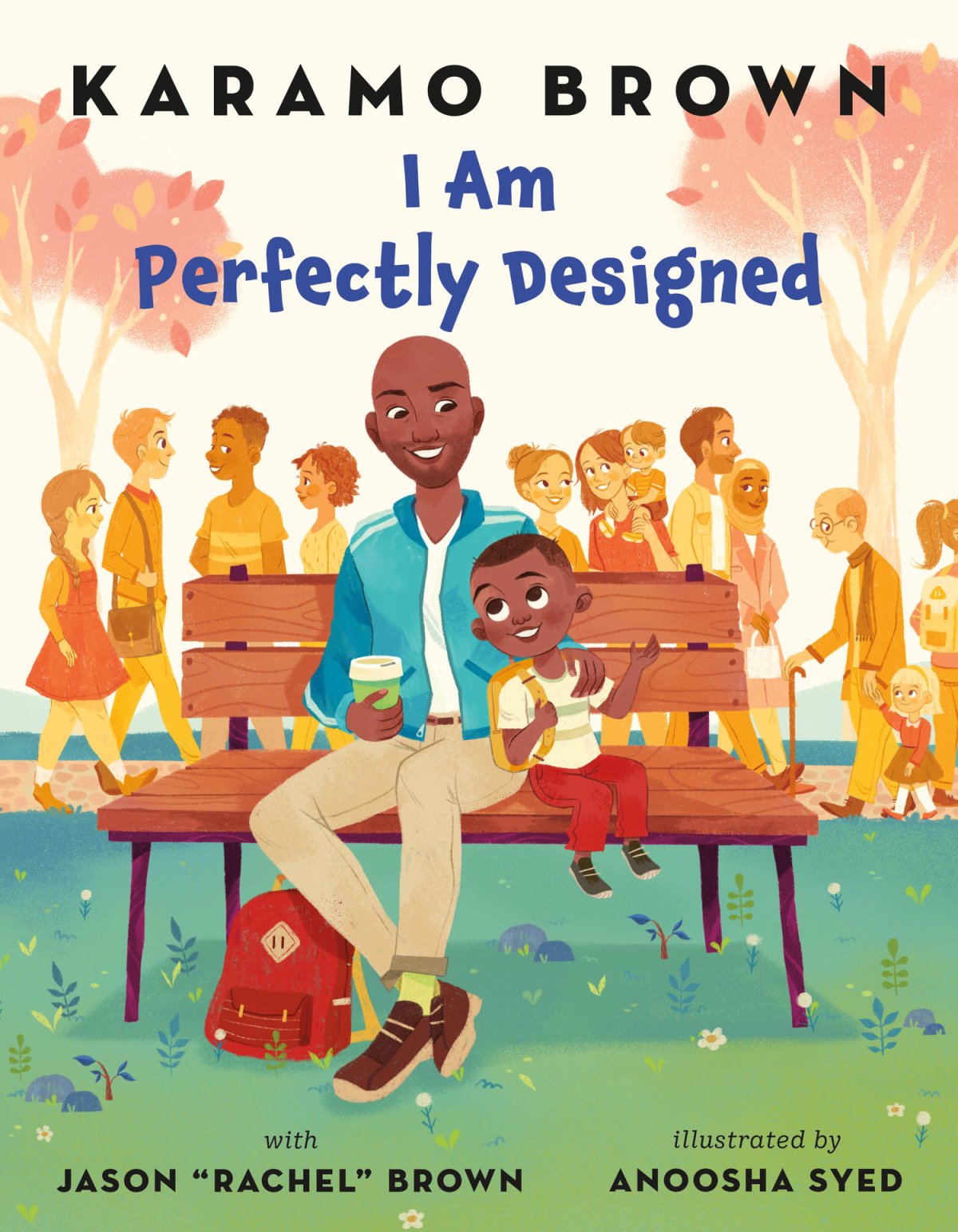
Anoosha Syed is a freelance illustrator and character designer for animation who represents a more current and culturally relevant perspective on children’s book illustration. The Pakistani-Canadian artist got her BFA at Ceruleum: Ecole d’arts Visuels in Switzerland. She has since been asked to illustrate a number of popular children’s books, including Daring Dreamers Club, Kid Scientists, and Bilal Cooks Daal. Her latest book is in collaboration with Karamo Brown, the Culture Expert from the popular Netflix series Queer Eye. I Am Perfectly Designed features a young African-American boy and his father enjoying a walk through the city. On her website, Anoosha describes the book as “an exuberant celebration of loving who you are, exactly as you are.[16]” On their walk, they observe the many different shapes that modern families take on. This and much of Anoosha’s work represent modern day society and the somewhat recent move toward inclusive children’s content, celebrating all different races, gender identities, sexual orientations, cultural backgrounds, and disabilities. Anoosha illustrates her work digitally, a practice which has come to dominate the current children’s book market. Her style features bright, playful colors that highlight important characters and objects. In this illustration, characters in the background have a more limited color palette so that they don’t draw attention away from the foreground. It is sweet and playful yet detailed enough to keep young readers turning pages to see what’s next.
Art forms stuck with the “commercial” label have long been seen as lesser by fine artists, their consumers, and critics. “Fine art” is validated for its often somewhat elusive meaning, context, and role as a reflection of the artist’s unique point of view. In contrast, illustrators are often paid up-front to convey a client’s ideas. Are illustrators, then, lesser artists as a direct effect of choosing to convey the message and perspective of another? I argue that illustrators work, especially children’s book illustrators, must adhere to an even wider set of requirements that make them worthy of recognition from the fine art world. Their work can have a long-lasting impact on the developing brains of children, including through learning, memory, and cultivating a lifelong interest in art. Their bodies of work are versatile in medium, purpose, and style. They also possess a unique skillset that is less common with fine artists. They must always meet strict deadlines, have to collaborate with clients throughout development on top of satisfying their prompt, and can even be asked to modify their personal style whereas most fine artists are hired specifically to demonstrate it. Unlike the vast majority of fine art, the imagery within children’s book and the stories they accompany are often adapted into massively popular and successful animated and live-action movies and tv series, and even video games. For this I believe illustrations, even children’s illustrations, deserve a place at the fine art table and a larger platform within galleries and museums.
Proposed Exhibition Image List
John Tenniel – Alice’s Adventures in Wonderland (1865)
E.H. Shepard – Winnie-the-Pooh (1926)
Ludwig Bemelmans – Madeline’s Rescue (1953)
Eric Carle – Brown Bear, Brown Bear, What Do You See? (1967)
Walter Wick – “City Blocks” (1994)
Anoosha Syed – I Am Perfectly Designed (2019)
Bibliography
“About.” Walter Wick Studio. Accessed May 14, 2019. http://www.walterwick.com/about.
Bland, David. A History of Book Illustration. Cleveland: The World Publishing Company, 1958.
Bromwich, Jonah Engel. “How the Author of ‘Madeline’ Created His Most Famous Character.” The New York Times. April 27, 2018. Accessed May 14, 2019. https://www.nytimes.com/2018/04/27/style/madeleine-author-illustrator.html.
“E.H. Shepard.” Illustration History. Accessed May 14, 2019. https://www.illustrationhistory.org/artists/ernest-howard-shepard.
“Eric Carle.” The NCCIL. Accessed May 14, 2019. https://www.nccil.org/artists/eric-carle.
Morris, Frankie (2005). Artist of Wonderland: The Life, Political Cartoons, and Illustrations of Tenniel. Charlottesville: University of Virginia Press. p. 37.
“Sir John Tenniel.” Illustration History. March 2018. Accessed May 14, 2019. https://www.illustrationhistory.org/artists/sir-john-tenniel.
Syed, Anoosha. “Published Works.” Anoosha Syed. Accessed May 14, 2019. http://www.anooshasyed.com/books-1#/i-am-perfectly-designed/.
“Walter Wick.” The NCCIL. January 19, 2017. Accessed May 14, 2019. https://www.nccil.org/artists/walter-wick.