An Explosion of Color

While the Fauvism and Pop Art movements happened nearly fifty years apart from one another, the two movements occasionally link together with striking similarities, in use of color, iconography, and brush work. While Fauvism itself was about the strong use of color and shape over realism in color and form, Pop Art used those lessons in a way that makes it such a well known movement even today, without Fauvism, it is likely that Pop Art would have looked much different.
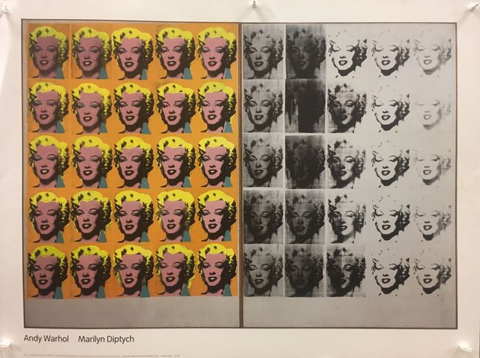
Andy Warhol. Marilyn Diptych, 1962. Silkscreen ink and acrylic paint on two canvases; Each 2054 x 1448 x 20mm. Aspen Art Museum, Aspen USA.
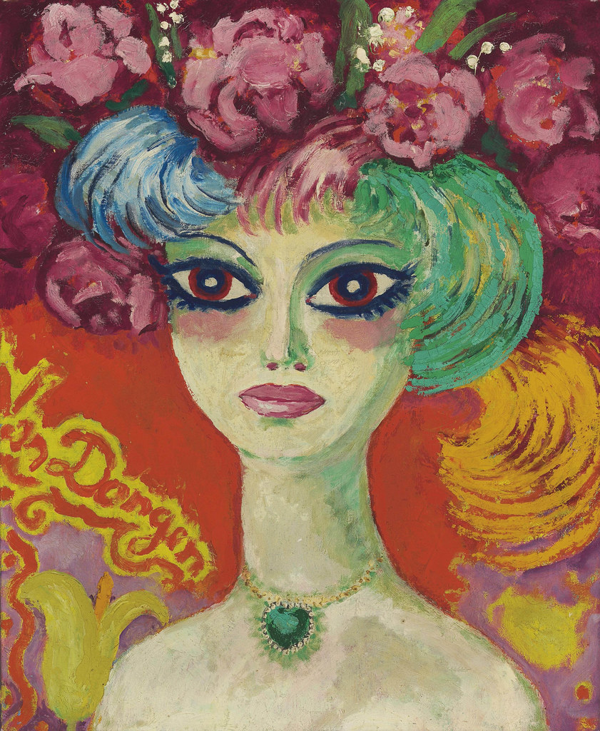
Kees Van Dongen. Portrait de femme. Oil on Canvas; 61 x 49.5 cm. Christie’s, New York.

            When discussing Pop Art, to most people Andy Warhol comes to mind. Considered to be one of the founders of the movement[1], his use of bright color and repetition added to the signature style. Comparing his piece Marilyn Diptych to Kees Van Dongen’s, Portrait de femme can help show the styles similarities, the bright colors, heavy eyeliner and mascara and plump lips, the barely there toning in the faces and the bright orange backgrounds, contrasting with other shades of yellow and cyan to make all the colors pop. Despite the two pieces being two completely separate mediums, they call to one another.
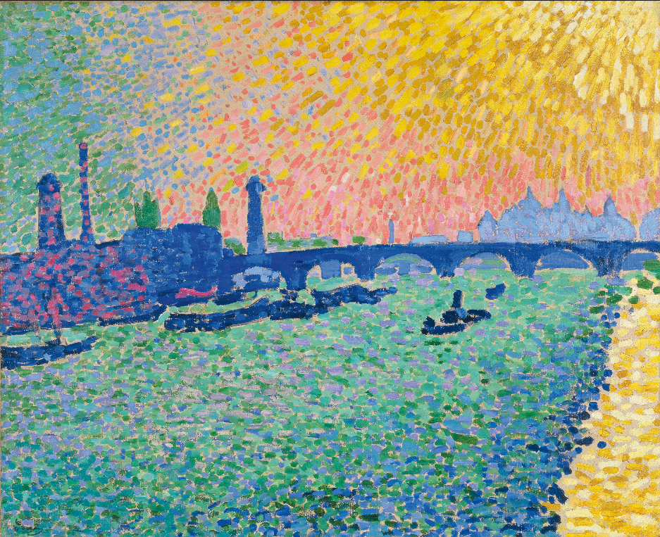
Andre Derain. Waterloo Bridge, 1906. Oil on Canvas; 80.5 x 101 cm. Museuo Nacional Thyssen-Bornemisza, Madrid.
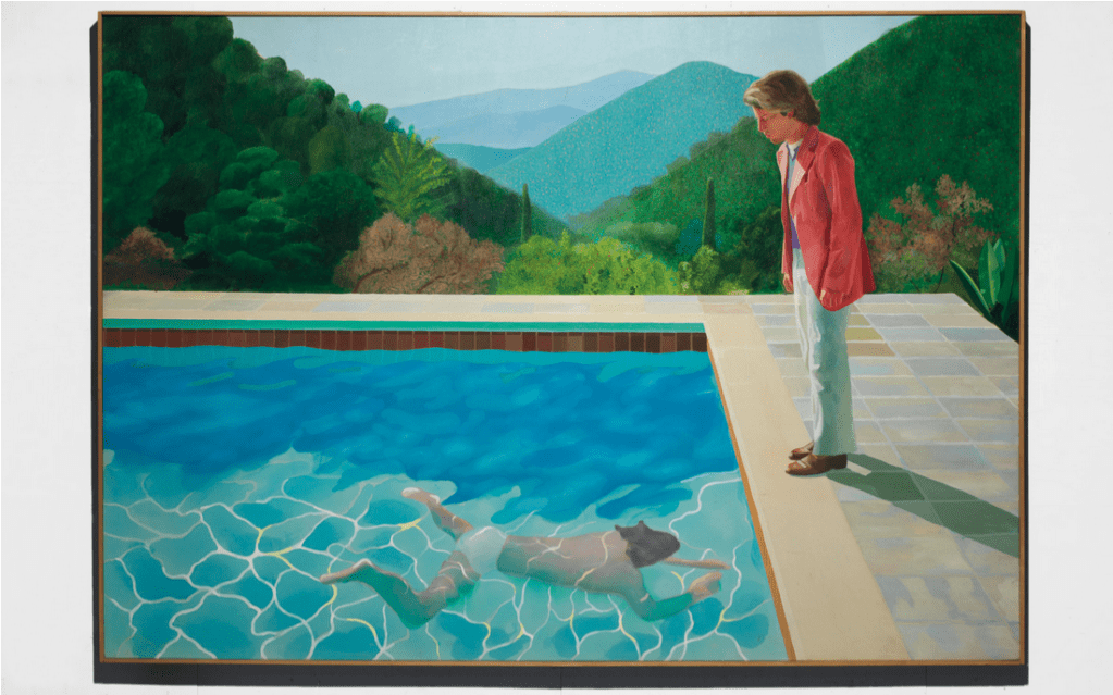
David Hockney. Portrait of an Artist (Pool with Two Figures), 1972. Acrylic on canvas; 84 x 120 in. Private Collector.

            Another two paintings to compare are Waterloo Bridge, 1906, by Andre Derain and Portrait of an Artist (Pool with Two Figures), 1972, by David Hockney, you can see the almost mosaic style of laying down color, the strong dashes of green and blue throughout the pieces, that while applied differently, combine to a similar effect. David Hockney, also considered to be a major player in Pop Art, has later art that is even compared to Fauvism[2], especially for pieces like Nichols Canyon, and The Garden, with bright heavy strokes and use of pattern and line.

While other aspects of the two movements can look or represent much different things, it’s easy to see the influence that color had on both movements.


[1]Justin Wolf “Pop Art Movement Overview and Analysis,” The Art Story, 2021 https://www.theartstory.org/movement/pop-art/

[2] “Nichols Canyon”, AaronArtPrints.org https://www.aaronartprints.org/hockney-nicholscanyon.php


Sources

Nichols Canyon By hockney. Accessed September 28, 2021. https://www.aaronartprints.org/hockney-nicholscanyon.php.

Wolf, Justin. “Pop Art Movement Overview.” The Art Story. Accessed September 28, 2021. https://www.theartstory.org/movement/pop-art/.

Andy Warhol’s “Early Colored Jackie” (1964)

Early Colored Jackie

Andy Warhol. Early Colored Jackie, 1964. Silkscreen ink on synthetic polymer paint on canvas; 40 x 40 in. Wadsworth Atheneum, Hartford, CT. Photo by Wadsworth Atheneum Collection

This work, titled Early Colored Jackie, is displayed in the Wadsworth Atheneum in Hartford, Connecticut. Warhol created this piece as a silkscreen print on synthetic polymer paint on canvas. As in typical Warhol fashion, he used blocks of bright, unrealistic colors to form the image of Jacqueline Kennedy. The light pink skin tone stands out from the dark blue background, while the bold red lipstick and seafoam green eyeshadow add pops of color to her face. The silkscreen print is taken from an official White House photograph snapped before the assassination of her husband, John F. Kennedy. It is printed in black ink on top of the colorful paint on the canvas. The photo used is cropped in close so it only includes the headshot of Jackie with a blank background.

Warhol was a pioneer of the pop art movement in which this piece was a part of. Jackie was a sign of royalty and glamour in the United States, which makes this piece relatable to the Marilynn Monroe silkscreen that Warhol is well-known for. Jackie was an icon through both her style and behavior for the American people and was one of the first First Lady’s to give more importance to her role as wife of the president. Warhol found inspiration for his subjects in celebrities as well as tragedy or death. This piece was made in 1964, about a year after JFK’s death. The Kennedy family as well as the country was still grieving. It is ironic that Warhol would have chosen a picture of Jackie smiling during such a trying time.


Sources

“Early Colored Jackie.” Wadsworth Atheneum Collection. Accessed December 18, 2019. http://argus.wadsworthatheneum.org/Wadsworth_Atheneum_ArgusNet/Portal/public.aspx?lala=en-US.

Sooke, Alastair. “Culture – Jackie Kennedy: Andy Warhol’s Pop Saint.” BBC. BBC, April 18, 2014. http://www.bbc.com/culture/story/20140418-jackie-warhols-pop-saint.